每日一博 | 阅读 Skeleton.css 源码,改善睡眠质量
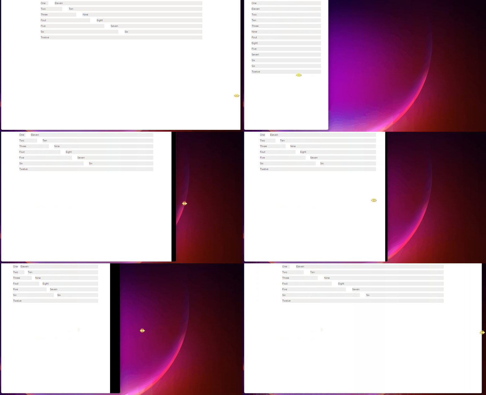
本文介绍 点赞就等于学会了! 如果本文对您有帮助,建议点赞收藏(点赞就等于学会了) <br> Skeleton 源码一共只有 419 行(加上注释和换行),非常适合用来学习。 本文是根据我的学习过程来编写的,几乎每个章节都包含 使用方法 和 源码分析。 虽然现在大部分业务都不需要重复造轮子了,但对于小白来说,学习完 Skeleton 源码 是能走出新手村的。 <br> 本文不是推荐大家使用 Skeleton.css ,因为现代工程其实已经用不上这个库了。本文的重点在 响应式布局源码的解读。 <br> 本文适合人群: 有 css 基础的(了解浮动、颜色、背景色等); 有一定工作经验,但又没了解过 css 库是如何生成的; <br> Skeleton 介绍 如果您正在着手一个较小的项目,或者觉得不太需要用到大型框架,那么可以尝试使用 Skeleton。 Skeleton仅对少数标准 HTML 元素设置了样式,并提供了一个网格系统。 <br> 『Skeleton.css 官网』 『github 地址』 也可以直接滑到文末获取 Skeleton 源码。 <br> 读css方面的源码,为什么要选 Skeleton ? Bootstrap:太长,不看! Layui:太长,不看! Element ui:和框架绑定的,不适合小白看~ Animate.css:动画库,下次再看。 …… Skeleton:短! <br> 功能目录 网格 - Grid 基础样式 Base Styles 排版 Typography 链接 Links 按钮 Buttons 表单 Forms 链接 Lists 代码 Code 表格 Tables 间隔 Spacing 工具集 Utilities 清除浮动 Clearing 媒体查询 Media Queries <br> <br> 出发!!! 本文所有例子都使用 CDN 的方式引入 skeleton.css ,默认已经引入了,所以在案例中不会再出现引入的代码。 <link href="https://cdn.bootcdn.net/ajax/libs/skeleton/2.0.4/skeleton.css" rel="stylesheet"> <br> 网格系统 Grid<a name="Grid"></a> Skeleton 提供了 12列 的网格布局模式,和现代UI库的24列相比,12列的确有点少了。但这并不影响我们学习。 <br> Skeleton 支持 指定值布局 和 比例布局,这两个名字是我自己起的,官方没这样说。 其实这两种布局方式都是大同小异的,只不过语义上有点不同而已。 <br> 使用方法 <br> 指定值布局 通过使用 1~12 的单词配合 .columns 类名 进行布局。 .one、.two、.three、.four、.five、.six、.seven、.eight、.nine、.ten、.eleven、.twelve <br> Skeleton.css 提供了12列的响应式网格布局,随着浏览器/设备尺寸的减小而缩小。 当浏览器窗口小于 550px 时,所有列都会占满整行。 <div class="container"> <div class="row"> <div class="one column">One</div> <div class="eleven columns">Eleven</div> </div> <div class="row"> <div class="two columns">Two</div> <div class="ten columns">Ten</div> </div> <div class="row"> <div class="three columns">Three</div> <div class="nine columns">Nine</div> </div> <div class="row"> <div class="four columns">Fout</div> <div class="eight columns">Eight</div> </div> <div class="row"> <div class="five columns">Five</div> <div class="seven columns">Seven</div> </div> <div class="row"> <div class="six columns">Six</div> <div class="six columns">Six</div> </div> <div class="row"> <div class="twelve columns">Twelve</div> </div> </div> <style> .row .column, .row .columns { margin-bottom: 10px; background: #eee; } </style> 本例使用了 .container 作为容器,限制了最大宽度是 980px ,并且水平居中。 因为布局容器是不提供背景和外边距等样式,所以本例写了一个背景色给 .columns 以便观察。 .row 这个其实不需要加的,本例添加这个类只是希望代码看起来能更加易读。 <br> 比例布局 提供了3个类名,需要配合 .column 使用。 .one-third:三分之一 .two-thirds:三分之二 .one-half:一半 <div class="container"> <div class="row"> <div class="one-third column">1/3</div> <div class="two-thirds column">2/3</div> </div> <div class="row"> <div class="one-half column">1/2</div> <div class="one-half column">1/2</div> </div> </div> <style> .row .column, .row .columns { margin-bottom: 10px; background: #eee; } </style> <br> 列偏移 <div class="container"> <div class="row"> <div class="offset-by-eleven one columns">One</div> </div> <div class="row"> <div class="offset-by-ten two columns">Two</div> </div> <div class="row"> <div class="offset-by-nine three columns">Three</div> </div> <div class="row"> <div class="offset-by-eight four columns">Fout</div> </div> <div class="row"> <div class="offset-by-seven five columns">Five</div> </div> <div class="row"> <div class="offset-by-six six columns">Six</div> </div> <div class="row"> <div class="offset-by-five seven columns">Seven</div> </div> <div class="row"> <div class="offset-by-four eight columns">Eight</div> </div> <div class="row"> <div class="offset-by-three nine columns">Nine</div> </div> <div class="row"> <div class="offset-by-two ten columns">Ten</div> </div> <div class="row"> <div class="offset-by-one eleven columns">Eleven</div> </div> <div class="row"> <div class="offset-by-two-thirds one-third column">1/3</div> </div> <div class="row"> <div class="offset-by-one-third two-thirds column">2/3</div> </div> <div class="row"> <div class="offset-by-one-half one-half column">1/2</div> </div> </div> <style> .container { border: 1px solid #ccc; } .row .column, .row .columns { margin-bottom: 10px; background: #eee; } </style> <br> 源码分析 布局其实分了几个部分: 容器部分 列(确定值) 列(百分比) 列间距 列偏移 <br> 容器部分 .container { position: relative; /* 相对定位 */ width: 100%; /* 容器宽度100% */ max-width: 960px; /* 但最大宽度不超过980px */ margin: 0 auto; /* 水平居中 */ padding: 0 20px; /* 容器左右内边距20px */ box-sizing: border-box; /* 设置容器盒模型,设置了容器的边框、内边距都不会超过容器宽度 */ } /* 当容器不小于400px时 */ @media (min-width: 400px) { .container { width: 85%; /* 宽度为85% */ padding: 0; /* 内边距为0 */ } } /* 当容器不小于550px时 */ @media (min-width: 550px) { .container { width: 80%; /* 宽度80,同时padding受到 @media (min-width: 400px) 里设置的影响 */ } } .container:after { content: ""; display: table; clear: both; /* 清除浮动 */ } <br> 容器使用了 container 这个类名,可以看出 skeleton 是先写了小屏的解决方案,然后再写大屏的。 默认情况下(文档宽度小于 400px),container 容器的宽度是 100%,最大宽度是 980px ,通过 margin: 0 auto; 实现了水平居中效果。 当文档宽度大于等于 400px 时,容器宽度变成 85%,但也会被最大宽度(980px)限制,同时内边距设为 0。 当文档宽度大于等于 550px 时,容器宽度变成 80%,会覆盖 @media (min-width: 400px) 里设置的宽度,但会受到 @media (min-width: 400px) 里设置的 padding 影响。 最后设置了一个伪元素 :after 清除浮动(clear: both;)。 <br> 列布局(响应式的开始) Skeleton.css 使用 浮动 + 百分比 的方式实现响应式。 <br> 列(确定值 )、**列(百分比)**和 列间距 这三个要放在一起讲。 skeleton 一共有12列布局,所以配置了基本的:one、two、three、four、five、six、seven、eight、nine、ten、eleven、twelve。 <br> 都是基础的数字英文,我就不翻译了。 这里要分2种情况来讨论, 能整除12的(one、two、three、four、six、twelve) 不能整除12的(five、seven、eight、nine、then、eleven) <br> 接下来会分开讨论这两种情况。 .column, .columns { width: 100%; /* 所有列的宽度都是100%。 */ float: left; /* 左浮动 */ box-sizing: border-box; /* 设置容器盒模型,设置了容器的边框、内边距都不会超过容器宽度 */ } @media (min-width: 550px) { .column, .columns { margin-left: 4%; /* 左边距4% */ } .column:first-child, .columns:first-child { margin-left: 0; /* 第一个元素不需要左边距,所以设为0 */ } .one.column, .one.columns { width: 4.66666666667%; } .two.columns { width: 13.3333333333%; } .three.columns { width: 22%; } .four.columns { width: 30.6666666667%; } .five.columns { width: 39.3333333333%; } .six.columns { width: 48%; } .seven.columns { width: 56.6666666667%; } .eight.columns { width: 65.3333333333%; } .nine.columns { width: 74.0%; } .ten.columns { width: 82.6666666667%; } .eleven.columns { width: 91.3333333333%; } .twelve.columns { width: 100%; margin-left: 0; } /* 只有一列,不需要左边距了 */ /* 1/3,对应 .four */ .one-third.column { width: 30.6666666667%; } /* 2/3,对应 .eight */ .two-thirds.column { width: 65.3333333333%; } /* 1/2,对应 .six */ .one-half.column { width: 48%; } } 默认情况下(文档宽度小于 550px)所有列的宽度都是 100%。 除了第一列,后面跟着的列都有一个 4%的左边距 。 <br> 能整除12的 .one、.two、.three、.four、.six、.twelve 布局方式如下图所示(本文只详细讲 .one 和 .two 两种列,其他的原理都是一样的,自己推算就行了) <br> 从上图可以看出,都使用 .one 的话,一共有 12列 、11个间隔 ,一行的宽度是 100% ,每个间隔的占比是 4% ,11个间隔一共就花掉了 44% ,剩下 56% 给12列平均分。 所以 .one 的宽度就是 56 ÷ 12 ≈ 4.66666666667 ,单位是 % <br> 都用.two 的话,从上图可以看出一共有 6列 、5个间隔 ,每个间隔的宽度是 4%,5个间隔合计占用 20% 的宽度,剩下 80% 的宽度给6列平均分。 **所以 .two 的宽度就是 80 ÷ 6 ≈ 13.3333333333 ,单位是 % ** <br> 剩下的我就直接写公式了,不懂的可以在评论区讨论~ 公式:(100% - 间隔数量 × 4%) ÷ 列的数量 .one:(100% - 4% × 11) ÷ 12 ≈ 4.66666666667% .two:(100% - 4% × 5) ÷ 6 ≈ 13.3333333333% .three:(100% - 4% × 3) ÷ 4 = 22% .four:(100% - 4% × 2 ) ÷ 3 ≈ 30.6666666667% .six:(100% - 4% × 1) ÷ 2 = 48% .twelve:就是100%咯,而且不需要左边距 <br> 不能整除12的 .five、.seven、.eight、.nine、.then、.eleven <br> 首先看 .five ,代表 5,12 - 5 = 7,但现在 .five 和 .seven 的值是多少我们都不知道,虽然可以按 5:7 再加一个 间隔(4%) 来计算,但我更愿意使用已知的值来推算。 .two + .five + .five 三列加起来刚好是 12 ,而 .two 的值我们是知道的,由此可以得到一个代数式: 13.3333333333% + 间隔 + .five + 间隔 + .five = 100% <br> 间隔 的占比是 4% 所以得到下面的代数式 13.3333333333% + 4% + .five + 4% + .five = 100% 21.3333333333% + 2(.five) = 100% 2(.five) = 78.6666666667% .five ≈ 39.3333333333% 根据上面的小学生推导法,得知一个 .five 是 39.3333333333% <br> .seven 刚刚有讲到,5 + 7 = 12,那现在 5 出来了,7 也就通过加减法能算出来 .five + 间隔 + .seven = 100% 39.3333333333% + 4% + .seven = 100% .seven = 100% - 39.3333333333% - 4% .seven = 56.6666666667% 综上所述,.seven 的宽度是 56.6666666667% <br> 这是我的推导方式,最后的值也和 skeleton 的值一样。.eight、.nine、.then、.eleven 的推导方式其实也和上面一样,这里我就不再啰嗦了。有疑问的可以在评论区交流。 <br> 最后得出 .five:39.3333333333% .seven:56.6666666667% .eight:65.3333333333% .nine:74.0% .ten:82.6666666667% .eleven:91.3333333333% <br> 比例 .one-third:三分之一。对应 .four .two-thirds:三分之二。对应 .eight .one-half:一半。对应.six <br> 列偏移 列偏移的类名都是 .offset-by- 开头的,后面再加上对应的数字或者比例的单词。 @media (min-width: 550px) { .offset-by-one.column, .offset-by-one.columns { margin-left: 8.66666666667%; } .offset-by-two.column, .offset-by-two.columns { margin-left: 17.3333333333%; } .offset-by-three.column, .offset-by-three.columns { margin-left: 26%; } .offset-by-four.column, .offset-by-four.columns { margin-left: 34.6666666667%; } .offset-by-five.column, .offset-by-five.columns { margin-left: 43.3333333333%; } .offset-by-six.column, .offset-by-six.columns { margin-left: 52%; } .offset-by-seven.column, .offset-by-seven.columns { margin-left: 60.6666666667%; } .offset-by-eight.column, .offset-by-eight.columns { margin-left: 69.3333333333%; } .offset-by-nine.column, .offset-by-nine.columns { margin-left: 78.0%; } .offset-by-ten.column, .offset-by-ten.columns { margin-left: 86.6666666667%; } .offset-by-eleven.column, .offset-by-eleven.columns { margin-left: 95.3333333333%; } .offset-by-one-third.column, .offset-by-one-third.columns { margin-left: 34.6666666667%; } .offset-by-two-thirds.column, .offset-by-two-thirds.columns { margin-left: 69.3333333333%; } .offset-by-one-half.column, .offset-by-one-half.columns { margin-left: 52%; } } <br> 如果用 .offset-by-one ,那我们就需要假设后面的内容补充完是 12。 1 + 11 = 12,我们通过上面的计算得知 .eleven 的宽度是 91.3333333333%,所以 .offset-by-one 的占比是: .offset-by-one = 100% - .eleven .offset-by-one = 8.66666666667% <br> 其他的 .offset-by-two 、.offset-by-three 那些也可以用同样的方法去计算。最后再和 skeleton 的值对比一下就行了。 <br> 基础样式 Base Styles<a name="BaseStyles"></a> 这部分主要定义了全局字体和行距的样式,作用在 html 和 body 标签上。 <br> <br> 使用方法 <div>雷猴</div> <br> <br> 源码分析 看看这部分的源码: html { font-size: 62.5%; /* 16px × 62.5% = 10px */ } body { font-size: 1.5em; /* 10px × 1.5 = 15px */ line-height: 1.6; /* 15px * 1.6 = 24px */ font-weight: 400; /* 字体粗细 */ font-family: "Raleway", "HelveticaNeue", "Helvetica Neue", Helvetica, Arial, sans-serif; /* 字体 */ color: #222; /* 文本颜色 */ } <br> 浏览器的默认字号是 16px ,在 html 设置字号是 62.5%,那就是变成 10px 了。 在 body 设置 font-size: 1.5em; ,那么之后的内容默认都会继承 body 的,也就是普通的文本是 15px。 最后再设置 行高 、字体粗细 、字体 、文本颜色 。 <br> <br> 排版 Typography<a name="Typography"></a> 不需要使用特别的类名,这部分作用在 h1 ~ h6 标签中。使用了 rem 的方式设置字体大小,会受到 <html> 标签字体大小影响。 <br> 使用方法 <h1>Heading</h1> <h2>Heading</h2> <h3>Heading</h3> <h4>Heading</h4> <h5>Heading</h5> <h6>Heading</h6> <p>The base type is 15px over 1.6 line height (24px)</p> <br> <br> 源码分析 h1, h2, h3, h4, h5, h6 { margin-top: 0; margin-bottom: 2rem; font-weight: 300; } h1 { font-size: 4.0rem; line-height: 1.2; letter-spacing: -.1rem;} h2 { font-size: 3.6rem; line-height: 1.25; letter-spacing: -.1rem; } h3 { font-size: 3.0rem; line-height: 1.3; letter-spacing: -.1rem; } h4 { font-size: 2.4rem; line-height: 1.35; letter-spacing: -.08rem; } h5 { font-size: 1.8rem; line-height: 1.5; letter-spacing: -.05rem; } h6 { font-size: 1.5rem; line-height: 1.6; letter-spacing: 0; } /* Larger than phablet */ @media (min-width: 550px) { h1 { font-size: 5.0rem; } h2 { font-size: 4.2rem; } h3 { font-size: 3.6rem; } h4 { font-size: 3.0rem; } h5 { font-size: 2.4rem; } h6 { font-size: 1.5rem; } } p { margin-top: 0; } <br> 这段源码其实没什么好解释的了,主要设置了 h1 ~ h6 的 外边距、字号、文字粗细、行高、字距,并且用 媒体查询 来重新定义不同尺寸的浏览器宽度显示出来的标题 字号 不同。 最后定义了段落 p 的上边距,这里的 p 的字号默认继承 body 里的设置,也就是 15px。 <br> 链接 Links<a name="Links"></a> <br> 使用方法 <a>Colored</a> <br> 源码分析 a { color: #1EAEDB; } a:hover { color: #0FA0CE; } 这里只定义了 a 的字体颜色,还有鼠标经过时的颜色。字号默认继承 body ,也就是 15px。 <br> 按钮 Buttons<a name="Buttons"></a> <br> 使用方法 <!-- 默认 --> <a class="button" href="#">Anchor button</a> <button>Button element</button> <input type="submit" value="submit input"> <input type="button" value="button input"> <!-- primary类型 --> <a class="button button-primary" href="#">Anchor button</a> <button class="button-primary">Button element</button> <input class="button-primary" type="submit" value="submit input"> <input class="button-primary" type="button" value="button input"> <br> 源码分析 /* 默认样式 */ .button, button, input[type="submit"], input[type="reset"], input[type="button"] { display: inline-block; /* 行内块 */ height: 38px; /* 高度 */ padding: 0 30px; /* 内边距:上下0,左右30px */ color: #555; /* 字体颜色:灰色(有点深) */ text-align: center; /* 本文居中 */ font-size: 11px; /* 字号 */ font-weight: 600; /* 字体稍微加粗 */ line-height: 38px; /* 行高(和height一样,所以是垂直居中了) */ letter-spacing: .1rem; /* 字距 */ text-transform: uppercase; /* 字母变成全大写 */ text-decoration: none; /* 不需要文本修饰 */ white-space: nowrap; /* 不换行 */ background-color: transparent; /* 背景色:透明 */ border-radius: 4px; /* 圆角:4px */ border: 1px solid #bbb; /* 边框:1px,实线,浅灰 */ cursor: pointer; /* 鼠标指针样式 */ box-sizing: border-box; /* 盒模型规则 */ } /* 鼠标经过、获得焦点 */ .button:hover, button:hover, input[type="submit"]:hover, input[type="reset"]:hover, input[type="button"]:hover, .button:focus, button:focus, input[type="submit"]:focus, input[type="reset"]:focus, input[type="button"]:focus { color: #333; /* 文字颜色比默认深一点点 */ border-color: #888; /* 边框颜色比默认深一点点 */ outline: 0; /* 轮廓:0 */ } /* primary类型 */ .button.button-primary, button.button-primary, input[type="submit"].button-primary, input[type="reset"].button-primary, input[type="button"].button-primary { color: #FFF; /* 字变白 */ background-color: #33C3F0; /* 背景色变蓝 */ border-color: #33C3F0; /* 边框颜色变蓝 */ } /* 使用primary类型时:鼠标经过、获得焦点 */ .button.button-primary:hover, button.button-primary:hover, input[type="submit"].button-primary:hover, input[type="reset"].button-primary:hover, input[type="button"].button-primary:hover, .button.button-primary:focus, button.button-primary:focus, input[type="submit"].button-primary:focus, input[type="reset"].button-primary:focus, input[type="button"].button-primary:focus { color: #FFF; /* 文本白色 */ background-color: #1EAEDB; /* 背景色变深一点点 */ border-color: #1EAEDB; /* 边框颜色变深一点点 */ } 按钮的实现方式有很多种,比如 <button> 、<input type="submit" /> 等等,这里就不一一列举额了,skeleton 把这类情况都写好了,可以直接在源码中看到。 skeleton 提供了2中样式的按钮,一个是默认的(白底黑字),一个是 primary 的(蓝底白字)。 还有一些选中状态。 skeleton 的做法是先写好默认的,其他状态都在默认状态的基础上覆盖新的样式。 <br> <br> 表单 Forms<a name="Forms"></a> <br> 使用方法 <form> <div class="row"> <div class="six columns"> <label for="exampleEmailInput">Your email</label> <input class="u-full-width" type="email" placeholder="test@mailbox.com" id="exampleEmailInput"> </div> <div class="six columns"> <label for="exampleRecipientInput">Reason for contacting</label> <select class="u-full-width" id="exampleRecipientInput"> <option value="Option 1">Questions</option> <option value="Option 2">Admiration</option> <option value="Option 3">Can I get your number?</option> </select> </div> </div> <label for="exampleMessage">Message</label> <textarea class="u-full-width" placeholder="Hi Dave …" id="exampleMessage"></textarea> <label class="example-send-yourself-copy"> <input type="checkbox"> <span class="label-body">Send a copy to yourself</span> </label> <input class="button-primary" type="submit" value="Submit"> </form> <br> 源码分析 /* 单行文本框、多行文本框、下来选择器 */ input[type="email"], input[type="number"], input[type="search"], input[type="text"], input[type="tel"], input[type="url"], input[type="password"], textarea, select { height: 38px; /* 高度 */ padding: 6px 10px; /* 内边距:上下6px,左右10px */ background-color: #fff; /* 背景色:白色 */ border: 1px solid #D1D1D1; /* 边框:1px,实线,灰色 */ border-radius: 4px; /* 圆角:4px */ box-shadow: none; /* 投影:无 */ box-sizing: border-box; /* 盒模型 */ } /* 针对单行和多行文本框的样式设置 */ input[type="email"], input[type="number"], input[type="search"], input[type="text"], input[type="tel"], input[type="url"], input[type="password"], textarea { -webkit-appearance: none; -moz-appearance: none; appearance: none; /* 外表 */ } /* 多行文本框 */ textarea { min-height: 65px; /* 最小高度是65px,会覆盖上面设置的height */ padding-top: 6px; /* 上内边距 */ padding-bottom: 6px; /* 下内边距 */ } /* 单行文本框、多行文本框、下来选择器 获取焦点时 */ input[type="email"]:focus, input[type="number"]:focus, input[type="search"]:focus, input[type="text"]:focus, input[type="tel"]:focus, input[type="url"]:focus, input[type="password"]:focus, textarea:focus, select:focus { border: 1px solid #33C3F0; /* 边框:1px,实线,蓝色 */ outline: 0; /* 轮廓:0 */ } /* label(标签) legend(组合表单中的相关元素,legend 元素为 fieldset 元素定义标题) */ label, legend { display: block; /* 块状 */ margin-bottom: .5rem; /* 下外边距 */ font-weight: 600; /* 字体有点粗 */ } /* fieldset(可将表单内的相关元素分组) */ fieldset { padding: 0; /* 内边距 */ border-width: 0; /* 边框宽度 */ } /* 多选和单选 */ input[type="checkbox"], input[type="radio"] { display: inline; /* 行内 */ } /* label标签下的 .label-body,可看使用例子 */ label > .label-body { display: inline-block; /* 行内 */ margin-left: .5rem; /* 左外边距:5px */ font-weight: normal; /* 字体粗细 */ } <br> <br> 列表 Lists<a name="Lists"></a> <br> 使用方法 <ul> <li>Item 1</li> <li> Item 2 <ul> <li>Item 2.1</li> <li>Item 2.2</li> </ul> </li> <li>Item 3</li> </ul> <ol> <li>Item 1</li> <li> Item 2 <ol> <li>Item 2.1</li> <li>Item 2.2</li> </ol> </li> <li>Item 3</li> </ol> <br> 源码分析 /* 无序列表 */ ul { list-style: circle inside; /* 标记样式:圆,内侧 */ } /* 有序列表 */ ol { list-style: decimal inside; /* 标记样式:十进制,内侧 */ } ol, ul { padding-left: 0; /* 左侧内边距:0 */ margin-top: 0; /* 左侧外边距:0 */ } /* 嵌套列表 */ ul ul, ul ol, ol ol, ol ul { margin: 1.5rem 0 1.5rem 3rem; /* 外边距 */ font-size: 90%; /* 字号 */ } /* 列表项 */ li { margin-bottom: 1rem; /* 下外边距 */ } <br> <br> 代码 Code<a name="Code"></a> <br> 使用方法 <pre> <code>.some-class { background-color: red; }</code> </pre> <br> 源码分析 code { padding: .2rem .5rem; /* 内边距 */ margin: 0 .2rem; /* 外边距 */ font-size: 90%; /* 字号 */ white-space: nowrap; /* 不换行 */ background: #F1F1F1; /* 背景色:超级浅的灰色 */ border: 1px solid #E1E1E1; /* 边框:1px,实线,灰色 */ border-radius: 4px; /* 圆角:4px */ } pre > code { display: block; /* 块状 */ padding: 1rem 1.5rem; /* 内边距 */ white-space: pre; /* 空白会被浏览器保留。 */ } code 和 pre 是 HTML 原生标签。 <br> <br> 表格 Tables<a name="Tables"></a> <br> 使用方法 <table> <thead> <tr> <th>Name</th> <th>Age</th> <th>Sex</th> <th>Location</th> </tr> </thead> <tbody> <tr> <td>Dave Gamache</td> <td>26</td> <td>Male</td> <td>San Francisco</td> </tr> <tr> <td>Dwayne Johnson</td> <td>42</td> <td>Male</td> <td>Hayward</td> </tr> </tbody> </table> <br> 源码分析 /* 表头的列 和 普通列 */ th, td { padding: 12px 15px; /* 内边距 */ text-align: left; /* 文本左对齐 */ border-bottom: 1px solid #E1E1E1; /* 底边框 */ } /* 第一个表头的列 和 每行第一个普通列 */ th:first-child, td:first-child { padding-left: 0; /* 左内边距 */ } /* 最后一个表头的列 和 每行最后一个普通列 */ th:last-child, td:last-child { padding-right: 0; /* 右内边距 */ } 没想到表格的 css 样式这么简单吧哈哈哈哈~ <br> <br> 间隔 Spacing<a name="Spacing"></a> <br> 源码分析 button, .button { margin-bottom: 1rem; } input, textarea, select, fieldset { margin-bottom: 1.5rem; } pre, blockquote, dl, figure, table, p, ul, ol, form { margin-bottom: 2.5rem; } 这部分主要定义常用的标签和类的底部外边距,太简单,不一一细讲了。 <br> <br> 工具集 Utilities<a name="Utilities"></a> <br> 源码分析 .u-full-width { width: 100%; box-sizing: border-box; } .u-max-full-width { max-width: 100%; box-sizing: border-box; } .u-pull-right { float: right; } .u-pull-left { float: left; } 这部分源码太简单了,不讲了~ .u-full-width :宽度满屏 .u-max-full-width :最大宽度是满屏 .u-pull-right :右浮动 .u-pull-left :左浮动 <br> <br> 分割线 Hr<a name="Hr"></a> <br> 使用方法 <hr /> <br> 源码分析 hr { margin-top: 3rem; margin-bottom: 3.5rem; border-width: 0; border-top: 1px solid #E1E1E1; } 上下设置了外边距 清除掉所有border 最后再设置回顶部边框为1px,实线,灰色 <br> <br> 清除浮动 Clearing<a name="Clearing"></a> <br> 源码分析 .container:after, .row:after, .u-cf { content: ""; display: table; clear: both; } 容器 和 行 都设置了清楚浮动。 .u-cf 是专门清楚浮动的。 清楚浮动的做法在很多基础的 css 教程有讲,这里不再啰嗦了。 <br> <br> 媒体查询 Media Queries<a name="MediaQueries"></a> <br> 源码分析 @media (min-width: 400px) {} @media (min-width: 550px) {} @media (min-width: 750px) {} @media (min-width: 1000px) {} @media (min-width: 1200px) {} 这部分的源码,是预留给开发者自己写的。 如果开发者需要自己重新定义某些元素的样式,根据不同的窗口宽度来定义,可以在此编写。 <br> <br> Skeleton.css源码 /* * Skeleton V2.0.4 * Copyright 2014, Dave Gamache * www.getskeleton.com * Free to use under the MIT license. * http://www.opensource.org/licenses/mit-license.php * 12/29/2014 */ /* Table of contents –––––––––––––––––––––––––––––––––––––––––––––––––– - Grid - Base Styles - Typography - Links - Buttons - Forms - Lists - Code - Tables - Spacing - Utilities - Clearing - Media Queries */ /* Grid –––––––––––––––––––––––––––––––––––––––––––––––––– */ .container { position: relative; width: 100%; max-width: 960px; margin: 0 auto; padding: 0 20px; box-sizing: border-box; } .column, .columns { width: 100%; float: left; box-sizing: border-box; } /* For devices larger than 400px */ @media (min-width: 400px) { .container { width: 85%; padding: 0; } } /* For devices larger than 550px */ @media (min-width: 550px) { .container { width: 80%; } .column, .columns { margin-left: 4%; } .column:first-child, .columns:first-child { margin-left: 0; } .one.column, .one.columns { width: 4.66666666667%; } .two.columns { width: 13.3333333333%; } .three.columns { width: 22%; } .four.columns { width: 30.6666666667%; } .five.columns { width: 39.3333333333%; } .six.columns { width: 48%; } .seven.columns { width: 56.6666666667%; } .eight.columns { width: 65.3333333333%; } .nine.columns { width: 74.0%; } .ten.columns { width: 82.6666666667%; } .eleven.columns { width: 91.3333333333%; } .twelve.columns { width: 100%; margin-left: 0; } .one-third.column { width: 30.6666666667%; } .two-thirds.column { width: 65.3333333333%; } .one-half.column { width: 48%; } /* Offsets */ .offset-by-one.column, .offset-by-one.columns { margin-left: 8.66666666667%; } .offset-by-two.column, .offset-by-two.columns { margin-left: 17.3333333333%; } .offset-by-three.column, .offset-by-three.columns { margin-left: 26%; } .offset-by-four.column, .offset-by-four.columns { margin-left: 34.6666666667%; } .offset-by-five.column, .offset-by-five.columns { margin-left: 43.3333333333%; } .offset-by-six.column, .offset-by-six.columns { margin-left: 52%; } .offset-by-seven.column, .offset-by-seven.columns { margin-left: 60.6666666667%; } .offset-by-eight.column, .offset-by-eight.columns { margin-left: 69.3333333333%; } .offset-by-nine.column, .offset-by-nine.columns { margin-left: 78.0%; } .offset-by-ten.column, .offset-by-ten.columns { margin-left: 86.6666666667%; } .offset-by-eleven.column, .offset-by-eleven.columns { margin-left: 95.3333333333%; } .offset-by-one-third.column, .offset-by-one-third.columns { margin-left: 34.6666666667%; } .offset-by-two-thirds.column, .offset-by-two-thirds.columns { margin-left: 69.3333333333%; } .offset-by-one-half.column, .offset-by-one-half.columns { margin-left: 52%; } } /* Base Styles –––––––––––––––––––––––––––––––––––––––––––––––––– */ /* NOTE html is set to 62.5% so that all the REM measurements throughout Skeleton are based on 10px sizing. So basically 1.5rem = 15px :) */ html { font-size: 62.5%; } body { font-size: 1.5em; /* currently ems cause chrome bug misinterpreting rems on body element */ line-height: 1.6; font-weight: 400; font-family: "Raleway", "HelveticaNeue", "Helvetica Neue", Helvetica, Arial, sans-serif; color: #222; } /* Typography –––––––––––––––––––––––––––––––––––––––––––––––––– */ h1, h2, h3, h4, h5, h6 { margin-top: 0; margin-bottom: 2rem; font-weight: 300; } h1 { font-size: 4.0rem; line-height: 1.2; letter-spacing: -.1rem;} h2 { font-size: 3.6rem; line-height: 1.25; letter-spacing: -.1rem; } h3 { font-size: 3.0rem; line-height: 1.3; letter-spacing: -.1rem; } h4 { font-size: 2.4rem; line-height: 1.35; letter-spacing: -.08rem; } h5 { font-size: 1.8rem; line-height: 1.5; letter-spacing: -.05rem; } h6 { font-size: 1.5rem; line-height: 1.6; letter-spacing: 0; } /* Larger than phablet */ @media (min-width: 550px) { h1 { font-size: 5.0rem; } h2 { font-size: 4.2rem; } h3 { font-size: 3.6rem; } h4 { font-size: 3.0rem; } h5 { font-size: 2.4rem; } h6 { font-size: 1.5rem; } } p { margin-top: 0; } /* Links –––––––––––––––––––––––––––––––––––––––––––––––––– */ a { color: #1EAEDB; } a:hover { color: #0FA0CE; } /* Buttons –––––––––––––––––––––––––––––––––––––––––––––––––– */ .button, button, input[type="submit"], input[type="reset"], input[type="button"] { display: inline-block; height: 38px; padding: 0 30px; color: #555; text-align: center; font-size: 11px; font-weight: 600; line-height: 38px; letter-spacing: .1rem; text-transform: uppercase; text-decoration: none; white-space: nowrap; background-color: transparent; border-radius: 4px; border: 1px solid #bbb; cursor: pointer; box-sizing: border-box; } .button:hover, button:hover, input[type="submit"]:hover, input[type="reset"]:hover, input[type="button"]:hover, .button:focus, button:focus, input[type="submit"]:focus, input[type="reset"]:focus, input[type="button"]:focus { color: #333; border-color: #888; outline: 0; } .button.button-primary, button.button-primary, input[type="submit"].button-primary, input[type="reset"].button-primary, input[type="button"].button-primary { color: #FFF; background-color: #33C3F0; border-color: #33C3F0; } .button.button-primary:hover, button.button-primary:hover, input[type="submit"].button-primary:hover, input[type="reset"].button-primary:hover, input[type="button"].button-primary:hover, .button.button-primary:focus, button.button-primary:focus, input[type="submit"].button-primary:focus, input[type="reset"].button-primary:focus, input[type="button"].button-primary:focus { color: #FFF; background-color: #1EAEDB; border-color: #1EAEDB; } /* Forms –––––––––––––––––––––––––––––––––––––––––––––––––– */ input[type="email"], input[type="number"], input[type="search"], input[type="text"], input[type="tel"], input[type="url"], input[type="password"], textarea, select { height: 38px; padding: 6px 10px; /* The 6px vertically centers text on FF, ignored by Webkit */ background-color: #fff; border: 1px solid #D1D1D1; border-radius: 4px; box-shadow: none; box-sizing: border-box; } /* Removes awkward default styles on some inputs for iOS */ input[type="email"], input[type="number"], input[type="search"], input[type="text"], input[type="tel"], input[type="url"], input[type="password"], textarea { -webkit-appearance: none; -moz-appearance: none; appearance: none; } textarea { min-height: 65px; padding-top: 6px; padding-bottom: 6px; } input[type="email"]:focus, input[type="number"]:focus, input[type="search"]:focus, input[type="text"]:focus, input[type="tel"]:focus, input[type="url"]:focus, input[type="password"]:focus, textarea:focus, select:focus { border: 1px solid #33C3F0; outline: 0; } label, legend { display: block; margin-bottom: .5rem; font-weight: 600; } fieldset { padding: 0; border-width: 0; } input[type="checkbox"], input[type="radio"] { display: inline; } label > .label-body { display: inline-block; margin-left: .5rem; font-weight: normal; } /* Lists –––––––––––––––––––––––––––––––––––––––––––––––––– */ ul { list-style: circle inside; } ol { list-style: decimal inside; } ol, ul { padding-left: 0; margin-top: 0; } ul ul, ul ol, ol ol, ol ul { margin: 1.5rem 0 1.5rem 3rem; font-size: 90%; } li { margin-bottom: 1rem; } /* Code –––––––––––––––––––––––––––––––––––––––––––––––––– */ code { padding: .2rem .5rem; margin: 0 .2rem; font-size: 90%; white-space: nowrap; background: #F1F1F1; border: 1px solid #E1E1E1; border-radius: 4px; } pre > code { display: block; padding: 1rem 1.5rem; white-space: pre; } /* Tables –––––––––––––––––––––––––––––––––––––––––––––––––– */ th, td { padding: 12px 15px; text-align: left; border-bottom: 1px solid #E1E1E1; } th:first-child, td:first-child { padding-left: 0; } th:last-child, td:last-child { padding-right: 0; } /* Spacing –––––––––––––––––––––––––––––––––––––––––––––––––– */ button, .button { margin-bottom: 1rem; } input, textarea, select, fieldset { margin-bottom: 1.5rem; } pre, blockquote, dl, figure, table, p, ul, ol, form { margin-bottom: 2.5rem; } /* Utilities –––––––––––––––––––––––––––––––––––––––––––––––––– */ .u-full-width { width: 100%; box-sizing: border-box; } .u-max-full-width { max-width: 100%; box-sizing: border-box; } .u-pull-right { float: right; } .u-pull-left { float: left; } /* Misc –––––––––––––––––––––––––––––––––––––––––––––––––– */ hr { margin-top: 3rem; margin-bottom: 3.5rem; border-width: 0; border-top: 1px solid #E1E1E1; } /* Clearing –––––––––––––––––––––––––––––––––––––––––––––––––– */ /* Self Clearing Goodness */ .container:after, .row:after, .u-cf { content: ""; display: table; clear: both; } /* Media Queries –––––––––––––––––––––––––––––––––––––––––––––––––– */ /* Note: The best way to structure the use of media queries is to create the queries near the relevant code. For example, if you wanted to change the styles for buttons on small devices, paste the mobile query code up in the buttons section and style it there. */ /* Larger than mobile */ @media (min-width: 400px) {} /* Larger than phablet (also point when grid becomes active) */ @media (min-width: 550px) {} /* Larger than tablet */ @media (min-width: 750px) {} /* Larger than desktop */ @media (min-width: 1000px) {} /* Larger than Desktop HD */ @media (min-width: 1200px) {} <br> <br> 更多推荐 🤖console.log也能插图!!! 👺Vite 搭建 Vue2 项目(Vue2 + vue-router + vuex) 🐱💻Fabric.js 从入门到膨胀 点赞 + 关注 + 收藏 = 学会了