适配多场景布局!TinySpace 组件上线,弹性 + 间距全 hold 住
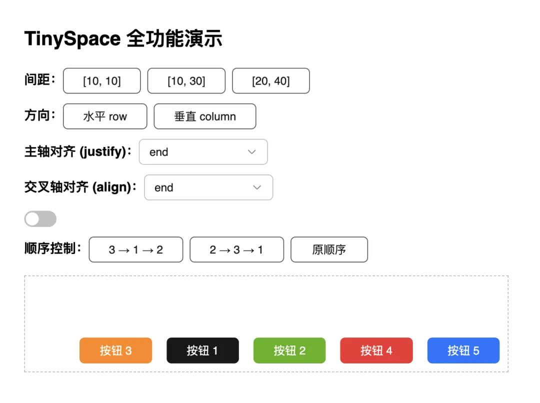
本文由TinySpace组件贡献者夏雯斐同学原创。 前言 近期,TinyVue正式发布 v3.27.0版本,这次版本更新也增加了很多新特性,space组件就是其中比较重要的一个特性。 Space组件 是 OpenTiny Vue组件库中的一个布局容器组件,用于在子元素之间提供灵活的间距控制。 它支持水平与垂直方向排列、自动换行、对齐与分布控制、以及顺序调整等功能,能帮助开发者轻松实现响应式、整齐的组件布局。 适用场景 表单项或按钮组的布局 列表项的水平/垂直间距 工具栏元素的分布控制 在响应式布局中控制间距与换行 环境准备与安装 1. 环境要求 确保已安装 Node.js 10.13+ 及包管理器 npm/pnpm/yarn。 node -v 2. 安装 OpenTiny Vue # npm npm install @opentiny/vue # 或 pnpm pnpm add @opentiny/vue 3.引入TinySpace import { TinySpace } from '@opentiny/vue' 快速开始 基础使用 <template> <div id="tiny-space-all" style="padding: 16px; max-width: 600px"> <h2>TinySpace 全功能演示</h2> <!-- 控制面板 --> <div style="margin-bottom: 16px; display: flex; flex-direction: column; gap: 12px;"> <!-- 间距控制 --> <div> <strong>间距:</strong> <tiny-button @click="size = [10, 10]">[10, 10]</tiny-button> <tiny-button @click="size = [10, 30]">[10, 30]</tiny-button> <tiny-button @click="size = [20, 40]">[20, 40]</tiny-button> </div> <!-- 布局方向 --> <div> <strong>方向:</strong> <tiny-button-group> <tiny-button @click="direction = 'row'">水平 row</tiny-button> <tiny-button @click="direction = 'column'">垂直 column</tiny-button> </tiny-button-group> </div> <!-- 主轴对齐 --> <div> <strong>主轴对齐 (justify):</strong> <tiny-select v-model="justify" style="width: 160px"> <tiny-option label="start" value="start" /> <tiny-option label="center" value="center" /> <tiny-option label="end" value="end" /> <tiny-option label="space-between" value="space-between" /> <tiny-option label="space-around" value="space-around" /> </tiny-select> </div> <!-- 交叉轴对齐 --> <div> <strong>交叉轴对齐 (align):</strong> <tiny-select v-model="align" style="width: 160px"> <tiny-option label="start" value="start" /> <tiny-option label="center" value="center" /> <tiny-option label="end" value="end" /> <tiny-option label="baseline" value="baseline" /> </tiny-select> </div> <!-- 自动换行 --> <div> <tiny-switch v-model="wrap" active-text="自动换行" inactive-text="不换行" /> </div> <!-- 顺序控制 --> <div> <strong>顺序控制:</strong> <tiny-button @click="order = ['3', '1', '2']">3 → 1 → 2</tiny-button> <tiny-button @click="order = ['2', '3', '1']">2 → 3 → 1</tiny-button> <tiny-button @click="order = []">原顺序</tiny-button> </div> </div> <!-- Space 布局演示 --> <tiny-space class="tiny-space-demo" :size="size" :direction="direction" :justify="justify" :align="align" :wrap="wrap" :order="order" style="border: 1px dashed #bbb; padding: 10px; min-height: 120px;" > <tiny-button key="1" type="primary">按钮 1</tiny-button> <tiny-button key="2" type="success">按钮 2</tiny-button> <tiny-button key="3" type="warning">按钮 3</tiny-button> <tiny-button key="4" type="danger">按钮 4</tiny-button> <tiny-button key="5" type="info">按钮 5</tiny-button> </tiny-space> </div> </template> <script setup> import { ref } from 'vue' import { TinyButton, TinyButtonGroup, TinySwitch, TinySelect, TinyOption } from '@opentiny/vue' import TinySpace from '@opentiny/vue-space' // 响应式配置项 const size = ref([10, 20]) const direction = ref('row') const justify = ref('start') const align = ref('center') const wrap = ref(true) const order = ref([]) </script> <style scoped> .tiny-space-demo .tiny-button { min-width: 80px; } </style> 默认方向为 row(水平排列),默认间距为 8px。 配置详解 1.控制间距 size size 是最核心的属性,支持多种写法。 1.1数值写法 <tiny-space :size="20"/> 间距为 20px。 1.2数组写法([rowGap, columnGap]) <tiny-space :size="[50, 50]"/> 行间距 50px,列间距 50px,方便实现不等距布局。 1.3字符串写法 <tiny-space size="100px"/> 间距为 100px <tiny-space size="small"/> // small | medium | large 2.控制排列方向 direction <tiny-space :size="12" direction="row"/> 'row'(默认):水平排列 'column':垂直排列 可以通过切换 direction 实现响应式布局(如手机端竖排、PC端横排)。 3.对齐 align 与分布 justify 通过 align 和 justify 控制元素对齐与分布方式。 3.1 justify <tiny-space :size="10" justify="center"/> 3.2 aligin <tiny-space :size="10" align="baseline"/> 属性 说明 可选值 align 垂直对齐 start / center / end/baseline/stretch justify 水平分布 start / center / end / space-between 4.自动换行 wrap <tiny-space :wrap="true" :size="[10, 12]"> <tiny-button v-for="n in 10" :key="n">按钮 {{ n }}</tiny-button> </tiny-space> 效果: 当宽度不够时,按钮会自动换行,仍然保持间距一致。 5.控制顺序 order <template> <tiny-space :order="order" style="border: 1px dashed #ccc"> <tiny-button key="1">First Button</tiny-button> <tiny-button key="2">Second Button</tiny-button> <tiny-button key="3">Third Button</tiny-button> <tiny-button>Fourth Button</tiny-button> </tiny-space> </template> <script setup> import { TinyButton, TinySpace } from '@opentiny/vue' const order = ['2', '3', '1'] // 自定义顺序:第二个、第三个、然后第一个 </script> 设置 order="['2', '3', '1']" 后,渲染顺序会变为 2 → 3 → 1。 适用于在响应式布局中快速调换内容顺序。 6.嵌套布局(组合使用) <tiny-space direction="column" :size="16"> <tiny-space direction="row" :size="8"> <tiny-button>左</tiny-button> <tiny-button>中</tiny-button> <tiny-button>右</tiny-button> </tiny-space> <tiny-space direction="row" :size="8"> <tiny-button>上</tiny-button> <tiny-button>下</tiny-button> </tiny-space> </tiny-space> 7.测试与稳定性 TinySpace 已通过 Playwright E2E 自动化测试,验证: 间距正确渲染(rowGap / columnGap) 动态数据更新响应 换行与方向切换稳定 兼容 Vue 2 & Vue 3 环境 8.最佳实践总结 场景 推荐配置 表单项垂直间距 <tiny-space direction="column" :size="12"> 按钮组 <tiny-space :size="8" align="center"> 可换行标签集合 <tiny-space :size="[8, 16]" wrap> 9.小结 TinySpace 是一个轻量级、灵活的布局组件,专为控制子元素间距而设计。 它支持: 数值、预设、数组多种间距形式 垂直与水平排列 自动换行与对齐分布 顺序控制 Vue 2 / Vue 3 双版本兼容 通过它,开发者可以轻松构建整洁、美观、响应式的 UI 布局。 属性一览 属性 类型 默认值 说明 size number /array / string small 设置间距大小,可为字符串、数字或数组,数组形式为 [横向间距, 纵向间距] direction string row row | column align string stretch 设置交叉轴上的对齐方式,对应 CSS align-items 属性 justify string start 设置主轴上的对齐方式,对应 CSS justify-content 属性 wrap boolean false 是否自动换行 order string[] - 控制子项显示顺序 关于OpenTiny 欢迎加入 OpenTiny 开源社区。添加微信小助手:opentiny-official 一起参与交流前端技术~ OpenTiny 官网:https://opentiny.design OpenTiny 代码仓库:https://github.com/opentiny TinyVue 源码:https://github.com/opentiny/tiny-vue TinyEngine 源码: https://github.com/opentiny/tiny-engine 欢迎进入代码仓库 Star🌟TinyEngine、TinyVue、TinyNG、TinyCLI、TinyEditor ~ 如果你也想要共建,可以进入代码仓库,找到 good first issue 标签,一起参与开源贡献 ~







)