Android深度定制化TabLayout:圆角,渐变色,背景边框,基于Android原生TabLayout
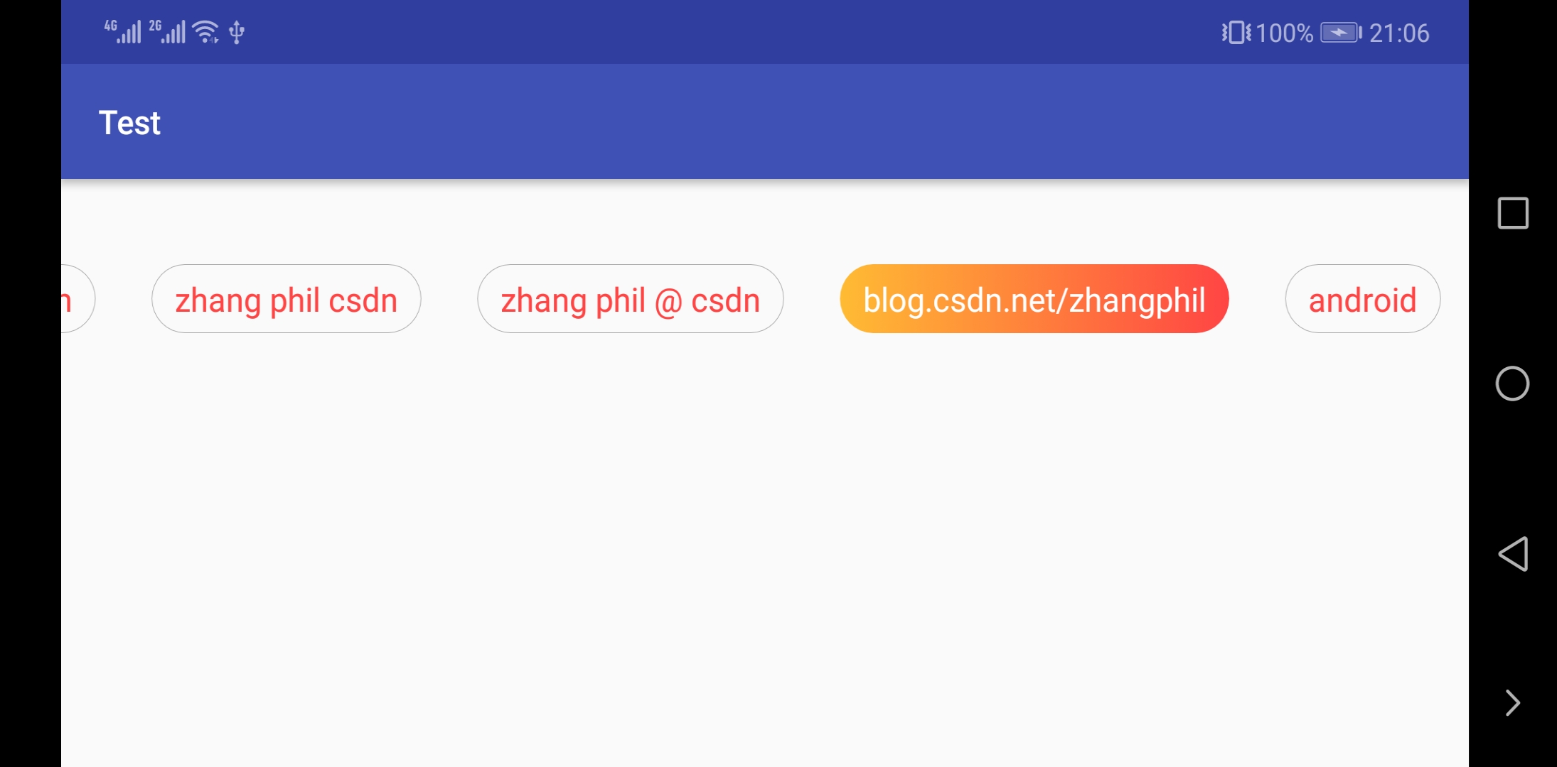
如今UI设计已经不再满足于下方只有一个下划线,切换后能改变和表示选中颜色的TabLayout了。设计对于TabLayout这种非常常见的切换控制条提出了更高的设计要求,比如,背景颜色渐变,有一定圆角弧度的背景边框线,等等,比如下面的的一个自定义TabLayout:
![]()
实现纯色且具有圆角弧度的Tab切换卡很多,但是要求具有一定渐变的实现,如上图被选中的选项卡颜色渐变则很少见,这样的设计要求原生或者即便第三方开源的项目也很少实现(至少截止发文时间)。现在说明如何上图的TabLayout,基于Android原生的TabLayout。
毫无疑问得继承自Android原生到的TabLayout,重写里面的相关方法,MyTabLayout.java:
package zhangphil.test;

import android.content.Context;
import android.graphics.Color;
import android.support.design.widget.TabLayout;
import android.util.AttributeSet;
import android.widget.TextView;

import java.util.ArrayList;
import java.util.List;


public class MyTabLayout extends TabLayout {
    private List<String> titles;

    public MyTabLayout(Context context) {
        super(context);
        init();
    }

    public MyTabLayout(Context context, AttributeSet attrs) {
        super(context, attrs);
        init();
    }

    public MyTabLayout(Context context, AttributeSet attrs, int defStyleAttr) {
        super(context, attrs, defStyleAttr);
        init();
    }

    private void init() {
        titles = new ArrayList<>();

        this.addOnTabSelectedListener(new TabLayout.OnTabSelectedListener() {

            @Override
            public void onTabSelected(Tab tab) {
                /**
                 * 设置当前选中的Tab为特殊高亮样式。
                 */
                if (tab != null && tab.getCustomView() != null) {
                    TextView tab_layout_text = tab.getCustomView().findViewById(R.id.tab_layout_text);

                    tab_layout_text.setTextColor(Color.WHITE);
                    tab_layout_text.setBackgroundResource(R.drawable.tablayout_item_pressed);
                }
            }

            @Override
            public void onTabUnselected(Tab tab) {
                /**
                 * 重置所有未选中的Tab颜色、字体、背景恢复常态(未选中状态)。
                 */
                if (tab != null && tab.getCustomView() != null) {
                    TextView tab_layout_text = tab.getCustomView().findViewById(R.id.tab_layout_text);

                    tab_layout_text.setTextColor(getResources().getColor(android.R.color.holo_red_light));
                    tab_layout_text.setBackgroundResource(R.drawable.tablayout_item_normal);
                }
            }

            @Override
            public void onTabReselected(Tab tab) {

            }
        });
    }

    public void setTitle(List<String> titles) {
        this.titles = titles;

        /**
         * 开始添加切换的Tab。
         */
        for (String title : this.titles) {
            Tab tab = newTab();
            tab.setCustomView(R.layout.tablayout_item);

            if (tab.getCustomView() != null) {
                TextView text = tab.getCustomView().findViewById(R.id.tab_layout_text);
                text.setText(title);
            }

            this.addTab(tab);
        }
    }
}
在setTitle时候,开始为TabLayout添加每一个选项卡Tab,每一个选项卡的文本显示是由res/layout/tab_layout_item.xml:
<?xml version="1.0" encoding="utf-8"?>
<TextView xmlns:android="http://schemas.android.com/apk/res/android"
    android:id="@+id/tab_layout_text"
    android:layout_width="wrap_content"
    android:layout_height="wrap_content"
    android:background="@drawable/tablayout_item_normal"
    android:gravity="center"
    android:paddingBottom="5dp"
    android:paddingLeft="10dp"
    android:paddingRight="10dp"
    android:paddingTop="5dp"
    android:textColor="@android:color/holo_red_light"
    android:textSize="14dp">

</TextView>
注意这个布局中的@+id/tab_layout_text的TextView,这将是后续改变背景颜色和字体颜色的操作对象。事实上如果你愿意,你可以把这个布局写的更加复杂更加多变,不止只有一个TextView,可以有更多的View和ViewGroup,只要有它们的id,然后在后面要介绍的onTabSelected和onTabUnselected里面尽情修改切换它们的表现形式。
res/layout/tab_layout_text.xml里面引用了普通的未被选中状态下的圆角边框线res/drawable/tablayout_item_normal.xml:
<?xml version="1.0" encoding="utf-8"?>
<shape xmlns:android="http://schemas.android.com/apk/res/android"
    android:shape="rectangle">
    <corners android:radius="50dp" />

    <stroke
        android:width="1px"
        android:color="@android:color/darker_gray" />
</shape>
这个其实一个简单圆角背景,灰色边框线。res/drawable/tablayout_item_normal.xml将作为未被选中的Tab的背景资源在后续的选中和未被选中时候加载。
实际上真正修改和重置TabLayout字体和背景颜色的工作是在addOnTabSelectedListener的两个关键函数onTabSelected和onTabUnselected里面。
在init函数中,给当前的TabLayout增加一个监听器OnTabSelectedListener,然后,onTabSelected表示当前TabLayout被选中的具体是哪一个Tab,有了这个回调函数,并且获得了被选中的具体Tab对象tab,就可以从该Tab提取出该View(通getCustomView()),再找到在setTitle时候添加的每一个Tab的布局R.layout.tab_layout_item中的子View,本例只添加了一个TextView,其id为(android:id="@+id/tab_layout_text")的TextView,为其设置选中的字体颜色和背景。本例是为每一个选中的Tab设置一个res/drawable/tablayout_item_pressed.xml:
<?xml version="1.0" encoding="utf-8"?>
<shape xmlns:android="http://schemas.android.com/apk/res/android"
    android:shape="rectangle">

    <corners android:radius="50dp" />

    <gradient
        android:angle="180"
        android:endColor="@android:color/holo_orange_light"
        android:startColor="@android:color/holo_red_light"
        android:type="linear" />
</shape>
在这个背景资源中,实现了圆角渐变颜色。(重要)
同时设置选中状态下的Tab字体颜色为白色。可以看到,因为在R.layout.tab_layout_item只定义了一个TextView,如果定义了很多子View,如果是ImageView,也可以通过该ImageView的id,操纵该ImageView被选中时候的状态,换句话说,借助getCustomView().findViewById,可以在onTabSelected玩出很多Tab在选中时候的花样和变化。
类似的,在onTabUnselected里面,则是所有没有选中的Tab设置字体颜色,背景,边框线等,没有选中的Tab,简单的设置为normal状态的背景资源即可。
具体使用,像Android原生的TabLayout一样把MyTabLayout写到xml布局里面:
<?xml version="1.0" encoding="utf-8"?>
<LinearLayout xmlns:android="http://schemas.android.com/apk/res/android"
    xmlns:app="http://schemas.android.com/apk/res-auto"
    android:layout_width="match_parent"
    android:layout_height="match_parent"
    android:orientation="vertical">

    <zhangphil.test.MyTabLayout
        android:id="@+id/tab_layout"
        android:layout_width="match_parent"
        android:layout_height="100dp"
        app:tabIndicatorHeight="0dp"
        app:tabMode="scrollable" />

</LinearLayout>
然后在上层Java代码写若干选项卡需要的字符串:
package zhangphil.test;

import android.os.Bundle;
import android.support.annotation.Nullable;
import android.support.v7.app.AppCompatActivity;

import java.util.Arrays;
import java.util.List;

public class TabActivity extends AppCompatActivity {

    @Override
    protected void onCreate(@Nullable Bundle savedInstanceState) {
        super.onCreate(savedInstanceState);
        setContentView(R.layout.tab_avtivity);

        String[] str = {"zhang", "phil", "zhang phil", "csdn", "zhang phil csdn", "zhang phil @ csdn", "blog.csdn.net/zhangphil", "android"};

        List<String> titles = Arrays.asList(str);

        MyTabLayout tabLayout = findViewById(R.id.tab_layout);
        tabLayout.setTitle(titles);
    }
}
