Android绘制(一):来用shape绘出想要的图形吧!
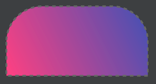
目录 前言 shape绘制 矩形 椭圆 线 环 用shape绘制SeekBar 最后 前言 在没有UI设计师的时候, 或者是想简单看下效果的时候, 用shape进行快速绘制是极好的! 官方文档. shape绘制 一共有四种shape: rectangle, oval, line, ring. 矩形 我们一个一个来看, 首先是矩形: 矩形例子 <?xml version="1.0" encoding="utf-8"?> <shape xmlns:android="http://schemas.android.com/apk/res/android" android:shape="rectangle"> <!-- 尺寸 --> <size android:width="160dp" android:height="80dp" /> <!-- 颜色 --> <!--<solid android:color="@color/colorPrimary" />--> <!-- 内间距 --> <padding android:bottom="8dp" android:left="8dp" android:right="8dp" android:top="8dp" /> <!-- 渐变 --> <gradient android:angle="45" android:endColor="@color/colorPrimary" android:startColor="@color/colorAccent" android:type="linear" /> <!-- 圆角 --> <!--<corners android:radius="200dp" />--> <!-- 圆角单独设置 --> <corners android:bottomLeftRadius="0dp" android:bottomRightRadius="0dp" android:topLeftRadius="40dp" android:topRightRadius="40dp" /> <!-- 描边 --> <stroke android:width="2dp" android:color="#666" android:dashGap="4dp" android:dashWidth="4dp" /> </shape> 渐变gradient是会覆盖颜色的, 如果你想要纯色, 直接设置颜色值即可, 就是设置solid中的color. 顺带一提, solid只有color一个参数. 如果你没有渐变gradient, 也不写solid, 那么将会是空心的. 渐变gradient的type参数有3个: linear 线性渐变 sweep 扫描渐变 radial 放射渐变, 需要配合参数gradientRadius 圆角corners可以直接设置radius, 也可以一个一个指定. 描边stroke的话不写dashGap, dashWidth就会是实线, dashWidth代表虚线宽度, dashGap代表虚线间隔. 内间距padding和尺寸size就不提了, 大家都懂的. 椭圆 椭圆例子 <?xml version="1.0" encoding="utf-8"?> <shape xmlns:android="http://schemas.android.com/apk/res/android" android:shape="oval"> <!-- 尺寸 --> <size android:width="160dp" android:height="80dp" /> <!-- 颜色 --> <!--<solid android:color="@color/colorPrimary" />--> <!-- 内间距 --> <padding android:bottom="8dp" android:left="8dp" android:right="8dp" android:top="8dp" /> <!-- 渐变 --> <gradient android:centerColor="@color/colorPrimary" android:endColor="@color/colorPrimaryDark" android:startColor="@color/colorAccent" android:type="sweep" /> <!-- 描边 --> <stroke android:width="1dp" android:color="#333" /> </shape> 渐变是最多可以设置三种颜色, 意思一看便知了: startColor centerColor endColor 一般椭圆都会用来绘制实心的小圆点. 线 线就很简单了: 线例子 <?xml version="1.0" encoding="utf-8"?> <shape xmlns:android="http://schemas.android.com/apk/res/android" android:shape="line"> <!-- 描边 --> <stroke android:width="8dp" android:color="@color/colorPrimary" android:dashGap="8dp" android:dashWidth="6dp" /> </shape> 环 最后来看环, 它有些特有属性: 环例子B <?xml version="1.0" encoding="utf-8"?> <shape xmlns:android="http://schemas.android.com/apk/res/android" android:innerRadiusRatio="4" android:shape="ring" android:thicknessRatio="100" android:useLevel="false"> <!-- 尺寸 --> <size android:width="200dp" android:height="200dp" /> <!-- 渐变 --> <gradient android:angle="0" android:centerColor="@color/colorPrimaryDark" android:endColor="@color/colorPrimary" android:startColor="@color/colorAccent" android:type="sweep" /> <!-- 描边 --> <stroke android:width="1dp" android:color="#777" android:dashGap="4dp" android:dashWidth="4dp" /> </shape> thicknessRatio 指的是环厚度百分比, 默认是9, 比如说这里宽度是200dp, thicknessRatio是100, 环厚度就是200dp / 100 = 2dp. 当然, 你可以直接用thickness设置厚度. innerRadiusRatio 是内环百分比, 默认是3, 就是指用宽度 / 百分比得到的值就是内环半径. 同样可以用innerRadius直接设置. 用shape绘制SeekBar 我知道有很多非常好看的自定义进度条, 但是我写这个SeekBar是想补充下shape的使用, 用非常少量的代码实现自定义进度条. 来看看效果图: 用shape绘制SeekBar 实现 <SeekBar android:layout_width="match_parent" android:layout_height="wrap_content" android:layout_margin="@dimen/eight_dp" android:max="200" android:maxHeight="@dimen/eight_dp" android:minHeight="@dimen/eight_dp" android:progressDrawable="@drawable/layout_progress" android:thumb="@drawable/shape_circle" /> 简单解释下几个要点属性: max代表进度条最大的值. maxHeight, minHeight可以设置进度条宽度, 我喜欢稍微宽一点的. thumb设置滑块, 可以是图片, 可以是shape写的设置. progressDrawable代表进度条的外观, 可以是图片, 可以是shape写的设置. 再来看看滑块和进度条外观具体代码, 进度条可以设置背景, 进度, 和第二进度. 滑块的话, 你想画成什么样都行. <?xml version="1.0" encoding="utf-8"?> <layer-list xmlns:android="http://schemas.android.com/apk/res/android"> <item android:id="@android:id/background"> <shape> <corners android:radius="@dimen/four_dp" /> <solid android:color="@android:color/darker_gray" /> </shape> </item> <item android:id="@android:id/secondaryProgress"> <clip> <shape> <corners android:radius="@dimen/four_dp" /> <solid android:color="@color/colorAccent" /> </shape> </clip> </item> <item android:id="@android:id/progress"> <clip> <shape> <corners android:radius="@dimen/four_dp" /> <solid android:color="@android:color/holo_blue_light" /> </shape> </clip> </item> </layer-list> <?xml version="1.0" encoding="utf-8"?> <shape xmlns:android="http://schemas.android.com/apk/res/android" android:shape="oval"> <solid android:color="@android:color/holo_blue_light" /> <stroke android:width="@dimen/one_dp" android:color="@android:color/holo_blue_light" /> <size android:width="@dimen/sixteen_dp" android:height="@dimen/sixteen_dp" /> </shape> java部分的话, 用Handler实例postDelayed方法让进度条跑起来就可以看到效果了. 这里设定50ms发一次消息. findViewById(R.id.cv_start).setOnClickListener(new View.OnClickListener() { @Override public void onClick(View v) { if (mRunnable == null) { mRunnable = new MyRunnable(); mHandler.postDelayed(mRunnable, 0); } } }); findViewById(R.id.cv_stop).setOnClickListener(new View.OnClickListener() { @Override public void onClick(View v) { mHandler.removeCallbacks(mRunnable); mRunnable = null; } }); private class MyRunnable implements Runnable { @Override public void run() { int progress = mSbTest.getProgress(); mTvProgress.setText(String.valueOf(progress)); mSbTest.setProgress(++progress); mSbTest.setSecondaryProgress(progress + 10); int progress2 = mSbTest2.getProgress(); mTvProgress2.setText(String.valueOf(progress2)); mSbTest2.setProgress(++progress2); mSbTest2.setSecondaryProgress(progress2 + 20); mHandler.postDelayed(this, 50); } } 最后 我个人还是偏向用shape绘制的, 图片一出理不好就是内存溢出啊, 形变啊, 还要注意分辨率, 真心头大. 喜欢记得点赞哦, 暗中关注我也是可以的~