首页 文章 精选 留言 我的

精选列表

搜索[v],共10000篇文章
优秀的个人博客,低调大师

华夏ERP v2.1 版本发布

华夏ERP基于SpringBoot框架和SaaS模式,立志为中小企业提供开源好用的ERP软件,目前专注进销存+财务功能。主要模块有零售管理、采购管理、销售管理、仓库管理、财务管理、报表查询、系统管理等。支持预付款、收入支出、仓库调拨、组装拆卸、订单等特色功能。拥有库存状况、出入库统计等报表。同时对角色和权限进行了细致全面控制,精确到每个按钮和菜单。 此版本可以投入生产环境使用。 从2.0版本的迭代内容如下: 1.更新了ui,从虚拟桌面换位了传统的菜单栏的方式; 2.增加了商品初始库存,增强导入功能; 3.增加消息模块; 4.优化库存的统计; 5.解决跨租户用户名重复的问题; 6.增加订单转采购或销售的功能; 7.增加序列号/机构等功能; 8.修复了比较多的bug。 开发初衷 华夏ERP立志为中小企业提供开源好用的ERP软件,降低企业的信息化成本 个人开发者也可以使用华夏ERP进行二次开发,加快完成开发任务 初学JAVA的小伙伴可以下载源代码来进行学习交流 技术框架 核心框架:SpringBoot 2.0.0 持久层框架:Mybatis 1.3.2 日志管理:Log4j 2.10.0 JS框架:Jquery 1.8.0 UI框架: EasyUI 1.3.5 模板框架: AdminLTE 2.4.0 项目管理框架: Maven 3.2.3 开发环境 建议开发者使用以下环境,可以避免版本带来的问题 IDE: IntelliJ IDEA 2017+ DB: Mysql5.7+ JDK: JDK1.8 Maven: Maven3.2.3+ 运行环境 数据库服务器:Mysql5.7+ JAVA平台: JRE1.8 操作系统:Windows、Linux等 开源说明 本系统100%开源,遵守GPL-3.0协议 系统美图 首页 零售管理 采购管理 销售管理 仓库管理 财务管理 报表查询 商品管理 基本资料 系统管理

优秀的个人博客,低调大师

RKCMS v1.0.0 重置版本发布

概要: 框架升级,YII1升级达到YII2 前端基础UI升级 后端UI升级 插件功能管理升级 后端模板编辑功能升级 框架: 由原来的YII1的版本升级至YII2的版本 前端基础UI升级: 完成基础的企业网站所需要的基础功能 前端导航页面栏目完善 产品展示列表、明细页DEMO示例 文章展示列表、明细页DEMO示例 下载展示列表、明细页DEMO示例 招聘展示列表、明细页DEMO示例 网站地图页面示例 后端UI升级: 后端UI采用商业模板(已经获得授权)进行UI升级 后端登入页面完善 后端管理页面整体布局完善 插件功能管理: 后端增加了对前端的使用的插件管理功能:基础插件有联系表单,在线留言 后端模板编辑功能升级: 页面主题模板由布局,页面构成,管理员可以自行调整UI代码,拓展性增强

优秀的个人博客,低调大师

SDK V1.2发布

信息摘要: 优化弱网体验,丢包网络下,延时更低、视频更清晰; 支持WebRTC SDK, 支持Android、iOS、Windows、Mac 适用客户: 在线教育、远程医疗、互动娱乐等音视频开发者 版本/规格功能: 1. 优化网络连接,支持UDP多端口通信 2. 优化弱网体验,丢包网络下视频更流畅 3. 支持与Web H5 SDK互通,实现与Native SDK互通互联 产品文档: https://help.aliyun.com/document_detail/71770.html?spm=a2c4g.11174283.6.572.57763c3dHA1CKE

优秀的个人博客,低调大师

React v16.7 "Hooks" - What to Expect

什么是 Hooks? Hooks 是一个 React 函数组件内一类特殊的函数(通常以 “use” 开头,比如 “useState”),使开发者能够在 function component 里依旧使用 state 和 life-cycles,以及使用 custom hook 复用业务逻辑。 动机 在 React 里,function component 就是一个 pure render component,没有 state 和 component life-cycle。如果需要这两个中的任意一个,就需要变成 class component。在既有的 React API 下,这个模式有如下一些缺点: 组件间交流的耦合度很高,组件树臃肿 在既有的模式下,React 的组件间通信无非是两种,一种是单项数据流,另一种是通过 redux 之类的 global store 来实现全局状态和各组件间的解耦。当有些状态不适合放在 global store 的情况下,组件间逻辑的复用和沟通就变得十分困难(必须一层一层往下传)。这一点在 Higher order component (高阶组件) 和 render props 中尤其常见。我们为了复用一些逻辑,单独创造了很多 HOC(高阶组件) 来向下传递状态。这导致的问题就是当我们的应用规模变得越来越大的时候,一些无关 UI 的 wrapper 组件越来越多,React 组件树变得越来越臃肿(在 devtool 中可以甚至看到数十层 wrapper)。某些业务场景下,一个 Tooltip component 里面都嵌套了三四层额外的组件,使开发和调试的效率变得很低。 在新的 React hook 中,我们可以创建 custom hook,在其中复用一些逻辑,这些逻辑不再出现在组件树中,而是成为一个单独的,独立的逻辑单元,但是他们仍然响应 React 在渲染之间的变化。 JavaScript 的 class 产生的诸多疑惑 这一点是相对于 JavaScript 来说的。还记得刚入门 JavaScript 的时候,需要跨越的一个重要难关就是 ”this” 指向,以及原型链,继承这些问题。即使我们真正觉得明白了其中的原理,在日常的开发中也难免因为疏忽而踩坑,这一系列的问题导致新手相对比较难上手 React。举个简单的例子,React 组件内的 event listener 之前需要手动 bind this 的问题,这个问题就很难对一个 JavaScript 入门的新手解释明白。 而这一系列的问题,将在 Hook 中被极大地解决。如果没有 class,没有了 this,可能上述的种种问题都不再是问题了。 Write Hooks 说了这么多,Hooks API 是什么样呢?首先需要声明的是,Hooks 是向后兼容的,class component 不会被移除。作为开发者,可以慢慢迁移到这个新的 API。 Hooks 主要分为三种: ● State hooks (在 function component 中使用 state) ● Effect hooks (在 function component 中使用生命周期和 side effect) ● Custom hooks (自定义 hooks 用来复用组件逻辑,解决了上述的第一个动机中阐述的问题,这一部分就不在此多费篇幅介绍了,请大家移步文档)。 State hooks import { useState } from 'react';function Example() { // Declare a new state variable, which we'll call "count" const [count, setCount] = useState(0); return ( <div> <p>You clicked {count} times</p> <button onClick={() => setCount(count + 1)}> Click me </button> </div> );} 之前讲过 hook 本质是一个特殊的函数(通常以 “use” 开头)。在这里,”useState” 就是一个 hook,通过它我们能够嵌入组件内部的 state。这个函数返回一个 pair,第一个值是当前对应这个 hook 的 state 值,第二个是怎样更新这个值。 我们可以从中感觉到,这两个返回值分别对应的以前的用法是: ● this.state ● this.setState 除此之外,我们还可以在一个函数组件中使用多个 useState: function ExampleWithManyStates() { // Declare multiple state variables! const [age, setAge] = useState(42); const [fruit, setFruit] = useState('banana'); const [todos, setTodos] = useState([{ text: 'Learn Hooks' }]); // ...} 这给我们的一个非常大的好处就是我们能够避免组件的 state 结构过于臃肿(因为之前每个 component class 只能有一个 state),能够独立处理每个 state。另一个好处就是这种写法非常直观,一眼就可以看出和这个 state 相关的两个变量,比如 [age, setAge]。 Effect hooks import { useState, useEffect } from 'react';function Example() { const [count, setCount] = useState(0); // Similar to componentDidMount and componentDidUpdate: useEffect(() => { // Update the document title using the browser API document.title = `You clicked ${count} times`; }); return ( <div> <p>You clicked {count} times</p> <button onClick={() => setCount(count + 1)}> Click me </button> </div> );} 我们还需要解决一个问题,那就是怎样在 function component 里使用 life-cycles,生命周期函数。在这里,所有的 life-cycles,比如 componentDidMount, componentDidUpdate, shouldUpdate, 等等都集合成一个 Hook,叫做 useEffect。这个函数类似 redux 中的 subscribe,每当 React 因为 state 或是 props 而重新 render 的之后,就会触发 useEffect 里的这个 callback listener(在第一次 render 和每次 update 后触发)。 为什么叫 useEffect 呢?因为我们通常在生命周期内做的操作很多都会产生一些 side-effect(副作用)的操作,比如更新 DOM,fetch 数据,等等。 Other Built-in Hooks 除了 useState, useEffect 还有另外一些 React 自带的 hooks。比如: ● useContext 替代了 <Context.Consumer> 使用 render props 的写法,使组件树更加简洁。 ● useReducer 相当于组件自带的 redux reducer,负责接收 dispatch 分发的 action 并更新 state。 详细用法请看文档。 总结 读到这里,你可能理解了为什么这个新的 API 被叫做 “Hooks” 了。”Hooks” 本意是”钩子“的意思。在 React 里,hooks 就是一系列特殊的函数,使函数组件 (functional component) 内部能够”钩住“ React 内部的 state 和 life-cycles。 这个向后兼容的 API 在解决了一些既有问题的情况下,不仅使我们能够更好地使用 state 和 life-cycles,真正功能强大的地方是使我们能够更轻松地复用组件逻辑(custom hooks)。但是限于篇幅,很多功能强大的部分和一些注意事项在这篇文章里并没有过多讲解,请大家移步官方文档学习更详细的姿势(墙裂推荐)。 原文发布时间为:2018-11-02 本文作者:cyan 本文来自云栖社区合作伙伴“前端大学”,了解相关信息可以关注“前端大学”。

优秀的个人博客,低调大师

Android Design Support Library v28

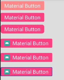
1). 依赖 implementation "com.android.support:design:28.0.0-alpha3" 2). MaterialButton 图1.png <?xml version="1.0" encoding="utf-8"?> <android.support.constraint.ConstraintLayout xmlns:android="http://schemas.android.com/apk/res/android" xmlns:app="http://schemas.android.com/apk/res-auto" xmlns:tools="http://schemas.android.com/tools" android:layout_width="match_parent" android:layout_height="match_parent" android:background="#DDD" tools:context="com.mazaiting.testdemo.design.MaterialButtonActivity"> <LinearLayout android:layout_width="match_parent" android:layout_height="match_parent" android:orientation="vertical"> <!--MaterialButton必须设置textAppearance属性--> <android.support.design.button.MaterialButton android:layout_width="wrap_content" android:layout_height="wrap_content" android:gravity="center" android:text="Material Button" android:textAllCaps="false" android:textAppearance="?android:attr/textAppearanceLargeInverse" app:rippleColor="#FF8888" /> <android.support.design.button.MaterialButton android:layout_width="wrap_content" android:layout_height="wrap_content" android:backgroundTint="@color/colorPrimary" android:gravity="center" android:text="Material Button" android:textAllCaps="false" android:textAppearance="?android:attr/textAppearanceLargeInverse" /> <android.support.design.button.MaterialButton android:layout_width="wrap_content" android:layout_height="wrap_content" android:gravity="center" android:text="Material Button" android:textAllCaps="false" android:textAppearance="?android:attr/textAppearanceLargeInverse" app:cornerRadius="10dp" /> <android.support.design.button.MaterialButton android:layout_width="wrap_content" android:layout_height="wrap_content" android:layout_marginTop="10dp" android:gravity="center" android:text="Material Button" android:textAllCaps="false" android:textAppearance="?android:attr/textAppearanceLargeInverse" app:icon="@mipmap/ic_launcher" app:iconSize="30dp" /> <android.support.design.button.MaterialButton android:layout_width="wrap_content" android:layout_height="wrap_content" android:layout_marginTop="10dp" android:gravity="center" android:text="Material Button" android:textAllCaps="false" android:textAppearance="?android:attr/textAppearanceLargeInverse" app:icon="@mipmap/ic_launcher" app:iconSize="30dp" app:iconTint="@color/colorPrimary" /> <android.support.design.button.MaterialButton android:layout_width="wrap_content" android:layout_height="wrap_content" android:layout_marginTop="10dp" android:gravity="center" android:text="Material Button" android:textAllCaps="false" android:textAppearance="?android:attr/textAppearanceLargeInverse" app:icon="@mipmap/ic_launcher" app:iconSize="30dp" app:iconTint="@color/colorPrimary" app:strokeColor="@color/colorPrimaryDark" app:strokeWidth="2dp" /> </LinearLayout> </android.support.constraint.ConstraintLayout> 注:MaterialButton必须设置textAppearance属性 MaterialButton属性: 属性 介绍 app:backgroundTint 按钮背景着色 app:backgroundTintMode 按钮背景的着色模式 app:icon 按钮图标(在文字左边,不能设置位置) app:iconSize 按钮图标大小 app:iconPadding 按钮图标的内边距 app:iconTint 按钮图标着色 app:iconTintMode 按钮图标的着色模式 app:additionalPaddingStartForIcon 按钮图标的左内边距 app:additionalPaddingEndForIcon 按钮图标的右内边距 app:strokeColor 按钮边框颜色 app:strokeWidth 按钮边框宽度 app:cornerRadius 按钮圆角角度 app:rippleColor 按钮点击水波纹效果颜色 3). Chip 图2.png <?xml version="1.0" encoding="utf-8"?> <android.support.constraint.ConstraintLayout xmlns:android="http://schemas.android.com/apk/res/android" xmlns:app="http://schemas.android.com/apk/res-auto" xmlns:tools="http://schemas.android.com/tools" android:layout_width="match_parent" android:layout_height="match_parent" android:background="#DDD" tools:context="com.mazaiting.testdemo.design.ChipActivity"> <LinearLayout android:layout_width="match_parent" android:layout_height="match_parent" android:gravity="center" android:orientation="vertical"> <android.support.design.chip.ChipGroup android:id="@+id/chip_group" android:layout_width="match_parent" android:layout_height="wrap_content" android:layout_margin="10dp" app:chipSpacing="10dp" app:singleSelection="false"> <android.support.design.chip.Chip android:layout_width="wrap_content" android:layout_height="wrap_content" android:checkable="true" android:clickable="true" android:focusable="true" android:text="Chip" android:textAllCaps="false"/> <android.support.design.chip.Chip android:layout_width="wrap_content" android:layout_height="wrap_content" android:clickable="true" android:focusable="true" android:text="水波纹颜色" android:textAllCaps="false" app:rippleColor="@color/colorAccent"/> <android.support.design.chip.Chip android:layout_width="wrap_content" android:layout_height="wrap_content" android:checkable="true" android:clickable="true" android:focusable="true" android:text="图标" android:textAllCaps="false" app:chipIcon="@mipmap/ic_launcher" app:chipIconEnabled="true" app:chipIconSize="20dp" app:iconStartPadding="5dp" /> <android.support.design.chip.Chip android:id="@+id/chip_close" android:layout_width="wrap_content" android:layout_height="wrap_content" android:checkable="true" android:clickable="true" android:focusable="true" android:text="删除按钮" android:textAllCaps="false" app:closeIconEnabled="true"/> <android.support.design.chip.Chip android:layout_width="wrap_content" android:layout_height="wrap_content" android:checkable="true" android:clickable="true" android:focusable="true" android:text="背景" android:textAllCaps="false" app:chipBackgroundColor="@color/colorAccent"/> <android.support.design.chip.Chip android:layout_width="wrap_content" android:layout_height="wrap_content" android:checkable="true" android:clickable="true" android:focusable="true" android:text="边框" android:textAllCaps="false" app:chipStrokeColor="@color/colorAccent" app:chipStrokeWidth="2dp"/> <android.support.design.chip.Chip android:layout_width="wrap_content" android:layout_height="wrap_content" android:checkable="true" android:clickable="true" android:text="圆角角度" android:textAllCaps="false" app:chipCornerRadius="10dp" android:focusable="true"/> </android.support.design.chip.ChipGroup> </LinearLayout> </android.support.constraint.ConstraintLayout> ChipGroup属性: 属性 介绍 app:chipSpacing Chip在水平&垂直方向的间距 app:chipSpacingHorizontal Chip在水平方向的间距 app:chipSpacingVertical Chip在垂直方向的间距 app:singleLine 是否单行显示Chip,默认为false app:singleSelection 是否为单选模式,默认为false Chip属性: 属性 介绍 app:chipBackgroundColor Chip背景颜色 app:chipCornerRadius Chip圆角角度 app:chipStrokeColor Chip边框颜色 app:chipStrokeWidth Chip边框宽度 app:rippleColor Chip点击水波纹效果颜色 app:chipIconEnabled 是否在Chip上显示图标,默认为true app:chipIcon Chip图标(在文字左边,不能设置位置) app:chipIconSize Chip图标大小 app:closeIconEnabled 是否显示Chip关闭按钮,默认为false app:closeIcon Chip关闭按钮图标 app:closeIconTint Chip关闭按钮着色 app:closeIconSize Chip关闭按钮大小 app:checkedIconEnabled 是否显示Chip选中图标,默认为true app:checkedIcon Chip选中图标 app:chipStartPadding Chip左内边距 app:chipEndPadding Chip右内边距 app:iconStartPadding Chip图标左内边距 app:iconEndPadding Chip图标右内边距 app:textStartPadding Chip文字左内边距 app:textEndPadding Chip文字右内边距 app:closeIconStartPadding Chip关闭图标左内边距 app:closeIconEndPadding Chip关闭图标右内边距 4). MaterialCardView 图3.png <?xml version="1.0" encoding="utf-8"?> <android.support.constraint.ConstraintLayout xmlns:android="http://schemas.android.com/apk/res/android" xmlns:app="http://schemas.android.com/apk/res-auto" xmlns:tools="http://schemas.android.com/tools" android:layout_width="match_parent" android:layout_height="match_parent" android:background="#DDD" tools:context="com.mazaiting.testdemo.design.MaterialCardViewActivity"> <LinearLayout android:gravity="center" android:orientation="vertical" android:layout_width="match_parent" android:layout_height="match_parent"> <android.support.design.card.MaterialCardView android:layout_margin="20dp" app:cardBackgroundColor="@color/colorAccent" android:layout_width="match_parent" android:layout_height="100dp"> <TextView android:layout_gravity="center" android:text="Material CardView" android:layout_width="wrap_content" android:layout_height="wrap_content"/> </android.support.design.card.MaterialCardView> <android.support.design.card.MaterialCardView android:layout_margin="20dp" app:cardCornerRadius="10dp" app:cardElevation="5dp" android:layout_width="match_parent" android:layout_height="100dp"> <TextView android:layout_gravity="center" android:text="Material CardView" android:layout_width="wrap_content" android:layout_height="wrap_content"/> </android.support.design.card.MaterialCardView> <android.support.design.card.MaterialCardView android:layout_margin="20dp" app:strokeColor="@color/colorAccent" app:strokeWidth="5dp" android:layout_width="match_parent" android:layout_height="100dp"> <TextView android:text="Material CardView" android:layout_gravity="center" android:layout_width="wrap_content" android:layout_height="wrap_content"/> </android.support.design.card.MaterialCardView> </LinearLayout> </android.support.constraint.ConstraintLayout> MaterialCardView属性: 属性 介绍 app:strokeColor MaterialCardView边框颜色 app:strokeWidth MaterialCardView边框宽度 5). BottomAppBar 图4.png <?xml version="1.0" encoding="utf-8"?> <android.support.constraint.ConstraintLayout xmlns:android="http://schemas.android.com/apk/res/android" xmlns:app="http://schemas.android.com/apk/res-auto" xmlns:tools="http://schemas.android.com/tools" android:layout_width="match_parent" android:layout_height="match_parent" tools:context="com.mazaiting.testdemo.design.BottomAppBarActivity"> <android.support.design.widget.CoordinatorLayout android:layout_width="match_parent" android:layout_height="match_parent"> <android.support.design.widget.FloatingActionButton android:src="@mipmap/ic_launcher" app:fabSize="normal" app:layout_anchor="@id/bottom_app_bar" android:layout_width="wrap_content" android:layout_height="wrap_content"/> <android.support.design.bottomappbar.BottomAppBar android:id="@+id/bottom_app_bar" android:layout_gravity="bottom" app:backgroundTint="@color/colorPrimary" app:fabAlignmentMode="end" app:fabAttached="true" android:layout_width="match_parent" android:layout_height="50dp"/> </android.support.design.widget.CoordinatorLayout> </android.support.constraint.ConstraintLayout> BottomAppBar属性: 属性 介绍 app:backgroundTint BottomAppBar背景着色 app:fabAlignmentMode FAB位置(居中或居右),默认为居右 app:fabAttached 是否绑定FAB,默认为true app:fabCradleMargin BottomAppBar与FAB的距离,默认为5dp app:fabCradleRoundedCornerRadius BottomAppBar与FAB相邻处的圆角角度,默认为8dp app:fabCradleVerticalOffset FAB在BottomAppBar中的垂直偏移量,默认为0dp 代码下载

优秀的个人博客,低调大师

银狐云服务架构V0.1

首先这套程序是由JAVA开发的,为什么使用JAVA? 因为在本人的几年开发经历中,JDK在各种服务器上安装都很顺利, JAVA程序运行稳定,接口名不经常变动等,各种开源类库提升开发效率,给本人以信心, 相比.NET, 各个版本居然都不兼容, 有时还安装不上去,接口名也是变来变去,因此现在已经放弃。 然后是本套程序100%开源,根据MIT协议开放源代码 开源的好处不用说了,方便学习,用着放心,扩展方便 以下是架构设计用到的 通迅底层 NETTY 事件 JFINAL-EVENT UI界面 JAVAFX(FXML) 如何把这些类库,组件有序的组合起来,充分发挥它们的威力,银狐云通迅框架做了一个商业级的参考示例! 本文转自jiahuafu博客园博客,原文链接http://www.cnblogs.com/jiahuafu/p/5741946.html如需转载请自行联系原作者 jiahuafu

资源下载

更多资源
优质分享App

优质分享App

近一个月的开发和优化,本站点的第一个app全新上线。该app采用极致压缩,本体才4.36MB。系统里面做了大量数据访问、缓存优化。方便用户在手机上查看文章。后续会推出HarmonyOS的适配版本。

腾讯云软件源

腾讯云软件源

为解决软件依赖安装时官方源访问速度慢的问题,腾讯云为一些软件搭建了缓存服务。您可以通过使用腾讯云软件源站来提升依赖包的安装速度。为了方便用户自由搭建服务架构,目前腾讯云软件源站支持公网访问和内网访问。

Nacos

Nacos

Nacos /nɑ:kəʊs/ 是 Dynamic Naming and Configuration Service 的首字母简称,一个易于构建 AI Agent 应用的动态服务发现、配置管理和AI智能体管理平台。Nacos 致力于帮助您发现、配置和管理微服务及AI智能体应用。Nacos 提供了一组简单易用的特性集,帮助您快速实现动态服务发现、服务配置、服务元数据、流量管理。Nacos 帮助您更敏捷和容易地构建、交付和管理微服务平台。

Rocky Linux

Rocky Linux

Rocky Linux(中文名:洛基)是由Gregory Kurtzer于2020年12月发起的企业级Linux发行版,作为CentOS稳定版停止维护后与RHEL(Red Hat Enterprise Linux)完全兼容的开源替代方案,由社区拥有并管理,支持x86_64、aarch64等架构。其通过重新编译RHEL源代码提供长期稳定性,采用模块化包装和SELinux安全架构,默认包含GNOME桌面环境及XFS文件系统,支持十年生命周期更新。

用户登录
用户注册