前言
在网页设计和前端开发中,CSS属性是非常重要的一部分。掌握常用的CSS属性不仅可以使你的网页看起来更美观,还能提升用户体验,今天小编为大家介绍8个常见的CSS小技巧:
1.修改滚动条样式
下图是我们常见的滚动条,现在需要改变滚动条的宽度和颜色了,并把它画的圆一点。
![]()
(常见的滚动条)
可以用::-webkit-scrollbar来实现:
/*设置滚动条的宽度*/
::-webkit-scrollbar{
 width: 10px;
}
/*将轨道改为蓝色,并设置圆形边框*/
::-webkit-scrollbar-track{
 background-color: blue;
 border-radius: 10px;
}
/* 将滚动条设置为灰色并将其设置为圆形*/
::-webkit-scrollbar-thumb{
 background: gray;
 border-radius: 10px
}
/*悬停时呈深灰色*/
::-webkit-scrollbar-thumb:hover{
 background: darkgray;
}
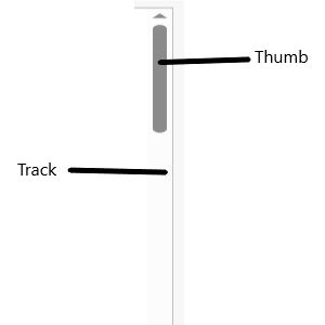
![]()
(改变之后的滚动条)
2.修改光标停留在页面上的样式
一般情况下鼠标的样式是一个箭头,改变鼠标光标的样式为其他类型:
/*类为first的元素,设置鼠标为不可用状态 。 */
.first{
 cursor: not-allowed;
}
/* 类为second的元素,将鼠标指针设置为放大镜效果 */
.second{
 cursor: zoom-in;
}
/* 类为third的元素,将鼠标指针设置为十字准星形状*/
.third{
 cursor: crosshair;
}
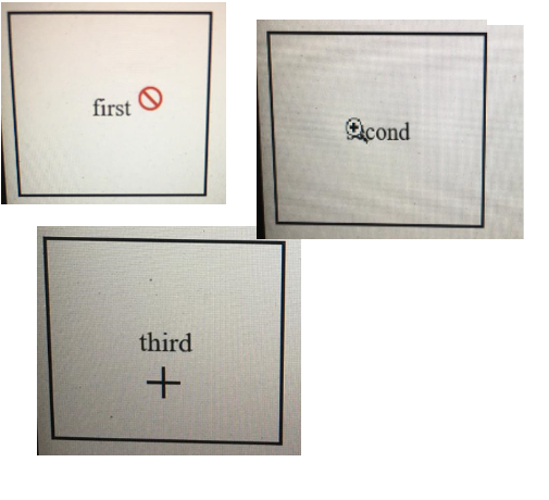
![]()
(改变之后的光标)
3.保持组件的纵横比大小
在构建响应式组件的时候,组件的高度与宽度的不协调经常会导致视频和图像会出现拉伸的情况,影响读者的观感,因此我们需要设置组件的纵横比属性:
.example{
 /* 设置纵横比 */
 aspect-ratio: 1 / .25;
 /* 设置宽度后,高度自动设置 */
 width: 200px;
 /*设置边框.*/
 border: solid black 1px;
}
设置了宽度之后,我们将自动得到等于125像素的高度,以保持长宽比。
![]()
(显示效果)
4.页面平滑的滚动
通过代码实现平滑地从一个页面跳转到另一个页面:
<!DOCTYPE html\>

<html\>

<head\>

<style\>

/*设置页面平滑地滚动*/

html {

scroll-behavior: smooth;

}

#section1 {

height: 600px;

background-color: pink;

}

#section2 {

height: 600px;

background-color: yellow;

}

<style\>

<head\>

<body>

<h1\>Smooth Scroll</h1\>

<div class="main" id="section1"\>

<h2>Section 1</h2>

<p>Click on the link to see the "smooth" scrolling effect.</p>

<a href="\#section2">Click Me to Smooth Scroll to Section 2 Below</a>

<p>Note: Remove the scroll-behavior property to remove smooth scrolling.</p>

</div>

<div class="main" id="section2">

<h2>Section 2</h2>

<a href="#section1">Click Me to Smooth Scroll to Section 1 Above</a>

</div>

<p><strong>Note:</strong> The scroll-behavior property is not supported in Internet Explorer.</p>

</body>

</html>
点击这里查看效果:
5.筛选
使用 CSS 向图像添加滤镜:
img{
 filter: /*YOUR VALUE */;
}
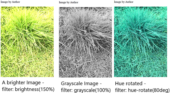
有许多可用的过滤器。您可以模糊、增亮和饱和滤镜。您可以将图像设为灰度、更改其不透明度、反转颜色等等。
![]()
正常图像(左)、模糊图像(中)和高对比度图像(右)
![]()
增亮图像(左)、灰度图像(中)和色调旋转图像(右)
点击此页面了解更多关于筛选的详细信息。
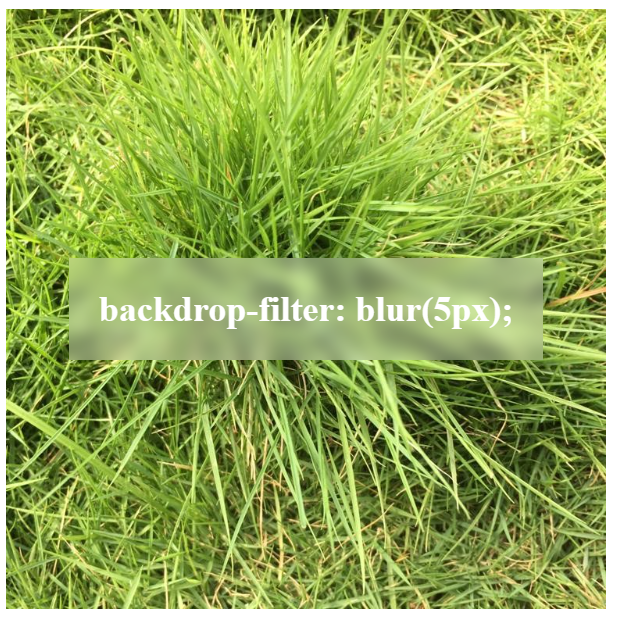
6.背景效果
使用backdrop-filter在图片中添加背景。
<div class="image"\>
 <div class="effect">
 backdrop-filter: blur(5px);
 </div>
</div>

<style>
.image{
 background-image: url(YOUR URL);
 background-size: cover;
 width: 400px;
 height: 400px;
 display: flex;
 align-items: center;
 justify-content: center;
}
.effect{
 font-size: x-large;
 color: white;
 font-weight: 800;
 background-color: rgba(255, 255, 255, .3);
 backdrop-filter: blur(5px);
 padding: 20px;
}
</style>
![]()
(实现的效果)
7.组件反射
在 SVG 下方创建反射:
.example{
 /* 反射将出现在下面。其他可能的值如下:| left | right */
 -webkit-box-reflect: below;
}
![]()
(方框反射)
抵消反射:
.example{
 /* 反射将出现在下面。其他可能的值如下:| left | right */
 -webkit-box-reflect: below 20px;
}
![]()
(带有偏移的反射)
渐变反射:
.example{
 /* 反射将出现在下面。其他可能的值如下:| left | right */
 -webkit-box-reflect: below 0px linear-gradient(to bottom, rgba(0,0,0,0), rgba(0,0,0,.5));
}
![]()
(渐变反射)
8. 检查浏览器是否支持某个属性
使用@Supports检查 CSS 是否支持特定属性。
/* 检查浏览器是否支持显示 */
@supports (display: flex){
 /* 如果支持,则显示为flex。*/
 div{
 display: flex
 }
}
以上就是关于CSS的8个小技巧,希望可以帮助到大家。
本文为翻译,原文地址:
https://medium.com/@anirudh.munipalli/10-powerful-css-properties-that-every-web-developer-must-know-e5d7f8f04e10
扩展链接:
高级SQL分析函数-如何用窗口函数进行排名计算
3D模型+BI分析,打造全新的交互式3D可视化大屏开发方案
React + Springboot + Quartz,从0实现Excel报表自动化


