Android屏蔽隐藏系统自带输入键盘
Android屏蔽隐藏系统自带输入键盘 若是Activity,在AndroidMainfest.xml配置Activity属性: android:windowSoftInputMode="stateAlwaysHidden|stateHidden"
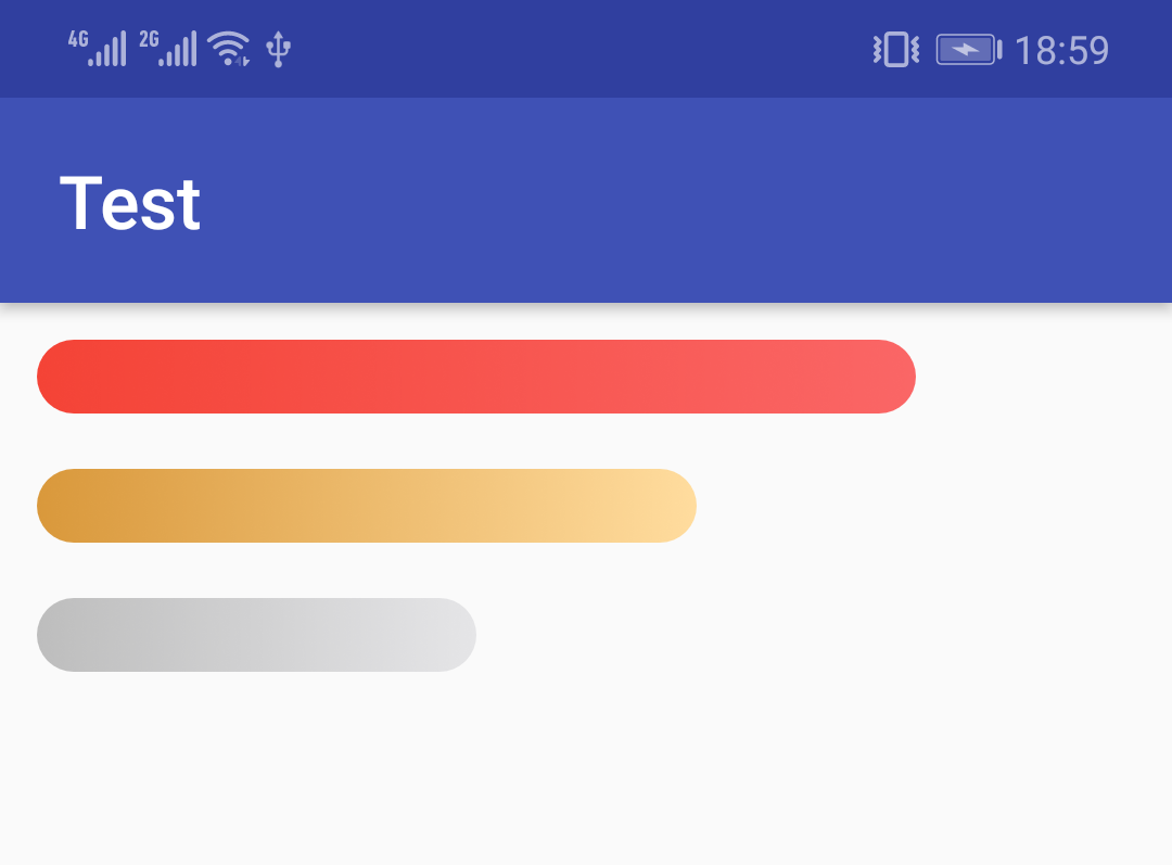
先看运行效果:
<?xml version="1.0" encoding="utf-8"?>
<LinearLayout xmlns:android="http://schemas.android.com/apk/res/android"
    android:layout_width="match_parent"
    android:layout_height="match_parent"
    android:orientation="vertical"
    android:padding="10dp">

    <ProgressBar
        style="@style/Widget.AppCompat.ProgressBar.Horizontal"
        android:layout_width="match_parent"
        android:layout_height="20dp"
        android:max="100"
        android:progress="80"
        android:progressDrawable="@drawable/progress_red" />

    <ProgressBar
        style="@style/Widget.AppCompat.ProgressBar.Horizontal"
        android:layout_width="match_parent"
        android:layout_height="20dp"
        android:layout_marginTop="15dp"
        android:max="100"
        android:progress="60"
        android:progressDrawable="@drawable/progress_yellow" />

    <ProgressBar
        style="@style/Widget.AppCompat.ProgressBar.Horizontal"
        android:layout_width="match_parent"
        android:layout_height="20dp"
        android:layout_marginTop="15dp"
        android:max="100"
        android:progress="40"
        android:progressDrawable="@drawable/progress_gray" />
</LinearLayout>
红色渐变res/drawable/progress_red.xml:
<?xml version="1.0" encoding="utf-8"?>
<layer-list xmlns:android="http://schemas.android.com/apk/res/android">
    <item android:id="@android:id/background">
        <shape>
            <corners android:radius="50dp" />
            <solid android:color="@android:color/transparent" />
        </shape>
    </item>
    <item android:id="@android:id/progress">
        <scale
            android:drawable="@drawable/round_red"
            android:scaleWidth="100%" />
    </item>
</layer-list>
<?xml version="1.0" encoding="utf-8"?>
<shape xmlns:android="http://schemas.android.com/apk/res/android"
    android:shape="rectangle">

    <corners android:radius="50dp" />

    <gradient
        android:angle="0"
        android:endColor="#FA6666"
        android:startColor="#F44336"
        android:type="linear" />
</shape>黄色渐变res/drawable/progress_yellow.xml:
<?xml version="1.0" encoding="utf-8"?>
<layer-list xmlns:android="http://schemas.android.com/apk/res/android">
    <item android:id="@android:id/background">
        <shape>
            <corners android:radius="50dp" />
            <solid android:color="@android:color/transparent" />
        </shape>
    </item>
    <item android:id="@android:id/progress">
        <scale
            android:drawable="@drawable/round_yellow"
            android:scaleWidth="100%" />
    </item>
</layer-list>
<?xml version="1.0" encoding="utf-8"?>
<shape xmlns:android="http://schemas.android.com/apk/res/android"
    android:shape="rectangle">

    <corners android:radius="50dp" />

    <gradient
        android:angle="0"
        android:endColor="#FFDC9E "
        android:startColor="#D9983B"
        android:type="linear" />
</shape><?xml version="1.0" encoding="utf-8"?>
<layer-list xmlns:android="http://schemas.android.com/apk/res/android">
<item android:id="@android:id/background">
<shape>
<corners android:radius="50dp" />
<solid android:color="@android:color/transparent" />
</shape>
</item>
<item android:id="@android:id/progress">
<scale
android:drawable="@drawable/round_gray"
android:scaleWidth="100%" />
</item>
</layer-list>
灰色渐变引用的圆角渐变res/drawable/round_gray.xml:
<?xml version="1.0" encoding="utf-8"?>
<shape xmlns:android="http://schemas.android.com/apk/res/android"
    android:shape="rectangle">

    <corners android:radius="50dp" />

    <gradient
        android:angle="0"
        android:endColor="#E5E5E7"
        android:startColor="#BDBDBD "
        android:type="linear" />
</shape>
微信关注我们
转载内容版权归作者及来源网站所有!
低调大师中文资讯倾力打造互联网数据资讯、行业资源、电子商务、移动互联网、网络营销平台。持续更新报道IT业界、互联网、市场资讯、驱动更新,是最及时权威的产业资讯及硬件资讯报道平台。
马里奥是站在游戏界顶峰的超人气多面角色。马里奥靠吃蘑菇成长,特征是大鼻子、头戴帽子、身穿背带裤,还留着胡子。与他的双胞胎兄弟路易基一起,长年担任任天堂的招牌角色。
为解决软件依赖安装时官方源访问速度慢的问题,腾讯云为一些软件搭建了缓存服务。您可以通过使用腾讯云软件源站来提升依赖包的安装速度。为了方便用户自由搭建服务架构,目前腾讯云软件源站支持公网访问和内网访问。
Rocky Linux(中文名:洛基)是由Gregory Kurtzer于2020年12月发起的企业级Linux发行版,作为CentOS稳定版停止维护后与RHEL(Red Hat Enterprise Linux)完全兼容的开源替代方案,由社区拥有并管理,支持x86_64、aarch64等架构。其通过重新编译RHEL源代码提供长期稳定性,采用模块化包装和SELinux安全架构,默认包含GNOME桌面环境及XFS文件系统,支持十年生命周期更新。
WebStorm 是jetbrains公司旗下一款JavaScript 开发工具。目前已经被广大中国JS开发者誉为“Web前端开发神器”、“最强大的HTML5编辑器”、“最智能的JavaScript IDE”等。与IntelliJ IDEA同源,继承了IntelliJ IDEA强大的JS部分的功能。
扫码在手机上查看文章
扫描二维码,手机阅读更方便
有任何问题或合作意向欢迎联系我们
Email: 99873273@qq.com
QQ: 99873273