今天来讲一下两个经典的图像组件:ImageButton 和 ImageView 。
第一讲:ImageView
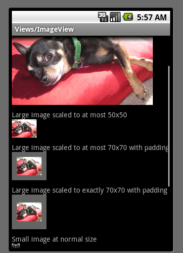
ImageView layout 文件 位于ApiDemos 的位置: ApiDemos/res/layout/image_view_1.xml,源码为:
<?
xml version="1.0" encoding="utf-8"
?>
<
ScrollView
xmlns:android
="http://schemas.android.com/apk/res/android"
android:layout_width
="fill_parent"
android:layout_height
="fill_parent"
>
<
LinearLayout
android:layout_width
="fill_parent"
android:layout_height
="fill_parent"
android:orientation
="vertical"
>
<!--
The following four examples use a large image
-->
<!--
1. Non-scaled view, for reference
-->
<
TextView
android:layout_width
="fill_parent"
android:layout_height
="wrap_content"
android:paddingTop
="10dip"
android:text
="@string/image_view_large_normal"
/>
<
ImageView
android:src
="@drawable/sample_1"
android:adjustViewBounds
="true"
android:layout_width
="wrap_content"
android:layout_height
="wrap_content"
/>
<!--
2. Limit to at most 50x50
-->
<
TextView
android:layout_width
="fill_parent"
android:layout_height
="wrap_content"
android:paddingTop
="10dip"
android:text
="@string/image_view_large_at_most"
/>
<
ImageView
android:src
="@drawable/sample_1"
android:adjustViewBounds
="true"
android:maxWidth
="50dip"
android:maxHeight
="50dip"
android:layout_width
="wrap_content"
android:layout_height
="wrap_content"
/>
<!--
3. Limit to at most 70x70, with 10 pixels of padding all around
-->
<
TextView
android:layout_width
="fill_parent"
android:layout_height
="wrap_content"
android:paddingTop
="10dip"
android:text
="@string/image_view_large_at_most_padded"
/>
<
ImageView
android:src
="@drawable/sample_1"
android:background
="#66FFFFFF"
android:adjustViewBounds
="true"
android:maxWidth
="70dip"
android:maxHeight
="70dip"
android:padding
="10dip"
android:layout_width
="wrap_content"
android:layout_height
="wrap_content"
/>
<!--
4. Limit to exactly 70x70, with 10 pixels of padding all around
-->
<
TextView
android:layout_width
="fill_parent"
android:layout_height
="wrap_content"
android:paddingTop
="10dip"
android:text
="@string/image_view_large_exactly_padded"
/>
<
ImageView
android:src
="@drawable/sample_1"
android:background
="#66FFFFFF"
android:scaleType
="centerInside"
android:padding
="10dip"
android:layout_width
="70dip"
android:layout_height
="70dip"
/>
<!--
Repeating the previous four examples with small image
-->
<!--
1. Non-scaled view, for reference
-->
<
TextView
android:layout_width
="fill_parent"
android:layout_height
="wrap_content"
android:paddingTop
="10dip"
android:text
="@string/image_view_small_normal"
/>
<
ImageView
android:src
="@drawable/stat_happy"
android:background
="#FFFFFFFF"
android:adjustViewBounds
="true"
android:layout_width
="wrap_content"
android:layout_height
="wrap_content"
/>
<!--
2. Limit to at most 50x50
-->
<
TextView
android:layout_width
="fill_parent"
android:layout_height
="wrap_content"
android:paddingTop
="10dip"
android:text
="@string/image_view_small_at_most"
/>
<
ImageView
android:src
="@drawable/stat_happy"
android:background
="#FFFFFFFF"
android:adjustViewBounds
="true"
android:maxWidth
="50dip"
android:maxHeight
="50dip"
android:layout_width
="wrap_content"
android:layout_height
="wrap_content"
/>
<!--
3. Limit to at most 70x70, with 10 pixels of padding all around
-->
<
TextView
android:layout_width
="fill_parent"
android:layout_height
="wrap_content"
android:paddingTop
="10dip"
android:text
="@string/image_view_small_at_most_padded"
/>
<
ImageView
android:src
="@drawable/stat_happy"
android:background
="#FFFFFFFF"
android:adjustViewBounds
="true"
android:maxWidth
="70dip"
android:maxHeight
="70dip"
android:padding
="10dip"
android:layout_width
="wrap_content"
android:layout_height
="wrap_content"
/>
<!--
4. Limit to exactly 70x70, with 10 pixels of padding all around
-->
<
TextView
android:layout_width
="fill_parent"
android:layout_height
="wrap_content"
android:paddingTop
="10dip"
android:text
="@string/image_view_small_exactly_padded"
/>
<
ImageView
android:src
="@drawable/stat_happy"
android:background
="#FFFFFFFF"
android:scaleType
="centerInside"
android:padding
="10dip"
android:layout_width
="70dip"
android:layout_height
="70dip"
/>
</
LinearLayout
>
</
ScrollView
>
- ScrollView 子节点只允许一个View 视图,如果有多于一个子节点将会报错;
- android:paddingTop 与上节点边距的填充;
- android:adjustViewBounds 如果设置为true 图像将自动调整自己的宽主;
- android:maxWidth 设置图像的最大高;
- android:maxHeight 设置图像的最大高;
- android:scaleType 控制如何调整图像大小或者移动范围,以配合ImageView 的大小。下面是 scaleType 所支持的类型:
| Constant |
Value |
Description |
matrix |
0 |
|
fitXY |
1 |
|
fitStart |
2 |
|
fitCenter |
3 |
|
fitEnd |
4 |
|
center |
5 |
|
centerCrop |
6 |
|
centerInside |
7 |
|
- android:padding 设置上、下、左、右的填充
ImageView java 文件 位于ApiDemos 的位置: ApiDemos/src/com.example.android.apis.view/ImageView1,源码为:
package
com.example.android.apis.view;
import
android.app.Activity;
import
android.os.Bundle;
import
com.example.android.apis.R;
/**
* Demonstrates setting size constraints on {
@link
android.widget.ImageView}
*
*/
public
class
ImageView1
extends
Activity {
@Override
public
void
onCreate(Bundle savedInstanceState) {
super
.onCreate(savedInstanceState);
setContentView(R.layout.image_view_1);
}
}
在这里,无须多讲此类。
运行效果图如下:
扩展 LinearLayout
看上图效果和代码,ImgeView 始终跟着一个TextView ,从代码角度上有点不雅观,那如何改变它呢?一步一步跟着我做吧。
- 1、第一步,新建一个包
com.terry.Ext 做为组件扩展包
- 2、第二步,新建一个类
imageViewExt.java 做为组件扩展类
- 3、第三步,使此类继承 LinearLayout 布局
public class imageViewExt extends LinearLayout
- 4、第四步,在构造函数中通过参数判断传进来的值做逻辑,具体代码后如下:
package
com.terry.Ext;
import
android.content.Context;
import
android.graphics.drawable.Drawable;
import
android.util.AttributeSet;
import
android.view.LayoutInflater;
import
android.widget.ImageView;
import
android.widget.LinearLayout;
import
android.widget.TextView;
public
class
imageViewExt
extends
LinearLayout {
private
TextView tv;
private
String labelText;
private
int
FontSize;
private
String Position;
private
Drawable bitmap;
private
ImageView iv;
public
imageViewExt(Context context, AttributeSet attrs) {
super
(context, attrs);
//
TODO Auto-generated constructor stub
int
resourceid;
resourceid
=
attrs.getAttributeResourceValue(
null
,
"
labelText
"
,
0
);
if
(resourceid
==
0
) {
labelText
=
attrs.getAttributeValue(
null
,
"
labelText
"
);
}
else
{
labelText
=
getResources().getString(resourceid);
}
if
(labelText
==
null
) {
labelText
=
"
默认
"
;
}
resourceid
=
attrs.getAttributeResourceValue(
null
,
"
imgSrc
"
,
0
);
if
(resourceid
>
0
) {
bitmap
=
getResources().getDrawable(resourceid);
}
else
{
throw
new
RuntimeException(
"
图像资源为空
"
);
}
resourceid
=
attrs.getAttributeResourceValue(
null
,
"
FontSize
"
,
0
);
if
(resourceid
==
0
) {
FontSize
=
attrs.getAttributeIntValue(
null
,
"
FontSize
"
,
12
);
}
else
{
FontSize
=
getResources().getInteger(resourceid);
}
resourceid
=
attrs.getAttributeResourceValue(
null
,
"
Position
"
,
0
);
if
(resourceid
==
0
) {
Position
=
attrs.getAttributeValue(
null
,
"
Position
"
);
}
else
{
Position
=
getResources().getString(resourceid);
}
if
(Position
==
null
) {
Position
=
"
left
"
;
}
String infService
=
Context.LAYOUT_INFLATER_SERVICE;
LayoutInflater li
=
(LayoutInflater) context
.getSystemService(infService);
if
(
"
left
"
.equals(Position)) {
li.inflate(com.terry.R.layout.image_horizontal,
this
);
}
else
if
(
"
top
"
.equals(Position)) {
li.inflate(com.terry.R.layout.image_vertical,
this
);
}
else
{
throw
new
RuntimeException(
"
必须为top 和left 属性
"
);
}
tv
=
(TextView) findViewById(com.terry.R.id.TextView01);
iv
=
(ImageView) findViewById(com.terry.R.id.imageview1);
iv.setImageDrawable(bitmap);
tv.setTextSize((
float
) FontSize);
tv.setText(labelText);
}
}
上面通过传进来的资源做判断,先假设传进来的是资源ID,然后判断最后加载不同的XML来布局文件,两个XML文件代码如下:
<?
xml version="1.0" encoding="UTF-8"
?>
<
LinearLayout
android:id
="@+id/LinearLayout01"
android:layout_width
="fill_parent"
android:layout_height
="fill_parent"
xmlns:android
="http://schemas.android.com/apk/res/android"
>
<
TextView
android:id
="@+id/TextView01"
android:layout_width
="wrap_content"
android:layout_height
="wrap_content"
></
TextView
>
<
ImageView
android:layout_width
="wrap_content"
android:id
="@+id/imageview1"
android:layout_height
="wrap_content"
></
ImageView
>
</
LinearLayout
>
<?
xml version="1.0" encoding="UTF-8"
?>
<
LinearLayout
android:id
="@+id/LinearLayout01"
android:orientation
="vertical"
android:layout_width
="fill_parent"
android:layout_height
="fill_parent"
xmlns:android
="http://schemas.android.com/apk/res/android"
>
<
TextView
android:id
="@+id/TextView01"
android:layout_width
="wrap_content"
android:layout_height
="wrap_content"
></
TextView
>
<
ImageView
android:layout_width
="wrap_content"
android:id
="@+id/imageview1"
android:layout_height
="wrap_content"
></
ImageView
>
</
LinearLayout
>
- 5、在XML中使用刚扩展的视图 imageViewExt,代码片段如下:
<
com.terry.Ext.imageViewExt
android:id
="@+id/img"
android:clickable
="true"
android:layout_width
="wrap_content"
labelText
="封装ImageExt"
imgSrc
="@drawable/stat_happy"
Position
="top"
android:layout_height
="wrap_content"
>
</
com.terry.Ext.imageViewExt
>
Tip: com.terry.Ext.imageViewExt 此句为你的包名加你的扩展视图名称。效果如下:
![]()
在这里你可以通过设置Position 调整图片和文本的位置这就是一个简单扩展组件的DEMO 当然,要扩展还会涉及到动态设置获取还有事件监听等内容,这些我们以后慢慢摸索。
第二讲:ImageButton
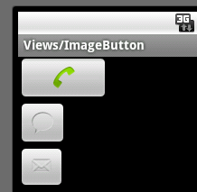
ImageButton layout 文件 位于ApiDemos 的位置: ApiDemos/res/layout/image_button_1.xml,源码为:
<
LinearLayout
xmlns:android
="http://schemas.android.com/apk/res/android"
android:layout_width
="fill_parent"
android:layout_height
="fill_parent"
android:orientation
="vertical"
>
<
ImageButton
android:layout_width
="100dip"
android:layout_height
="50dip"
android:src
="@android:drawable/sym_action_call"
/>
<
ImageButton
android:layout_width
="wrap_content"
android:layout_height
="wrap_content"
android:src
="@android:drawable/sym_action_chat"
/>
<
ImageButton
android:layout_width
="wrap_content"
android:layout_height
="wrap_content"
android:src
="@android:drawable/sym_action_email"
/>
</
LinearLayout
>
其中:
android:src
="@android:drawable/sym_action_chat" 此字样的文字为调用系统内置icon ,系统图标大全可点击如下:
图标大全
ImageButton java 文件 位于ApiDemos 的位置: ApiDemos/src/com.example.android.apis.view/ImageButton1,源码为:
![ExpandedBlockStart.gif]()
package
com.example.android.apis.view;
import
android.app.Activity;
import
android.os.Bundle;
import
com.example.android.apis.R;
public
class
ImageButton1
extends
Activity {
@Override
public
void
onCreate(Bundle savedInstanceState) {
super
.onCreate(savedInstanceState);
setContentView(R.layout.image_button_1);
}
}
由于只是加载内容,这里不做介绍,运行效果如下:
使用XML为ImageButton做交互事件
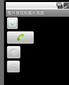
有看过上篇文章的朋友肯定知道如何为按钮做按下弹起图片交互的事件操作,由于ImageButton 是一个变型的Button 故它在事件上也是跟有Button 的点击或者Touch事件,但是ImageView 并不是TextView 的子类,故它并不支持settext的方法或者指定文本,如果需要使其有支持文本功能,建议有二:A,不使用ImageButton 支持使用Button ,Button 可使用BackGround做图片并加文字 ;B,扩展组件,在onDraw 事件里面为ImageButton 画文字 ,具体可参照上边代码。
那么如何才能使用XML为ImageButton 做图片切换的交互呢?看XML代码:
<?
xml version="1.0" encoding="utf-8"
?>
<
selector
xmlns:android
="http://schemas.android.com/apk/res/android"
>
<
item
android:state_pressed
="true"
android:drawable
="@drawable/button_pressed"
/>
<
item
state_focused
="true"
android:drawable
="@drawable/button_focused"
/>
<!--
<item android:drawable="@drawable/icon" /> default
-->
</
selector
>
然后设置ImageButton 的SRC 图片路径:
<
ImageButton
android:id
="@+id/ImageButton01"
android:src
="@drawable/my_image"
android:layout_width
="wrap_content"
android:layout_height
="wrap_content"
>
</
ImageButton
>
Tip:XML文件必须于res/drawable 中的任意文件夹,代表该XML为图像XML文件索引。
运行效果如下:
本文转自 terry_龙 51CTO博客,原文链接:http://blog.51cto.com/terryblog/364963,如需转载请自行联系原作者


