引言 — 在 web 应用中,前端同学在实现动画效果时往往常用的几种方案:
css3 transition / animation - 实现过渡动画
setInterval / setTimeout - 通过设置一个间隔时间来不断的改变图像的位置
requestAnimationFrame - 通过一个回调函数来改变图像位置,由系统来决定这个回调函数的执行时机,比定时修改的性能更好,不存在失帧现象
在大多数需求中,css3 的 transition / animation 都能满足我们的需求,并且相对于 js 实现,可以大大提升我们的开发效率,降低开发成本。
本篇文章将着重对 animation 的使用做个总结,如果你的工作中动画需求较多,相信本篇文章能够让你有所收获:
Animation 与 Svg 又会擦出怎样的火花呢?🔥
Animation 常用动画属性 —
介绍完 animation 常用属性,为了将这些属性更好地理解与运用,下面将手把手实现一些 DEMO 具体讲述
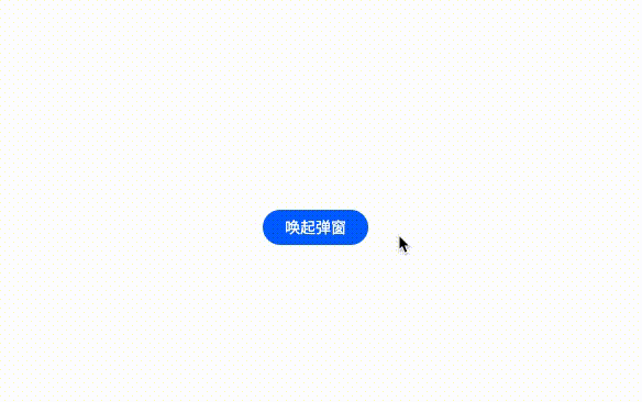
Animation 实现不间断播报 —
实现不间断播报 DEMO [1]
通过修改内容在父元素中的 y 轴的位置来实现广播效果
@keyframes scroll {transform : translate (0 , 0 );transform : translate (0 , -$height);.ul {animation-name : scroll;animation-duration : 5s ;animation-timing-function : linear;animation-iteration-count : infinite;/* animation: scroll 5s linear infinite; 动画属性简写 */ 此处为了保存广播滚动效果的连贯性,防止滚动到最后一帧时没有内容,需要多添加一条重复数据进行填充
<div class ="ul" > <div class ="li" > 小刘同学加入了凹凸实验室</div > <div class ="li" > 小邓同学加入了凹凸实验室</div > <div class ="li" > 小李同学加入了凹凸实验室</div > <div class ="li" > 小王同学加入了凹凸实验室</div > <!-- 插入用于填充的数据数据 --> <div class ="li" > 小刘同学加入了凹凸实验室</div > </div > Animation 实现回弹效果 — 通过将过渡动画拆分为多个阶段,每个阶段的 top 属性停留在不同的位置来实现
实现回弹效果 DEMO [2]
/* 规定动画,改变top,opacity */ @keyframes animate {top : -100% ;opacity : 0 ;top : 60 ;opacity : 1 ;top : 48% ;opacity : 1 ;top : 52% ;opacity : 1 ;top : 50% ;opacity : 1 ;为了让过渡效果更自然,这里通过 cubic-bezier() 函数定义一个贝塞尔曲线来控制动画播放速度
过渡动画执行完后,为了将让元素应用动画最后一帧的属性值,我们需要使用 animation-fill-mode: forwards
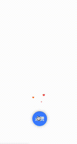
.popup {animation-name : animate;animation-duration : 0.5s ;animation-timing-function : cubic-bezier (0.21 , 0.85 , 1 , 1 );animation-iteration-count : 1 ;animation-fill-mode : forwards;/* animation: animate 0.5s cubic-bezier(0.21, 0.85, 1, 1) 1 forwards; 动画属性简写 */ Animation 实现点赞效果 —
实现点赞效果 DEMO [3]
相信大多数同学都知道点赞效果,本文章会实现一个简易版的点赞效果,主要讲述一下实现思路:
为了让气泡可以向上偏移,我们需要先实现一个 y 轴方向上移动的 @keyframes 动画
/* 规定动画,改变y轴偏移距离*/ @keyframes animation-y {transform : translate (-50% , 100px ) scale (0 );transform : translate (-50% , -100px ) scale (1.5 );transform : translate (-50% , -300px ) scale (1.5 );
为了让气泡向上偏移时显得不太单调,我们可以再实现一个 x 轴方向上移动的 @keyframes 动画
/* 规定动画,改变x轴偏移距离 */ @keyframes animation-x {margin-left : 0px ;margin-left : 25px ;margin-left : -25px ;margin-left : 0px ;这里我理解:
虽然是 修改 margin 来改变 x 轴偏移距离,但实际上与 修改 transform没有太大的性能差异
因为通过 @keyframes animation-y 中的 transform 已经新建了一个 渲染层 ( PaintLayers )
animation 属性 可以让该渲染层提升至 合成层(Compositing Layers) 拥有单独的 图形层 ( GraphicsLayer ),即开启了硬件加速 ,不会影响其他渲染层的 paint、layout
对于 合成层(Compositing Layers)相关知识不是很了解的同学,可以阅读一下凹凸实验室(http://aotu.io)的文章《从浏览器渲染层面解析 css3 动效优化原理》
如笔者这里理解有误,还请读者大佬指出,感激不尽~
给气泡应用上我们所实现的两个 @keyframes 动画
.bubble {animation : animation-x 3s -2s linear infinite,animation-y 4s 0s linear 1 ;/* 给 bubble 开启了硬件加速 */
在点赞事件中,通过 js 操作动态添加/移除气泡元素
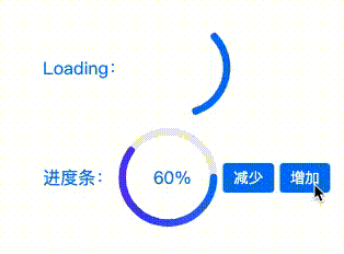
function like (const likeDom = document .createElement('div' );'bubble' ; // 添加样式 document .body.appendChild(likeDom); // 添加元素 () =>document .body.removeChild(likeDom); // 移除元素 4000 )Animation 与 Svg 绘制 loading/进度条 组件 🔥 —
Animation 与 Svg 绘制 loading/进度条 组件 🔥 DEMO [4]
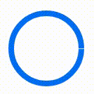
首先,我们使用 svg 绘制一个圆周长为 2 * 25 * PI = 157 的圆
<svg with ='200' height ='200' viewBox ="0 0 100 100" > <circle cx ="50" cy ="50" r ="25" fill ="transparent" stroke-width ="4" stroke ="#0079f5" > </circie > </svg >
将实线圆绘制成虚线圆,这里需要用 stoke-dasharray:50, 50 (可简写为50) 属性来绘制虚线, stoke-dasharray 参考资料 [5]
它的值是一个数列,数与数之间用逗号或者空白隔开,指定 短划线(50px)和 缺口(50px)的长度。
由于 50(短划线) + 50(缺口) + 50(段划线) = 150, 150 < 157,无法绘制出完整的圆,所以会导致右边存在 缺口(7px)
<svg with ='200' height ='200' viewBox ="0 0 100 100" > <circle cx ="50" cy ="50" r ="25" fill ="transparent" stroke-width ="4" stroke-dasharray ="50" stroke ="#0079f5" > </circie > </svg >
stroke-dashoffset 属性可以使圆的短划线和缺口产生偏移,添加 @keyframes 动画后能够实现从无到有的效果, stoke-dashoffset 参考资料 [6]
设置 stroke-dasharray="157 157",指定 短划线(157px) 和 缺口(157px) 的长度。
添加 @keyframes 动画 修改stroke-dashoffset值, 值为 正数时 逆时针偏移🔄,, 值为 负数时, 顺时针偏移🔃
@keyframes loading {stroke-dashoffset : 0 ;stroke-dashoffset : -157 ; /* 线条顺时针偏移 */ circle {animation : loading 1s 0s ease-out infinite;
为了让 loading 组件线条可见,我们需要一个 50px的短划线,设置 stroke-dasharray="50"
为了让短划线发生偏移后可以完全消失, 缺口需要大于或等于圆周长157,设置 stroke-dasharray="50 157"
添加 @keyframes 动画,为了让 动画结束时仍处理动画开始位置,需要 修改 stroke-dashoffset:-207(短划线+缺口长度)
进度条也是类似原理,帮助理解 stroke-dashoffset 属性,具体实现请查看 示例 [7]
@keyframes loading {stroke-dashoffset : 0 ;stroke-dashoffset : -207 ; /* 保证动画结束时仍处理动画开始位置 */ circle {animation : loading 1s 0s ease-out infinite;Animation steps()运用 — steps() 是 animation-timing-function 的属性值
animation-timing-function : steps (number [, end | start] )
steps 函数指定了一个阶跃函数,它接受 两个参数
第一个参数接受一个整数值,表示两个关键帧之间分几步完成
第二个参数有两个值 start or end。默认值为 end
step-start 等同于 step(1, start)。step-end 等同于 step(1, end)
steps 适用于关键帧动画,第一个参数将两个关键帧细分为N帧,第二个参数决定从一帧到另一帧的中间间隔是用开始帧还是结束帧来进行填充。
看下图可以发现:
steps(N, start)将动画分为 N段,动画在每一段的 起点发生阶跃(即图中的空心圆 → 实心圆),动画结束时停留在了第 N 帧
steps(N, end)将动画分为 N段,动画在每一段的 终点发生阶跃(即图中的空心圆 → 实心圆),动画结束时第 N 帧已经被跳过(即图中的空心圆 → 实心圆),停留在了 N+1 帧。
实践出真知! —
Animation 实现打字效果 DEMO [8]
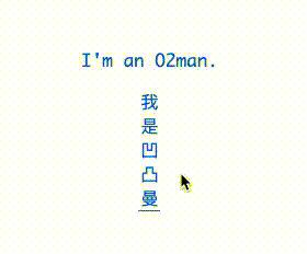
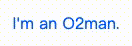
此处用英文字母(I'm an O2man.)举例,一共有 13个字符。[经测试,多数中文字体每个字符宽高都相等]
steps(13)可以将 @keyframes 动画分为 13阶段运行,且 每一阶段运行距离相等。
效果如下:
/* 改变容器宽度 */ @keyframes animate-x {width : 0 ;p {width : 125px ;overflow : hidden;border-right : 1px solid transparent;animation : animate-x 3s 0s steps (13 ) 1 forwards;
可以发现仅仅这样还不够,动画运行过程中出现了字符被截断的情况,为了保证每个阶段运行后能准确无误地显示当前所处阶段的字符,我们还需要保证 每个字符的width与动画每一阶段运行的距离相等
设置 Monaco字体属性,用以保证 每个字符的 width 相同,具体像素受 fontSize属性影响,示例中的字体宽度约为 9.6px, 9.6px * 13(段数) = 124.8px (125px),所以当我们设置容器宽度为 125px,即可的达成目的: 每个字符的 width 与动画每一阶段运行的距离相等(约为 9.6px )。
p {/* 设置 Monaco 字体属性,字体大小为16px,用以保证每个字符的 width 相同,width 约为9.6p */ font-family : Monaco;/* 9.6px * 13 = 124.8px (125px) */ width : 125px ;font-size : 16px ;overflow : hidden;border-right : 1px solid transparent;/* 同时应用动画 animate-x、cursor-x */ animation : animate-x 3s 0s steps (13 ) 1 forwards,cursor-x 0.4s 0s linear infinite;
Animation 实现帧动画 ⏰ DEMO [9]
这里我们拿到了一张 47帧的 雪碧图(css spirit) [10] ,设置背景图
.main {width : 260px ;height : 200px ;background : url (url) no-repeat;background-size : 100% ;background-position : 0 0 ;
添加 @keyframes 修改 background-position,让背景图移动
@keyframes animate {background-position : 0 0 ;background-position : 0 100% ;.main {width : 260px ;height : 200px ;background : url (url) no-repeat;background-size : 100% ;background-position : 0 0 ;animation : animate 2s 1s steps (47 ) infinite alternate;
同时, css 还提供了 animation-play-state用于控制动画是否暂停
input :checked+.main {animation-play-state : paused;文章篇幅较长,感谢大家的阅读,希望各位看客能够有所收获~ ~ ~
《Animation 常用动画属性》 [11]
《CSS 参考手册》 [12]
《steps 参考资料》 [13]
《SVG 学习之 stroke-dasharray 和 stroke-dashoffset 详解》 [14]
《理解 CSS3 Animation 中的 steps》 [15]
《【译】css 动画里的 steps 用法详解》 [16]
《CSS Will Change》 [17]
参考资料 [1] 实现不间断播报 DEMO : https://codepen.io/awesomedevin/pen/wvMGEaY
[2] 实现回弹效果 DEMO: https://codepen.io/awesomedevin/pen/wvMGEaY
[3] 实现点赞效果 DEMO : https://codepen.io/awesomedevin/pen/dyGXEar
[4] Animation 与 Svg 绘制 loading/进度条 组件 🔥 DEMO : https://codepen.io/awesomedevin/pen/zYromBB
[5] stoke-dasharray 参考资料: https://www.cnblogs.com/daisygogogo/p/11044353.html
[6] stoke-dashoffset 参考资料: https://www.cnblogs.com/daisygogogo/p/11044353.html
[7] 示例: https://codepen.io/awesomedevin/pen/zYromBB
[8] Animation 实现打字效果 DEMO: https://codepen.io/awesomedevin/pen/xxZEjjO
[9] Animation 实现帧动画 ⏰ DEMO : https://codepen.io/awesomedevin/pen/JjGRMgN
[10] 雪碧图(css spirit): https://img11.360buyimg.com/ling/jfs/t1/142743/11/2314/166268/5f046114Efb97efac/b327092864ed1f04.png
[11] Animation 常用动画属性: https://www.w3school.com.cn/cssref/index.asp
[12] CSS 参考手册: https://www.w3school.com.cn/cssref/index.asp
[13] steps 参考资料: https://segmentfault.com/a/1190000007042048
[14] SVG 学习之 stroke-dasharray 和 stroke-dashoffset 详解: https://www.cnblogs.com/daisygogogo/p/11044353.html
[15] 理解 CSS3 Animation 中的 steps: https://laixiazheteng.com/article/page/id/0gU2Wefas7hn
[16] 【译】css 动画里的 steps 用法详解: https://segmentfault.com/a/1190000007042048
[17] CSS Will Change: https://developer.mozilla.org/zh-CN/docs/Web/CSS/will-change


