本模块共有六篇文章,参考郭神的《第一行代码》,对Material Design的学习做一个详细的笔记,大家可以一起交流一下:
引子:
文章提要与总结
1. CollapsingToolbarLayout

    1.1 CollapsingToolbarLayout是一个作用于Toolbar基础之上的布局,由DesignSupport库提供。

    1.2 CollapsingToolbarLayout不能独立存在,
        它在设计的时候就被限定只能作为AppBarLayout的直接子布局来使用。
        而AppBarLayout又必须是CoordinatorLayout的子布局;
    1.3 水果详情界面布局框架:
        CoordinatorLayout下分三部分:水果标题栏、水果详情栏、悬浮按钮;
        具体属性意义详见文章;

        <?xml version="1.0" encoding="utf-8"?>
<android.support.design.widget.CoordinatorLayout  ......
    android:fitsSystemWindows="true">

    <!--水果标题栏-->
    <android.support.design.widget.AppBarLayout  ......
        android:layout_height="250dp"
        android:fitsSystemWindows="true">
        <android.support.design.widget.CollapsingToolbarLayout  ......
            android:theme="@style/ThemeOverlay.AppCompat.Dark.ActionBar"
            android:fitsSystemWindows="true"
            app:contentScrim="?attr/colorPrimary"
            app:layout_scrollFlags="scroll|exitUntilCollapsed">
            <ImageView  ......
            android:scaleType="centerCrop"
                android:fitsSystemWindows="true"
                app:layout_collapseMode="parallax"/>

            <android.support.v7.widget.Toolbar   ......
                app:layout_collapseMode="pin"/>
        </android.support.design.widget.CollapsingToolbarLayout>
    </android.support.design.widget.AppBarLayout>

    <!--水果详情栏-->
    <android.support.v4.widget.NestedScrollView   ......
        app:layout_behavior="@string/appbar_scrolling_view_behavior">

        <LinearLayout
            ......>

            <android.support.v7.widget.CardView   ......
                android:layout_marginBottom="15dp"   ......
                app:cardCornerRadius="4dp">

            <TextView   ......
                android:layout_margin="10dp"/>
            </android.support.v7.widget.CardView>
        </LinearLayout>
    </android.support.v4.widget.NestedScrollView>

    <android.support.design.widget.FloatingActionButton   ......
        android:src="@drawable/ic_comment"
        app:layout_anchor="@id/appBar"
        app:layout_anchorGravity="bottom|end"/>

</android.support.design.widget.CoordinatorLayout>
    1.4 水果详情界面java逻辑:
    public class FruitActivity extends AppCompatActivity {

        全局变量:设置约定 intent 传输键值常量;

        @Override
        protected void onCreate(Bundle savedInstanceState){
           此类是水果详情页,通过intent获得来自水果卡片列表页传来的数据(水果名字和图片id);
            实例化诸对象;
            设置toolbar
            设置导航按钮
           设置折叠栏标题
            加载图片,设置文字
           }

            利用StringBuilder重复fruitname生成长字符串
        private String generateFruitContent(String fruitName){ }

           响应导航按钮
            @Override
        public boolean onOptionsItemSelected(MenuItem item) {}
      }


    1.5 处理RecyclerView的点击事件,将点击到的卡片子项提取出name和imageId,
        用intent传给水果详情界面展示;
2. 充分利用系统状态栏空间(系统差异型)

    2.1 将控件(这里是ImageView)布局结构中的所有父布局的
        android:fitsSystemWindows属性指定成true,就表示该控件会出现在系统状态栏里;

    2.2 在程序的主题中将状态栏颜色指定成透明色;
        在主题中将android:statusBarColor属性的值指定成@android:color/transparent;
    2.3 创建一个values-v21目录;values-v21目录下创建一个styles.xml文件;
        编写:
<?xml version="1.0" encoding="utf-8"?>
<resources>
    <style name="FruitActivityTheme" parent="AppTheme">
        <item name="android:statusBarColor">@android:color/transparent</item>
    </style>
</resources>

    2.4 修改values/styles.xml文件:
<resources>......
    <style name="AppTheme" parent="Theme.AppCompat.Light.NoActionBar">  ......
    </style>
    <style name="FruitActivityTheme" parent="AppTheme">
    </style>
</resources>

    2.5 修改AndroidManifest.xmI:
        <activity
            android:name=".FruitActivity"
            android:theme="@style/FruitActivityTheme">
        </activity>
正文
可折叠式标题栏(CollapsingToolbarLayout)
顾名思义,CollapsingToolbarLayout是一个作用于Toolbar基础之上的布局,由DesignSupport库提供。
CollapsingToolbarLayout可以让Toolbar的效果变得更加丰富,不仅仅是展示一个标题栏,而是能够实现非常华丽的效果。
不过CollapsingToolbarLayout不能独立存在,它在设计的时候就被限定只能作为AppBarLayout的直接子布局来使用。而AppBarLayout又必须是CoordinatorLayout的子布局。
本文来做一个额外的活动作为水果的详情展示界面,当点击水果列表卡片的时候就进入这个界面。
右击com.example.materialtest包—>New—>Activity—>EmptyActivity,创建一个FruitActivity,并将布局名指定成activity_fruit.xml。
接着我们来编写这个布局。
Activity_fruit.xml中的内容主要分为两部分,一个是水果标题栏,一个是水果内容详情。
首先实现标题栏部分,这里使用CoordinatorLayout来作为最外层布局(我们在讲监测snackbar弹出,解决其遮挡悬浮按钮问题的时候用到过这个布局),如下:
<android.support.design.widget.CoordinatorLayout
    xmlns:android="http://schemas.android.com/apk/res/android"
    xmlns:app="http://schemas.android.com/apk/res-auto"
    android:layout_width="match_parent"
    android:layout_height="match_parent">

</android.support.design.widget.CoordinatorLayout>
接着在里面嵌套一个AppBarLayout:
<android.support.design.widget.CoordinatorLayout
    xmlns:android="http://schemas.android.com/apk/res/android"
    xmlns:app="http://schemas.android.com/apk/res-auto"
    android:layout_width="match_parent"
    android:layout_height="match_parent">

    <android.support.design.widget.AppBarLayout
        android:id="@+id/appBar"
        android:layout_width="match_parent"
        android:layout_height="250dp">
    </android.support.design.widget.AppBarLayout>
</android.support.design.widget.CoordinatorLayout>
这里主要是将高度指定为250dp,郭神亲测觉得这样视觉效果比较好。
接着在AppBarLayout中再嵌套一个CollapsingToolbarLayout:
<android.support.design.widget.CoordinatorLayout
    xmlns:android="http://schemas.android.com/apk/res/android"
    xmlns:app="http://schemas.android.com/apk/res-auto"
    android:layout_width="match_parent"
    android:layout_height="match_parent">

    <android.support.design.widget.AppBarLayout
        android:id="@+id/appBar"
        android:layout_width="match_parent"
        android:layout_height="250dp">
        <android.support.design.widget.CollapsingToolbarLayout
            android:id="@+id/collapsing_toolbar"
            android:layout_width="match_parent"
            android:layout_height="match_parent"
            android:theme="@style/ThemeOverlay.AppCompat.Dark.ActionBar"
            app:contentScrim="?attr/colorPrimary"
            app:layout_scrollFlags="scroll|exitUntilCollapsed">
        </android.support.design.widget.CollapsingToolbarLayout>
    </android.support.design.widget.AppBarLayout>
</android.support.design.widget.CoordinatorLayout>
这里使用了新的布局CollapsingToolbarLayout。
其中,
android:theme指定了ThemeOverlay.AppCompat.Dark.ActionBar主题,之前(第四弹)在activitymain.xml中给Toolbar指定的也是这个主题,只不过这里要实现更加高级的Toolbar效果,因此需要将这个主题的指定提到上一层来。
app:contentScrim指定CollapsmgToolbarLayout在趋于折叠状态以及折叠之后的背景色,
其实CollapsingToolbarLayout在折叠之后就是一个普通的Toolbar,背景色是colorPrimary;
app:layout_scrollFlags之前(第四弹)是给Toolbar指定的,现在也移到外面来了。
其中,
- scroll表示CollapsingToolbarLayout会随着水果内容详情的滚动一起滚动,
- exitUntilCollapsed表示当CollapsingToolbarLayout随着滚动完成折叠之后就保留在界面上,不再移出屏幕。
接下来在CollapsingToolbarLayout中定义标题栏的具体内容:
......
<android.support.design.widget.CollapsingToolbarLayout
android:id="@+id/collapsing_toolbar"
android:layout_width="match_parent"
android:layout_height="match_parent"
android:theme="@style/ThemeOverlay.AppCompat.Dark.ActionBar"
app:contentScrim="?attr/colorPrimary"
app:layout_scrollFlags="scroll|exitUntilCollapsed">
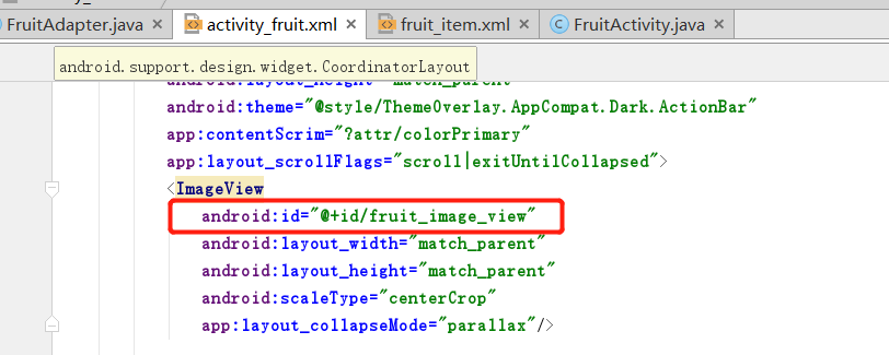
<ImageView
android:id="@+id/fruit_image_view"
android:layout_width="match_parent"
android:layout_height="match_parent"
android:scaleType="centerCrop"
app:layout_collapseMode="parallax"/>
<android.support.v7.widget.Toolbar
android:id="@+id/toolbar"
android:layout_width="match_parent"
android:layout_height="?attr/actionBarSize"
app:layout_collapseMode="pin"/>
</android.support.design.widget.CollapsingToolbarLayout>
......
这里在CollapsingToolbarLayout中定义了一个ImageView和一个Toolbar,也即这个高级版的标题栏是由普通的标题栏加上图片组合而成的。
以及,
- app:layout_collapseMode用于指定当前控件在CollapsingToolbarLayout折叠过程中的折叠模式,
其中Toolbar指定成pin,表示在折叠的过程中位置始终保持不变,
- ImageView指定成parallax,表示会在折叠的过程中产生一定的错位偏移,这种模式的视觉效果会非常好。
下面编写水果内容详情部分,继续改activity_fruit.xml:
......
        </android.support.design.widget.CollapsingToolbarLayout>
    </android.support.design.widget.AppBarLayout>

    <android.support.v4.widget.NestedScrollView
        android:layout_width="match_parent"
        android:layout_height="match_parent"
        app:layout_behavior="@string/appbar_scrolling_view_behavior">

    </android.support.v4.widget.NestedScrollView>

</android.support.design.widget.CoordinatorLayout>
我们知道ScrollView允许使用滚动的方式来查看屏幕以外的数据,
而NestedScrollView在此基础之上增加了嵌套响应滚动事件的功能。
由于CoordinatorLayout本身已经可以响应滚动事件了,
因此我们在它的内部就需要使用NestedScrollView或RecyclerView这样可以响应滚动事件的布局。
另外,通过
app:layout_behavior属性指定一个布局行为,这和之前 第四弹
在RecyclerView中的用法是一模一样的。
不管是ScrollView还是NestedScroIIView,它们的内部都只允许存在一个直接子布局。
如果我们想要在里面放入很多东西的话,通常都会先嵌套一个LinearLayout,然后再在LinearLayout中放入具体的内容,如下:
......
    <android.support.v4.widget.NestedScrollView
        android:layout_width="match_parent"
        android:layout_height="match_parent"
        app:layout_behavior="@string/appbar_scrolling_view_behavior">

        <LinearLayout
            android:orientation="vertical"
            android:layout_width="match_parent"
            android:layout_height="wrap_content">
        </LinearLayout>
    </android.support.v4.widget.NestedScrollView>

</android.support.design.widget.CoordinatorLayout>
接下来在LinearLayout中放入具体的内容,
使用一个TextView来显示水果的内容详情,
并将TextView放在一个卡片式布局当中:
......
 </android.support.design.widget.AppBarLayout>

    <android.support.v4.widget.NestedScrollView
        android:layout_width="match_parent"
        android:layout_height="match_parent"
        app:layout_behavior="@string/appbar_scrolling_view_behavior">

        <LinearLayout
            android:orientation="vertical"
            android:layout_width="match_parent"
            android:layout_height="wrap_content">

            <android.support.v7.widget.CardView
                android:layout_width="match_parent"
                android:layout_height="wrap_content"
                android:layout_marginBottom="15dp"
                android:layout_marginLeft="15dp"
                android:layout_marginRight="15dp"
                android:layout_marginTop="35dp"
                app:cardCornerRadius="4dp">

            <TextView
                android:id="@+id/fruit_content_text"
                android:layout_width="wrap_content"
                android:layout_height="wrap_content"
                android:layout_margin="10dp"/>
            </android.support.v7.widget.CardView>
        </LinearLayout>
    </android.support.v4.widget.NestedScrollView>

</android.support.design.widget.CoordinatorLayout>
这里主要要注意的是,为了让界面更加美观,在CardView和TextView上都加了一些边距。
其中,
CardView的marginTop加了35dp的边距,这是为下面要编写的东西留出空间。
至此水果标题栏和水果内容详情的界面便编写完了。
接着还可以在界面上再添加一个悬浮按钮,
当然并不是必需的,只是如果加的话,我们将免费获得一些额外的动画效果。
这里就实战一下,在activity_fruit.xml中加一个关于水果的表示评论作用的悬浮按钮。
首先需要提前准备好一个图标,
这里放置了一张ic_comment.png到drawable-xxhdpi目录下。
然后修改activity_fruit.xml:
......
    </android.support.v4.widget.NestedScrollView>

    <android.support.design.widget.FloatingActionButton
        android:layout_width="wrap_content"
        android:layout_height="wrap_content"
        android:layout_margin="16dp"
        android:src="@drawable/ic_comment"
        app:layout_anchor="@id/appBar"
        app:layout_anchorGravity="bottom|end"/>

</android.support.design.widget.CoordinatorLayout>
这里加了一个FloatingActionButton,它和AppBarLayout(水果标题栏)以及NestedScrollView(水果详情栏)布局平级。
FloatingActionButton中,
app:layou_anchor属性(anchor n.锚状物)指定了一个锚点,这里将锚点设置为AppBarLayout,这样悬浮按钮就会出现在水果标题栏的区域内;
app:layout_anchorGravity属性将悬浮按钮定位在标题栏区域的右下角。
至此activity_fruit.xml布局(水果详情界面)便写完了。
界面完成了之后,接着开始编写功能逻辑,修改FruitActivity(水果详情界面的逻辑):
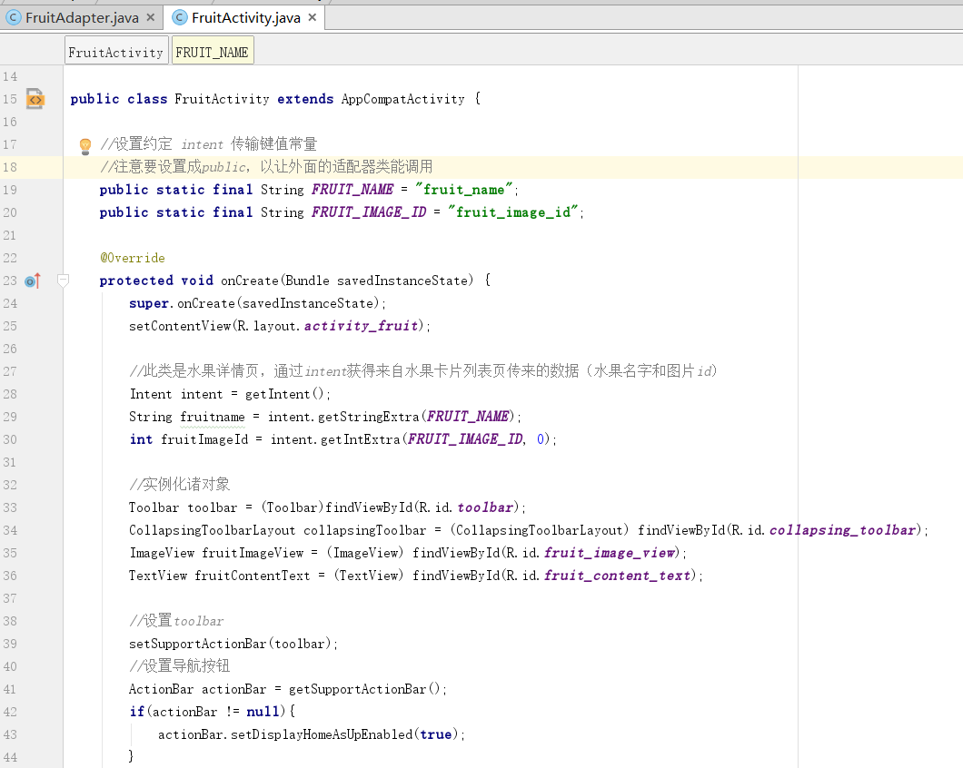
public class FruitActivity extends AppCompatActivity {

    //设置约定 intent 传输键值常量
    public static final String FRUIT_NAME = "fruit_name";
    public static final String FRUIT_IMAGE_ID = "fruit_image_id";

    @Override
    protected void onCreate(Bundle savedInstanceState) {
        super.onCreate(savedInstanceState);
        setContentView(R.layout.activity_fruit);

        //此类是水果详情页,通过intent获得来自水果卡片列表页传来的数据(水果名字和图片id)
        Intent intent = getIntent();
        String fruitname = intent.getStringExtra(FRUIT_NAME);
        int fruitImageId = intent.getIntExtra(FRUIT_IMAGE_ID, 0);

        //实例化诸对象
        Toolbar toolbar = (Toolbar)findViewById(R.id.toolbar);
        CollapsingToolbarLayout collapsingToolbar = (CollapsingToolbarLayout) findViewById(R.id.collapsing_toolbar);
        ImageView fruitImageView = (ImageView) findViewById(R.id.fruit_image_view);
        TextView fruitContentText = (TextView) findViewById(R.id.fruit_content_text);

        //设置toolbar
        setSupportActionBar(toolbar);
        //设置导航按钮
        ActionBar actionBar = getSupportActionBar();
        if(actionBar != null){
            actionBar.setDisplayHomeAsUpEnabled(true);
        }
        //设置折叠栏标题
        collapsingToolbar.setTitle(fruitname);

        //加载图片,设置文字
        Glide.with(this).load(fruitImageId).into(fruitImageView);
        String fruitContent = generateFruitContent(fruitname);
        fruitContentText.setText(fruitContent);
    }

    //利用StringBuilder重复fruitname生成长字符串
    private String generateFruitContent(String fruitName){
        StringBuilder fruitContent = new StringBuilder();
        for(int i = 0; i < 500; i++){
            fruitContent.append(fruitName);
        }
        return fruitContent.toString();
    }

    //响应导航按钮
    @Override
    public boolean onOptionsItemSelected(MenuItem item) {
        switch (item.getItemId()){
            case android.R.id.home:
                finish();
                return true;
        }
        return super.onOptionsItemSelected(item);
    }
}
接下来处理RecyclerView的点击事件,将点击到的卡片子项提取出name和imageId,
用intent传给水果详情界面展示,下面修改FruitAdapter:
......
//加载子布局,将子项作为参数传给ViewHolder,在ViewHolder里面
    //为cardView添加点击事件
    @Override
    public ViewHolder onCreateViewHolder(ViewGroup parent, int viewType) {
        if(mContext == null){
            mContext = parent.getContext();
        }
        View view = LayoutInflater.from(mContext).inflate(R.layout.fruit_item,
                parent, false);
        final ViewHolder holder = new ViewHolder(view);//将子项作为参数传给ViewHolder,在ViewHolder里面面实例化子项中的各个对象
        holder.cardView.setOnClickListener(new View.OnClickListener() {
            @Override
            public void onClick(View v) {
                int position = holder.getAdapterPosition();//获得列表对应子项的位置
                //mFruitList由new适配器的时候传进来的构造函数的参数提供,
                // get(position)将子项对应位置的水果对象从设置到适配器中的水果列表数据中取出来
                Fruit fruit = mFruitList.get(position);
                Intent intent = new Intent(mContext, FruitActivity.class);
                intent.putExtra(FruitActivity.FRUIT_NAME, fruit.getName());
                intent.putExtra(FruitActivity.FRUIT_IMAGE_ID,fruit.getImageId());
                mContext.startActivity(intent);
            }
        });
        return holder;
    }
......
修改前(原全文见第四弹):
......
    //加载子布局,将子项作为参数传给ViewHolder,在ViewHolder里面
    @Override
    public ViewHolder onCreateViewHolder(ViewGroup parent, int viewType) {
        if(mContext == null){
            mContext = parent.getContext();
        }
        View view = LayoutInflater.from(mContext).inflate(R.layout.fruit_item,
                parent, false);
        return new ViewHolder(view);//将子项作为参数传给ViewHolder,在ViewHolder里面实例化子项中的各个对象
    }
......
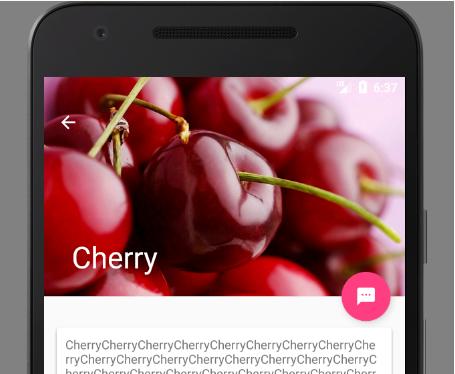
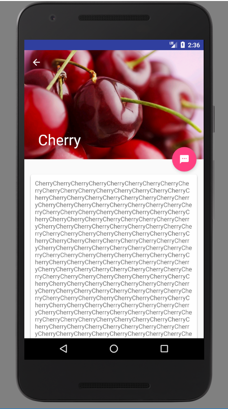
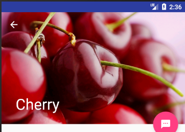
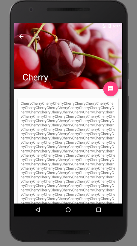
重新运行一下程序,效果如下:
向上拖动水果图片,背景图上的标题会慢慢缩小,而且会产生错位偏移的效果,toolbar的位置和图片还会产生透明度的变化等等,效果十分炫酷。
这是由于用户想要查看水果的内容详情,此时界面的重点在具体的内容上面,因此标题栏就会自动进行折叠,从而节省屏幕空间。
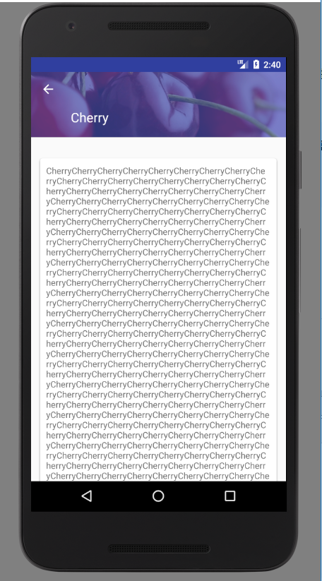
继续向上拖动,直到标题栏变成完全折叠状态,效果如图:
而这个时候向下拖动水果内容详情,就会执行一个完全相反的动画过程。最终恢复刚刚点进来的样子。
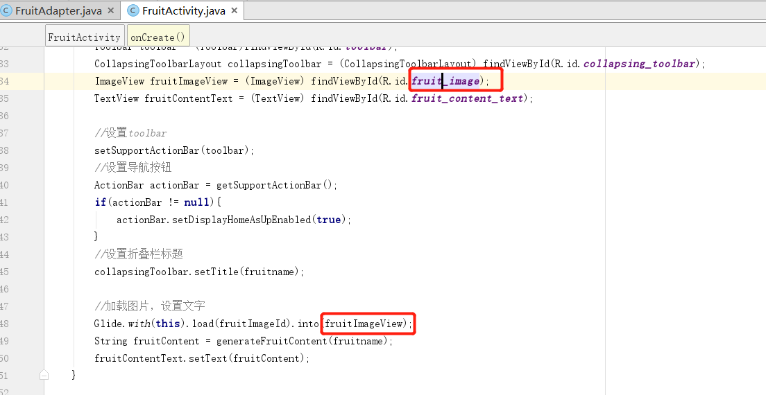
那个这里的话其实有个小尴尬,再次强调注意命名规范的重要性了。。。
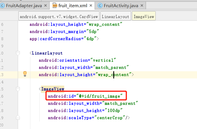
首先这个是水果详情界面标题栏的ImageView,id是fruit_image_view:
另下面这个是卡片水果列表界面的ImageView,id是fruit_image:
我在水果详情界面的逻辑中,findViewbyid写错成了卡片水果列表界面的ImageView的id:
以至于点击水果卡片的时候报错:
java.lang.IllegalArgumentException: You must pass in a non null View
毕竟点击水果卡片之后是要跳转到水果详情界面了,逻辑还要去设置进入onStop()状态的卡片水果列表界面的控件,显然这肯定是不行的。
将刚刚写错的地方——实例化使用的id改正一下即可:
ImageView fruitImageView = (ImageView) findViewById(R.id.fruit_image_view);
充分利用系统状态栏空间
这里如果将背景图和状态栏融合到一起,绝对能让视觉体验提升好几个档次了。
只不过Android5.0系统之前是无法对状态栏的背景或颜色进行操作的,那个时候也没有Matenal Design的概念。
而Android5.0及之后的系统就支持这个功能。
所以这里需要一个系统差异型的效果,即
对于Android5.0及之后的系统使用背景图和状态栏融合的模式;
在之前的系统中使用普通的模式;
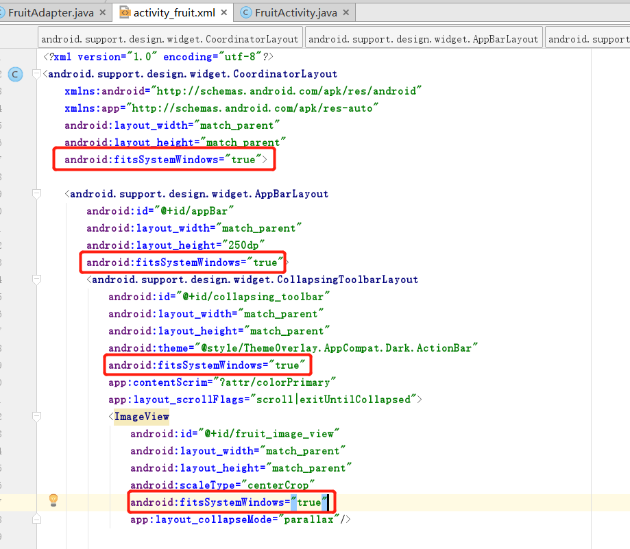
让背景图和系统状态栏融合,需要借助Android:fitsSystemWindows这个属性来实现。
在
CoordinatorLayout(外层监听框架)、
AppBarLayout(水果详情界面标题栏外层)、
CollapsingToolbarLayout(水果详情界面标题栏)这种嵌套结构的布局中,
将控件的android:fitsSystemWindows属性指定成true,就表示该控件会出现在系统状态栏里。
对应到我们的程序,那就是水果标题栏中的ImageView应该设置这个属性了。
不过只给ImageView设置这个属性是没有用的,
我们必须将ImageView布局结构中的所有父布局都设置上这个属性才可以,
修改activity_fruit.xml中的代码,如下所示:
这里除了将android:fitsSystemWindows属性设置好,还必须在程序的主题中将状态栏颜色指定成透明色。
方法很简单,在主题中将android:statusBarColor属性的值指定成@android:color/transparent即可。
但android:statusBarCoIor这个属性是从API 21,即Android5.0系统开始才有的,之前的系统无法指定这个属性。
那么,系统差异型的功能实现至此开始;
右击res目录—>New—>Directory,创建一个values-v21目录,然后右击values-v21目录—>New
—>Values resource file,创建一个styles.xml文件。对这个文件进行编写:
<?xml version="1.0" encoding="utf-8"?>
<resources>

    <style name="FruitActivityTheme" parent="AppTheme">
        <item name="android:statusBarColor">@android:color/transparent</item>
    </style>

</resources>
这里定义了一个FruitActivityTheme主题,
- 它是专门给FruitAcuvity使用的。
- FruitActivityTheme的parent主题是AppTheme,也就是说它继承了AppTheme中的所有特性。
- 然后在FruitAcuvityTheme中将状态栏的颜色指定成透明色,
由于values-v21目录是只有Android5.0及以上的系统才会去读取的,
因此这么声明是没有问题的。
但是Android5.0之前的系统却无法识别FruitActivityTheme这个主题,因此还需修改values/styles.xml文件:
<resources>

    <!-- Base application theme. -->
    <style name="AppTheme" parent="Theme.AppCompat.Light.NoActionBar">
        <!-- Customize your theme here. -->
        <item name="colorPrimary">@color/colorPrimary</item>
        <item name="colorPrimaryDark">@color/colorPrimaryDark</item>
        <item name="colorAccent">@color/colorAccent</item>
    </style>

    <!--修改了这儿-->
    <style name="FruitActivityTheme" parent="AppTheme">
    </style>
</resources>
这里也定义了一个FruitActivityTheme主题,并且parent主题也是AppTheme,但是它的内部是空的。
因为Android5.0之前的系统无法指定状态栏的颜色,因此这里什么都不用做就可以了。
5.0之前的版本会加载这里的FruitActivityTheme,也就是间接地使用了默认的AppTheme主题;
5.0之后的版本或许也加载这里的FruitActivityTheme,但同时读取values-v21的styles,随后刚刚我们做的设置状态栏的代码会将这里的覆盖掉,也就是使用了我们编写的新的FruitActivityTheme。
于是达到了系统差异型的功能实现的目的。
最后还需让FruitActivity使用这个主题,修改AndroidManifest.xmI:
<?xml version="1.0" encoding="utf-8"?>
<manifest xmlns:android="http://schemas.android.com/apk/res/android"
    package="com.example.materialtest">

    <application
        ......
        <activity
            android:name=".FruitActivity"
            android:theme="@style/FruitActivityTheme">
        </activity>
    </application>

</manifest>
这里使用android:theme属性单独给FruitActivity指定了这个主题,到这里就大功告成了。
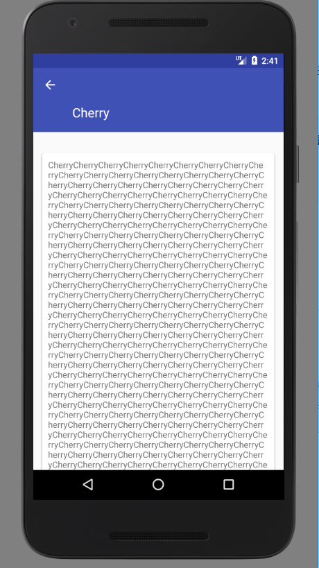
现在只要是在Android5.0及以上的系统运行这个MaterialTest程序,水果详情展示界面的效果便如下:
跟刚刚的效果相比,视觉体验是完全不同档次的。
关于的 Material Design 学习到此就告一段落了,具体的可以参考 Material Design的官方文档:
