前言
页面布局是减少代码重复和创建可维护且具有专业外观的应用程序的基本模式。如果使用的是Nuxt,则可以提供开箱即用的优雅解决方案。然而,令人遗憾的是,在Vue中,这些问题并未得到官方文档的解决。
经过多次尝试,小编得出了一个运行良好且可扩展而不会令人头疼的架构的模式。下面用一个简单的例子为大家介绍一下。
设置需求
布局架构需要满足的需求:
- 页面应声明每个部分的布局和组件。
- 对页面的更改不应影响其他页面。
- 如果布局的某些部分在页面中是通用的,则只应声明一次。
设置Vue路由
小编需要在页面之间导航,这就是小编要设置 vue-router 的原因。 Vue-cli 脚手架vite提供了在创建新项目时包含它的选项,但如果您没有用脚手架创建项目,可以通过下面的方式设置路由。
1. 安装 vue-router 依赖项
npm i -D vue-router@4
2. 声明路由
const routes = [
  { path: "/", component: () => import("./pages/HomePage.vue") },
  { path: "/explore", component: () => import("./pages/ExplorePage.vue") },
];
3. 将其安装为插件
import { createApp } from "vue";
import { createRouter, createWebHashHistory } from "vue-router";
import App from "./App.vue";
import routes from "./routes.ts"

const router = createRouter({
  history: createWebHashHistory(),
  routes,
});

const app = createApp(App);

app.use(router);

app.mount("#app");
4. 最后,更新 App.vue使其仅包含router-view
<template>
  <router-view />
</template>
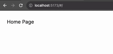
运行后的显示效果如下图所示: ![]()
页面
下面将创建以下页面:主页、探索、文章和 404,以及三种布局:三列、两列和空白。
三列布局
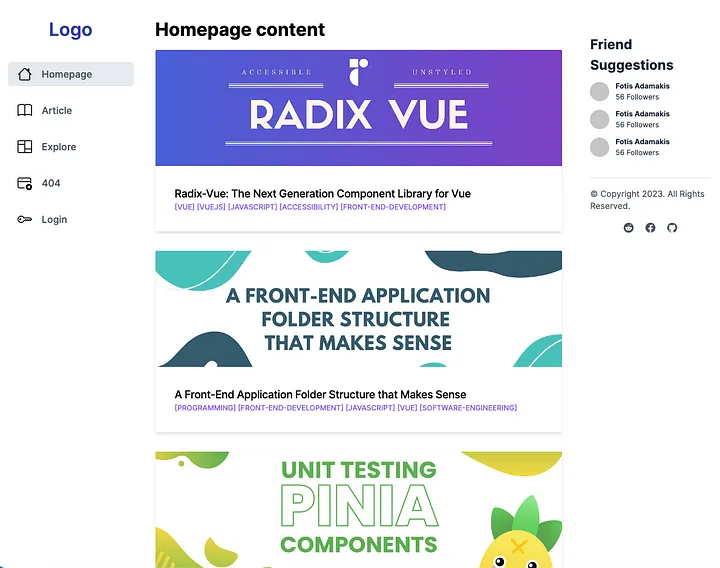
主页是每个流行的社交网络使用的典型 3 列布局。第一列包含应用程序的徽标和导航,在使用此布局的每个页面中保持不变。这同样适用于右下角的页脚。每个页面的主要内容和侧边栏小部件都会更改。 ![]()
首先从 HomePage.vue 组件开始实现这一点。
<script setup lang="ts">
import ThreeColumnLayout from "../layouts/ThreeColumnLayout.vue";
import ArticleCard from "../components/ArticleCard.vue";
import WidgetFriendSuggestions from "../components/WidgetFriendSuggestions.vue";
import useArticles from "../composables/useArticles";
const articles = useArticles().getArticles();
</script>

<template>
  <ThreeColumnLayout>
    <h2 class="text-3xl font-bold mb-4">Homepage content</h2>
    <ArticleCard v-for="article in articles" :article="article" />

    <template #aside>
      <WidgetFriendSuggestions />
    </template>
  </ThreeColumnLayout>
</template>
小编使用一个 ThreeColumnLayout 组件(稍后会实现它)。默认插槽具有标题和文章列表,它们是页面的主要内容。此外,小编创建一个名称为aside 的命名槽,用于声明小部件。
按照通用约定, ThreeColumnLayout 组件放置在文件夹中 /layouts 它将使用网格容器并用于
grid-template-areas 创建三列布局。
布局的实现细节将取决于此组件,而不是页面。使用flexbox,网格系统或任何其他技术都是可能的。如果使用全宽、盒装或流体布局,则同样适用。
此布局有 3 列
第一列将包含硬编码的徽标和导航组件。
第二列将仅创建默认插槽,并让页面决定要插入的内容。
第三列将包含每个页面通用的旁槽和页脚组件。
ThreeColumnLayout.vue
<script setup>
import AppNavigation from "../components/AppNavigation.vue";
import AppFooter from "../components/AppFooter.vue";
import AppLogo from "../components/AppLogo.vue";
</script>

<template>
  <div class="three-column-layout">
    <header>
      <AppLogo />
      <AppNavigation />
    </header>

    <main>
      <slot />
    </main>

    <aside>
      <slot name="aside" />
      <AppFooter />
    </aside>
  </div>
</template>

<style scoped lang="scss">
.three-column-layout {
  display: grid;
  grid-template-areas:
    "header"
    "main"
    "aside";

  header {
    grid-area: header;
    margin-top: 30px;
  }
  main {
    grid-area: main;
    margin-top: 10px;
    padding: 20px;
  }
  aside {
    grid-area: aside;
    margin-top: 10px;
    padding: 20px;
  }

  @media (min-width: 768px) {
    grid-template-columns: 1fr 3fr 1fr;
    grid-template-areas: "header main aside";
  }
}
</style>
实现效果如下图所示: ![]()
创建具有相同布局的新页面将证明这种方法是多么简洁。
使用下面的代码创建文章页面,并在侧边栏上有一个额外的小部件:
<script setup>
import ThreeColumnLayout from "../layouts/ThreeColumnLayout.vue";
import WidgetRelatedContent from "../components/WidgetRelatedContent.vue";
import WidgetFriendSuggestions from "../components/WidgetFriendSuggestions.vue";
import { useRoute } from "vue-router";
import useArticles from "../composables/useArticles";
const article = useArticles().getArticle(useRoute().params.id);
</script>

<template>
  <ThreeColumnLayout>
    <h2 class="text-3xl font-bold mb-4">{{ article.title }}</h2>
    <div class="max-w-md" v-html="article.description"></div>

    <template #aside>
      <WidgetFriendSuggestions />
      <WidgetRelatedContent />
    </template>
  </ThreeColumnLayout>
</template>
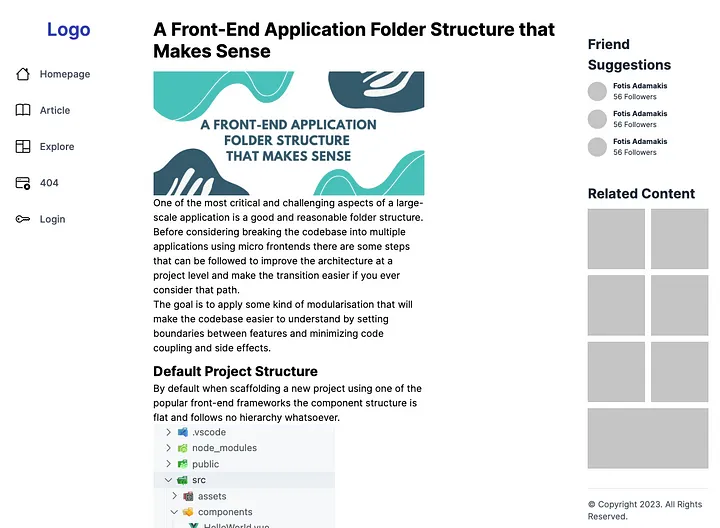
实现的效果: ![]()
两列布局
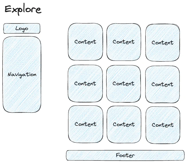
对于“详情”页面,小编将创建一个两列布局。第一列将与三列布局相同,但主要部分将占据屏幕的其余部分,并将页脚放在底部。 ![]()
该实现看起来与上一个没有太大区别。但是这次小编使用flex-basis。( 只是为了演示创建CSS布局的不同方法。在实际场景中,所有实现都应使用相同的技术。)
TwoColumnLayout.vue
<script setup>
import AppNavigation from "../components/AppNavigation.vue";
import AppLogo from "../components/AppLogo.vue";
import AppFooter from "../components/AppFooter.vue";
</script>
<template>
  <div class="two-column-layout">
    <header>
      <AppLogo />
      <AppNavigation />
    </header>

    <main>
      <slot />
      <AppFooter />
    </main>
  </div>
</template>

<style scoped>
.two-column-layout {
  display: flex;
  @media (max-width: 768px) {
    flex-direction: column;
  }
}
header {
  flex-basis: 20%;
  margin-top: 30px;
}

main {
  flex-basis: 80%;
  margin-top: 10px;
  padding: 20px;
}
</style>
使用此布局的浏览页面非常简单。
Explore.vue
<script setup>
import TwoColumnLayout from "../layouts/TwoColumnLayout.vue";
import ExploreItem from "../components/ExploreItem.vue";

import useArticles from "../composables/useArticles";
const articles = useArticles().getExploreArticles();
</script>

<template>
  <TwoColumnLayout>
    <h2 class="text-3xl font-bold mb-12">
      Latest content on <a target="_blank" href="https://dev.to/">Dev.to</a>
    </h2>
    <div class="grid lg:grid-cols-3 gap-6">
      <ExploreItem v-for="article in articles" :article="article" />
    </div>
  </TwoColumnLayout>
</template>
实现效果:
![]()
空白布局
最后,小编创建一个可在 404 页面上使用的空白整页布局。
<template>
  <main class="container my-24 px-6 mx-auto">
    <slot />
  </main>
</template>
即使实现很简单,使用布局也很重要,这次只有一个居中的容器(tailwind.css)。
这样,小编可以保持页面组件的精简,并确保使用此布局的多个页面的外观和行为相同。
<script setup>
import BlankLayout from "../layouts/BlankLayout.vue";
import PageNotFound from "../components/PageNotFound.vue";
</script>

<template>
  <BlankLayout>
    <PageNotFound />
  </BlankLayout>
</template>
![]()
结论
布局是减少样板和维护具有专业外观的应用程序的绝佳工具。结合全面的文件夹结构可以产生每个人都喜欢使用的代码库,除此之外,如果您想下载完整代码,欢迎点击这里:Gitee。
扩展链接:
Redis从入门到实践
一节课带你搞懂数据库事务!
Chrome开发者工具使用教程
从表单驱动到模型驱动,解读低代码开发平台的发展趋势
低代码开发平台是什么?
基于分支的版本管理,帮助低代码从项目交付走向定制化产品开发


