
redis-pro-swiftUI 1.4.0 发布,增加 SSH Tunnel
redis-pro 是一款开源的Redis 轻量客户端管理工具,采用 SwiftUI 编写。 更新日志: 增加 SSH Tunnel 登录功能 key 列表采用新的精确分页方式,弥补 scan 返会的不精确分页数量 set, zset 使用精确分页,搜索使用返回精确数量 安装 下载地址 或者 brew install redis-pro
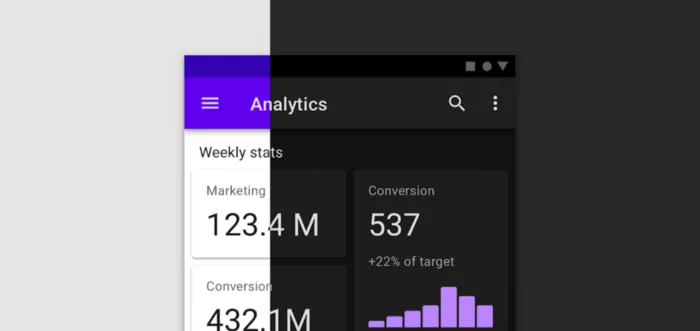
为了保证您的应用与用户设备中安装的其他应用在视觉和行为上保持一致,我们推荐您遵循 Material Design 规范,因为用户从一个应用中学习的操作模式可以无缝衔接地在另一个应用中使用。
Material Design 规范
https://material.io/design/introduction
Android 用户希望您的应用在视觉和行为上与系统保持一致。您在设计视觉和导航模式时应该遵循 Material Design 规范…
—— d.android.com/design
您可以使用 Material Design Components (MDC) 组件库来实现这一目的。本文将列出使用 MDC 的优势,从而说明我们推荐使用它的原因。
Material Design Components
https://github.com/material-components/material-components-android
d.android.com/design
https://developer.android.google.cn/design
组件
MDC 提供了系统标准组件的 Material 版本,例如 Buttons、Toolbars、CheckBox 等等,使用这些组件能轻松实现 Material 风格。如果您使用了 MaterialComponents 主题,当您 inflate 一个 layout (通过 MDC 的 View Inflater) 时,被实例化是 Material 组件而不是标准组件,因此您不需要对布局进行重大的更新就能轻松实现 Material 风格。
<!-- Copyright 2019 Google LLC.SPDX-License-Identifier: Apache-2.0 --><!-- 标准组件 Button 将会被替换为 MaterialButton --><Button ... /><!-- 您甚至可以使用 MaterialButton 特定的属性 --><Button ...app:icon="@drawable/foo"/><!--如果您想用具有向后兼容能力的 AppCompatButton 而不是 MaterialButton,您可以这样做 --><androidx.appcompat.widget.AppCompatButton ... />
Buttons
https://material.io/develop/android/components/buttons
Toolbars
https://material.io/develop/android/components/app-bars-top
CheckBox
https://material.io/develop/android/components/checkboxes
View Inflater
https://developer.android.google.cn/reference/com/google/android/material/theme/MaterialComponentsViewInflater
所有 Material 组件都继承自对应的 AppCompat 组件,因此它们享有相同的向后兼容能力和新版本的 bug 修复。
Material 组件在对应的系统标准组件和 AppCompat 组件的基础上拓展出更多样式和功能,例如 MaterialButton 拥有以下多种样式:
https://material.io/develop/android/components/buttons
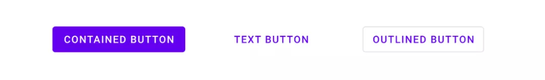
<!-- Copyright 2019 Google LLC.SPDX-License-Identifier: Apache-2.0 --><!-- Contained button --><Button ...style="?attr/materialButtonStyle"/><!-- Text button --><Button ...style="?attr/borderlessButtonStyle"/><!-- Outlined button --><Button ...style="?attr/materialButtonOutlinedStyle"/>
我最喜欢的功能之一是使用 MaterialTextView 替换 TextView,它新增的功能可以很方便地在 TextAppearance 中设置行高。
MaterialTextView
https://material.io/develop/android/components/material-text-view
新增的功能
https://medium.com/androiddevelopers/whats-your-text-s-appearance-f3a1729192d
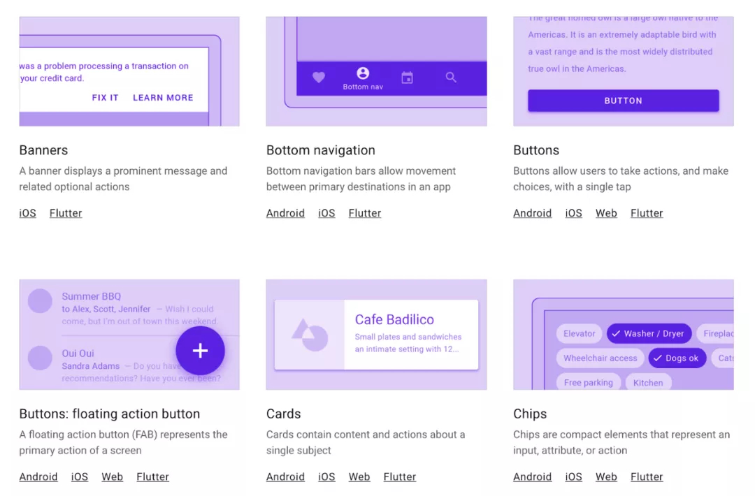
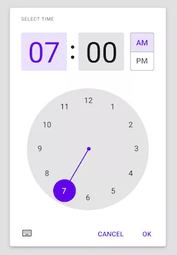
除了拓展现有组件的功能外,MDC 还提供了一系列全新的组件。您可能知道 Bottom Navigation、Bottom Sheet 和 Floating Action Button,但未必听说过 Chips、Date Picker 和 Time Picker。
Bottom Navigation
https://material.io/develop/android/components/bottom-navigation-view/
Bottom Sheet
https://material.io/develop/android/components/bottom-sheet-behavior/
Floating Action Button
https://material.io/develop/android/components/floating-action-button/
Chips
https://material.io/develop/android/components/chip/
Date Picker
https://material.io/develop/android/components/picker
Time Picker
https://github.com/material-components/material-components-android/blob/master/docs/components/TimePicker.md
MDC 提供的全部组件列单,请查阅——组件:
https://material.io/components
Material 主题
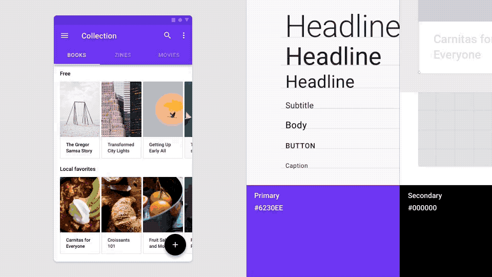
Material 主题可以更系统地自定义 Material Design 样式来体现您的产品品牌。Material 主题包括颜色、字体样式和形状属性。对其进行自定义将自动应用到您用于构建应用的组件上。
Material 主题
https://material.io/design/material-theming/
颜色
https://material.io/design/color/
字体样式
https://material.io/design/typography/
形状
https://material.io/design/shape/
您可以将 Material 主题理解为创建设计系统的设计系统。您只需配置好颜色、字体样式和形状,即可得到一套基于您品牌的完整设计系统。
Nick Rout 在以下文章中分别深入地介绍了这三个子系统:
Nick Rout
https://medium.com/@ricknout
深色主题
MDC 组件遵循 Material 的深色主题背景规范实现了深色主题。在深色主题下,许多组件都将调整它们的颜色,并且在阴影不可见的情况下添加了 elevation 叠加层以表现高度变化。
深色主题背景规范
https://material.io/design/color/dark-theme.html
Chris Banes 在下面这篇文章中深入介绍了 MDC 的深色主题:
Chris Banes
https://chrisbanes.medium.com/
Material 动效
Material Design 还针对转场动画制定了规范。现在,MDC 不仅提供了规范,还将这些模式实现为 Transition 以便您在应用中使用。
规范
https://material.io/design/motion/the-motion-system.html
Hunter Stich 在下面这篇文章中介绍了 Material Motion 库:
Hunter Stich
https://medium.com/@hunter_stich
使用 Compose
Jetpack Compose 是 Android 系统的下一代 UI 工具包,目前已正式发布。它会提供 Material 风格的组件和主题。尽早使用 MDC 将为未来迁移至 Jetpack Compose 做好准备 — 它们使用了相同的概念、设计名词和组件。您甚至可以使用类似 MDC-Android Compose 主题适配器的库来简化迁移过程,该库将 XML 实现的 MDC 主题转换为 Compose 的 MaterialTheme。
Jetpack Compose
https://developer.android.google.cn/jetpack/compose
MDC-Android Compose 主题适配器
https://github.com/material-components/material-components-android-compose-theme-adapter
MaterialTheme
https://developer.android.google.cn/reference/kotlin/androidx/compose/material/package-summary#materialtheme
推荐使用 Material
希望您已经清楚我们推荐使用 Material Design Components 构建 Android UI 的原因。我们近期更新了在 Android Studio 中通过 File > New Project 菜单新建的模版,这些模版为您预设置了 Material 主题并使用了 MDC,因此您可以更容易的开始使用 MDC。如果您还没有迁移到 MDC,请查看我们的迁移指南:
https://medium.com/androiddevelopers/migrating-to-material-components-for-android-ec6757795351
Material Design Components
https://github.com/material-components/material-components-android
近期更新
https://developer.android.google.cn/studio/preview/features#mdc-templates

微信关注我们
转载内容版权归作者及来源网站所有!
低调大师中文资讯倾力打造互联网数据资讯、行业资源、电子商务、移动互联网、网络营销平台。持续更新报道IT业界、互联网、市场资讯、驱动更新,是最及时权威的产业资讯及硬件资讯报道平台。
马里奥是站在游戏界顶峰的超人气多面角色。马里奥靠吃蘑菇成长,特征是大鼻子、头戴帽子、身穿背带裤,还留着胡子。与他的双胞胎兄弟路易基一起,长年担任任天堂的招牌角色。
为解决软件依赖安装时官方源访问速度慢的问题,腾讯云为一些软件搭建了缓存服务。您可以通过使用腾讯云软件源站来提升依赖包的安装速度。为了方便用户自由搭建服务架构,目前腾讯云软件源站支持公网访问和内网访问。
Nacos /nɑ:kəʊs/ 是 Dynamic Naming and Configuration Service 的首字母简称,一个易于构建 AI Agent 应用的动态服务发现、配置管理和AI智能体管理平台。Nacos 致力于帮助您发现、配置和管理微服务及AI智能体应用。Nacos 提供了一组简单易用的特性集,帮助您快速实现动态服务发现、服务配置、服务元数据、流量管理。Nacos 帮助您更敏捷和容易地构建、交付和管理微服务平台。
Spring框架(Spring Framework)是由Rod Johnson于2002年提出的开源Java企业级应用框架,旨在通过使用JavaBean替代传统EJB实现方式降低企业级编程开发的复杂性。该框架基于简单性、可测试性和松耦合性设计理念,提供核心容器、应用上下文、数据访问集成等模块,支持整合Hibernate、Struts等第三方框架,其适用范围不仅限于服务器端开发,绝大多数Java应用均可从中受益。
扫码在手机上查看文章
扫描二维码,手机阅读更方便
有任何问题或合作意向欢迎联系我们
Email: 99873273@qq.com
QQ: 99873273