App主题色控制
-
Theme有两种:全局Theme和局部Theme。全局Theme是由应用程序根MaterialApp创建的Theme 。
-
Theme作用:可以设置Widget的主题,提高开发效率和速度,保持App主题统一性或某种一致性。
Theme
Theme组件可以为material APP定义主题数据(ThemeData)。Material组件库里很多组件都使用了主题数据, 如导航栏颜色、标题字体、Icon样式等。Theme内会使用InheritedWidget来为其子树共享样式数据。
设置主题栗子
全局:
/// 全局主题在MaterialApp的theme属性
/// 全局生效
new MaterialApp(
  title: 'demo',
  theme: new ThemeData( // 这里就是参数
    brightness: Brightness.dark,
    primaryColor: Colors.lightBlue[800],
    accentColor: Colors.cyan[600],
  ),
);
局部:
/// 假如我们要给FloatingActionButton设置主题样式
/// 直接写个Theme包裹FloatingActionButton组件
/// 然后设置data,接收类型依然是ThemeData,里面填写我们的参数
/// (如果没有设置局部主题则默认使用全局主题)
new Theme(
  data: new ThemeData(
    accentColor: Colors.yellow,
  ),
  child: new FloatingActionButton(
    onPressed: () {},
    child: new Icon(Icons.add),
  ),
);
扩展父主题:
/// 扩展父主题时无需覆盖所有的主题属性,可以通过使用copyWith方法来实现
new Theme(
  data: Theme.of(context).copyWith(accentColor: Colors.yellow),
  child: new FloatingActionButton(
    onPressed: null,
    child: new Icon(Icons.add),
  ),
);
Theme.of(context)将查找Widget树并返回树中最近的Theme。如果Widget之上有一个单独的Theme定义, 则返回该值。如果不是,则返回App主题。
判断平台显示指定主题:
/// defaultTargetPlatform在foundation包里。
///
/// 我们也可以使用io包里的Platform来进行判断。
/// 那么判断就是
/// theme: Platform.isIOS ? iOSTheme : AndroidTheme,
new MaterialApp(
  theme: defaultTargetPlatform == TargetPlatform.iOS
      ? iOSTheme
      : AndroidTheme,
  title: 'Flutter Theme',
  home: new MyHomePage(),
);
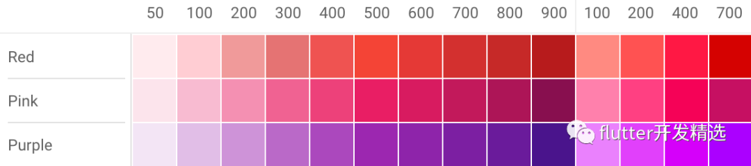
Tips:
Flutter的Color中大多数颜色从100到900,增量为100,加上颜色50,数字越小颜色越浅, 数字越大颜色越深。强调色调只有100、200、400和700。
栗子:
![]()
推荐站点(Material design):
https://material.io/resources/color,
为你的UI创建共享调色板,并衡量任何颜色组合的可观性【非常实用的工具】。
ThemeData(Color类型属性):
-
accentColor - 前景色(文本、按钮等)
-
backgroundColor - 与
primaryColor对比的颜色(例如 用作进度条的剩余部分)。
-
bottomAppBarColor -
BottomAppBar的默认颜色。
-
buttonColor -
Material中 RaisedButtons使用的默认填充色。
-
canvasColor -
MaterialType.canvas Material的默认颜色。
-
cardColor -
Material被用作 Card时的颜色。
-
dialogBackgroundColor -
Dialog元素的背景色。
-
disabledColor - 用于
Widget无效的颜色,无论任何状态。例如禁用复选框。
-
dividerColor -
Dividers和PopupMenuDividers的颜色,也用于 ListTiles中间,和DataTables的每行中间.
-
errorColor - 用于输入验证错误的颜色,例如在
TextField中。
-
highlightColor - 用于类似墨水喷溅动画或指示菜单被选中的高亮颜色。
-
hintColor - 用于提示文本或占位符文本的颜色,例如在
TextField中。
-
indicatorColor -
TabBar中选项选中的指示器颜色。
-
primaryColor - App主要部分的背景色(
ToolBar, TabBar等)。
-
primaryColorDark -
primaryColor的较暗版本。
-
primaryColorLight -
primaryColor的较亮版本。
-
scaffoldBackgroundColor - 作为
Scaffold基础的 Material默认颜色,典型 Material应用或应用内页面的背景颜色。
-
secondaryHeaderColor - 有选定行时
PaginatedDataTable标题的颜色。
-
selectedRowColor - 选中行时的高亮颜色。
-
-
textSelectionColor - 文本字段中选中文本的颜色,例如
TextField。
-
textSelectionHandleColor - 用于调整当前文本的哪个部分的句柄颜色。
-
toggleableActiveColor - 用于突出显示切换
Widget(如 Switch, Radio和 Checkbox)的活动状态的颜色。
-
unselectedWidgetColor - 用于
Widget处于非活动(但已启用)状态的颜色。例如,未选中的复选框。通常与 accentColor形成对比。
-
focusColor - 焦点获取时的颜色,例如,一些按钮焦点、输入框焦点。
-
hoverColor - 点击之后徘徊中的颜色,例如,按钮长按,按住之后的颜色。
-
ThemeData(Theme相关类型属性):
-
accentIconTheme -
IconThemeData类型,与突出颜色对照的图片主题。
-
accentTextTheme -
TextTheme类型,与突出颜色对照的文本主题。
-
chipTheme -
ChipThemeData类型,用于渲染 Chip的颜色和样式。
-
buttonTheme -
ButtonThemeData类型,定义了按钮等控件的默认配置,像 RaisedButton和 FlatButton。
-
primaryIconTheme -
IconThemeData类型,一个与主色对比的图片主题。
-
primaryTextTheme -
TextThemeData类型,一个与主色对比的文本主题。
-
iconTheme -
IconThemeData类型,与卡片和画布颜色形成对比的图标主题。
-
inputDecorationTheme -
InputDecorationTheme类型, InputDecorator, TextField和 TextFormField的默认 InputDecoration值基于此主题。
-
sliderTheme -
SliderThemeData类型,用于渲染 Slider的颜色和形状。
-
textTheme -
TextTheme类型,与卡片和画布对比的文本颜色。
-
toggleButtonsTheme -
ToggleButtonsThemeData类型,Flutter 1.9 全新组件 ToggleButtons 的主题。
-
tabBarTheme -
TabBarTheme类型, TabBar的主题样式。
-
tooltipTheme -
TooltipThemeData类型, tooltip提示的主题样式。
-
cardTheme -
CardTheme类型,卡片的主题样式。
-
pageTransitionsTheme -
PageTransitionsTheme类型,页面转场主题样式。
-
appBarTheme -
AppBarTheme类型, AppBar主题样式。
-
bottomAppBarTheme -
BottomAppBarTheme类型,底部导航主题样式。
-
dialogTheme -
DialogTheme类型,对话框主题样式。
-
floatingActionButtonTheme -
FloatingActionButtonThemeData类型, FloatingActionButton的主题样式,也就是 Scaffold属性的那个。
-
cupertinoOverrideTheme -
CupertinoThemeData类型, cupertino覆盖的主题样式。
-
snackBarTheme -
SnackBarThemeData类型,弹出的 snackBar的主题样式。
-
bottomSheetTheme -
BottomSheetThemeData类型,底部滑出对话框的主题样式。
-
popupMenuTheme -
PopupMenuThemeData类型,弹出菜单对话框的主题样式。
-
bannerTheme -
MaterialBannerThemeData类型, Material材质的 Banner主题样式。
-
dividerTheme -
DividerThemeData类型, Divider组件的主题样式,也就是那个横向线条组件。
ThemeData(其他类型属性):
-
accentColorBrightness -
Brightness类型, accentColor的亮度。用于确定放置在突出颜色顶部的文本和图标的颜色(例如 FloatingButton上的图标)。
-
brightness -
Brightness类型,应用程序整体主题的亮度。由按钮等 Widget使用,以确定在不使用主色或强调色时要选择的颜色。
-
platform -
TargetPlatform类型, Widget需要适配的目标类型。
-
splashFactory -
InteractiveInkFeatureFactory类型,定义 InkWall和 InkResponse生成的墨水喷溅的外观。
-
primaryColorBrightness -
Brightness类型, primaryColor的亮度。
-
fontFamily -
String类型,字体样式。
-
applyElevationOverlayColor
bool类型,是否应用 elevation覆盖颜色。
-
materialTapTargetSize -
MaterialTapTargetSize类型, Chip等组件的尺寸主题设置,如:设置为 MaterialTapTargetSize.shrinkWrap时, clip距顶部距离为0;设置为 MaterialTapTargetSize.padded时距顶部有一个距离
-
colorScheme -
ColorScheme类型,scheme组颜色,一组13种颜色,可用于配置大多数组件的颜色属性。
-
typography -
Typography类型,用于配置 TextTheme、 primaryTextTheme和 accentTextTheme的颜色和几何文本主题值。
适配夜间模式
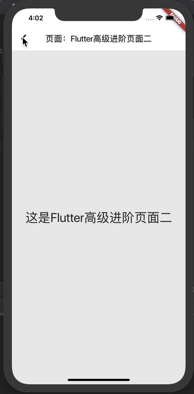
实现效果:
![]()
分析:
这次是使用局部的实现,哪个页面需要同步就加个Theme就行了,全局也是类似的实现方式,主体代码不到100行。
代码:
首先写个配置类,主要配置主题的是否为黑夜模式和主题样式:
class Config {
  static bool dark = true; // 是否为黑夜模式
  static ThemeData themeData = new ThemeData.dark(); // 主题为暗色
}
然后我们正常的执行代码:
import 'package:flutter/material.dart';
import 'global_config.dart';

void main() => runApp(new MyApp());

class MyApp extends StatelessWidget {
  @override
  Widget build(BuildContext context) {
    return new MaterialApp(title: "Flutter高级进阶", home: new MyScaffold());
  }
}

class MyScaffold extends StatefulWidget {
  @override
  _MyScaffoldState createState() => _MyScaffoldState();
}

class _MyScaffoldState extends State<MyScaffold> {
  /*
  * 主题改变
  * */
  changeTheme() {
    if (Config.dark) {
      Config.themeData = new ThemeData(
        primaryColor: Colors.white,
        scaffoldBackgroundColor: new Color(0xFFEBEBEB),
      );
      Config.dark = false;
    } else {
      Config.themeData = new ThemeData.dark();
      Config.dark = true;
    }
    setState(() {});
  }

  Widget body(context) {
    return new ListView(
      children: <Widget>[
        new Container(
          width: MediaQuery.of(context).size.width / 4, // 整宽除4
          child: new GestureDetector(
            onTap: () => changeTheme(), // 触发更换主题的事件
            child: new Column(
              children: <Widget>[
                new FlutterLogo(
                  size: 150.0,
                  style: FlutterLogoStyle.horizontal,
                  duration: Duration(milliseconds: 100),
                  textColor: Theme.of(context).colorScheme.background, // 从上下文拿到背景
                ),
                new Text( // 如果为黑夜模式则按钮文字为白天模式,否则文字显示为黑夜模式
                  '点击Logo更换${Config.dark ? "白天模式" : "黑夜模式"}',
                  style: new TextStyle(fontSize: 25.0),
                ),
              ],
            ),
          ),
        ),
        new MaterialButton( // 跳转按钮
          onPressed: () {
            Navigator.of(context).push(new MaterialPageRoute(
                builder: (context) => new NewPage('Flutter高级进阶页面二')));
          },
          child: new Text('跳转到新页面'),
        ),
      ],
    );
  }

  @override
  Widget build(BuildContext context) {
    return new Theme( // 主题组件,可设置局部的主题样式
      data: Config.themeData, // 设置为配置的主题数据
      child: new Scaffold(
        appBar: new AppBar(elevation: 0),
        body: body(context), // 身体页面body
      ),
    );
  }
}
再把NewPage测试页面写上:
class NewPage extends StatefulWidget {
  final String title; // 接收的标题

  NewPage(this.title);

  @override
  _NewPageState createState() => new _NewPageState(); // 创建有状态页面
}

class _NewPageState extends State<NewPage> {
  @override
  Widget build(BuildContext context) {
    return new Theme(
      child: new Scaffold( // title就是我们的标题
        appBar: new AppBar(title: new Text('页面:${widget.title}'), elevation: 0),
        body: new Center(
          child: new Text(
            '这是${widget.title}',
            style: TextStyle(fontSize: 30.0),
          ),
        ),
      ),
      data: Config.themeData, // 设置为配置的主题数据
    );
  }
}
直接复制到自己的项目内即可运行。
