探索性数据分析(EDA) 涉及两个基本步骤
数据可视化 (使用不同类型的图来展示数据中的关系) 。
Pandas 是 Python 中最常用的数据分析库。Python 提供了大量用于数据可视化的库,Matplotlib 是最常用的,它提供了对绘图的完全控制,并使得绘图自定义变得容易。
但是,Matplotlib 缺少了对 Pandas 的支持。而 Seaborn 弥补了这一缺陷,它是建立在 Matplotlib 之上并与 Pandas 紧密集成的数据可视化库。
然而,Seaborn 虽然活干得漂亮,但是函数众多,让人不知道到底该怎么使用它们?不要怂,本文就是为了理清这点,让你快速掌握这款利器。
这篇文章主要涵盖如下内容,
Pandas 与 Seaborn 的集成如何实现以最少的代码绘制复杂的多维图?
如何在 Matplotlib 的辅助下自定义 Seaborn 绘图设置?
谁适合阅读这篇文章? 如果你具备 Matplotlib 和 Pandas 的基本知识,并且想探索一下 Seaborn,那么这篇文章正是不错的起点。
如果目前只掌握 Python,建议翻阅文末相关文章,特别是 在掌握 Pandas 的基本使用之后再回到这里来或许会更好一些。
1 Matplotlib 尽管仅使用最简单的功能就可以完成许多任务,但是了解 Matplotlib 的基础非常重要,其原因有两个,
Seaborn 在底层使用 Matplotlib 绘图。
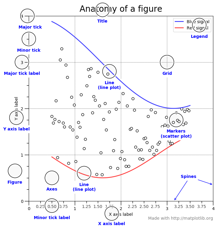
这里对 Matplotlib 的基础作个简单概述。下图显示了 Matplotlib 窗口的各个要素。
需要了解的三个主要的类是图形(Figure) ,图轴(Axes) 以及坐标轴(Axis) 。
它指的就是你看到的整个图形窗口。同一图形中可能有多个子图(图轴) 。在上面的示例中,在一个图形中有四个子图(图轴) 。
图轴就是指图形中实际绘制的图。一个图形可以有多个图轴,但是给定的图轴只是整个图形的一部分。在上面的示例中,我们在一个图形中有四个图轴。
坐标轴是指特定图轴中的实际的 x-轴和 y-轴。
本帖子中的每个示例均假设已经加载所需的模块以及数据集,如下所示,
import pandas as pdimport numpy as npfrom matplotlib import pyplot as pltimport seaborn as sns'tips' )'iris' )import matplotlib'ggplot' )tips.head()
total_bill
tip
sex
smoker
day
time
size
0
16.99 1.01 Female No Sun Dinner 2
1
10.34 1.66 Male No Sun Dinner 3
2
21.01 3.50 Male No Sun Dinner 3
3
23.68 3.31 Male No Sun Dinner 2
4
24.59 3.61 Female No Sun Dinner 4
iris.head()
sepal_length
sepal_width
petal_length
petal_width
species
0
5.1
3.5
1.4
0.2
setosa
1
4.9
3.0
1.4
0.2
setosa
2
4.7
3.2
1.3
0.2
setosa
3
4.6
3.1
1.5
0.2
setosa
4
5.0
3.6
1.4
0.2
setosa
让我们通过一个例子来理解一下 Figure 和 Axes 这两个类。
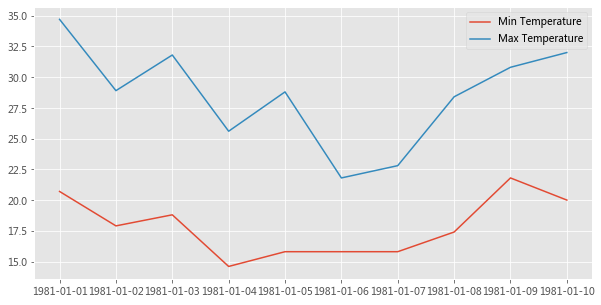
dates = ['1981-01-01' , '1981-01-02' , '1981-01-03' , '1981-01-04' , '1981-01-05' ,'1981-01-06' , '1981-01-07' , '1981-01-08' , '1981-01-09' , '1981-01-10' ]20.7 , 17.9 , 18.8 , 14.6 , 15.8 , 15.8 , 15.8 , 17.4 , 21.8 , 20.0 ]34.7 , 28.9 , 31.8 , 25.6 , 28.8 , 21.8 , 22.8 , 28.4 , 30.8 , 32.0 ]1 , ncols=1 , figsize=(10 ,5 ));'Min Temperature' );'Max Temperature' );
plt.subplots() 创建一个 Figure 对象实例,以及 nrows x ncols 个 Axes 实例,并返回创建的 Figure 对象和 Axes 实例。在上面的示例中,由于我们传递了 nrows = 1 和 ncols = 1,因此它仅创建一个 Axes 实例。如果 nrows > 1 或 ncols > 1,则将创建一个 Axes 网格并将其返回为 nrows 行 ncols 列的 numpy 数组。
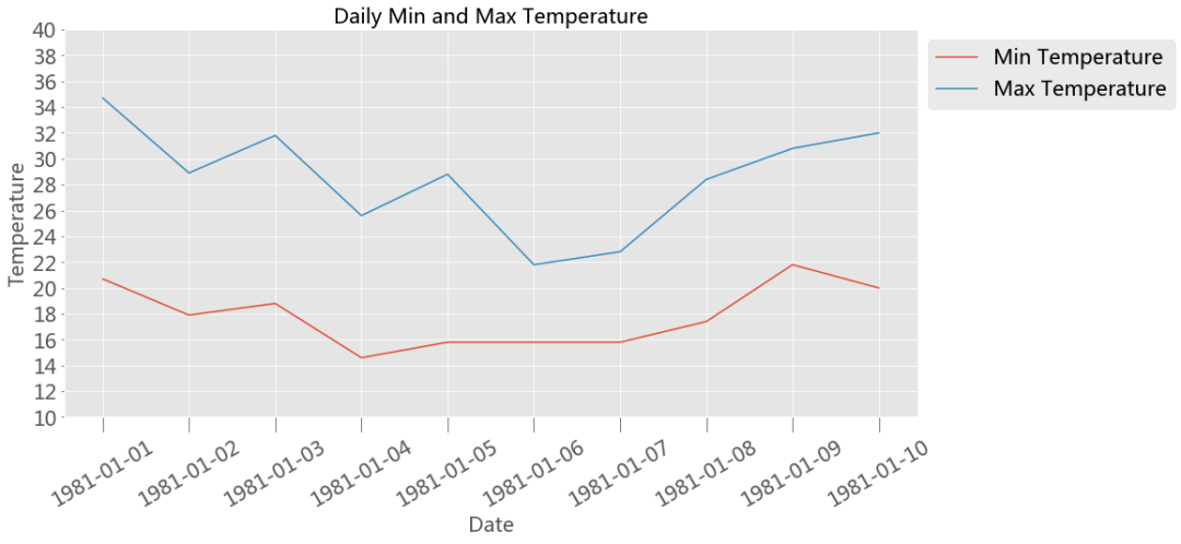
Axes 类最常用的自定义方法有,
Axes.set_xlabel() Axes.set_ylabel()下面是一个使用上述某些方法进行自定义的例子,
fontsize =20 1 , ncols=1 , figsize=(15 ,7 ))'Min Temperature' )'Max Temperature' )'Date' , fontsize=fontsize)'Temperature' , fontsize=fontsize)'Daily Min and Max Temperature' , fontsize=fontsize)'x' , labelsize=fontsize, labelrotation=30 , size=15 )10 ,40 )10 ,41 ,2 ))'y' ,labelsize=fontsize)'upper left' , bbox_to_anchor=(1 ,1 ));
上面我们快速了解了下 Matplotlib 的基础知识,现在让我们进入 Seaborn。
2 Seaborn Seaborn 中的每个绘图函数既是图形级函数又是图轴级函数,因此有必要了解这两者之间的区别。
如前所述,图形指的是你看到的整个绘图窗口上的图,而图轴指的是图形中的一个特定子图。
图轴级函数只绘制到单个 Matplotlib 图轴上,并不影响图形的其余部分。
我们可以这么来理解这一点,图形级函数可以调用不同的图轴级函数在不同的图轴上绘制不同类型的子图 。
sns.set_style('darkgrid' )2.1 图轴级函数 下面罗列的是 Seaborn 中所有图轴级函数的详细列表。
关系图 Relational Plots
类别图 Categorical Plots
violinplot( )、countplot( )
分布图 Distribution Plots
回归图 Regression Plots
矩阵图 MatrixPlots( )
使用任何图轴级函数需要了解的两点,
2.1.1 将输入数据提供给图轴级函数的不同方法 1、列表、数组或系列
将数据传递到图轴级函数的最常用方法是使用迭代器,例如列表 list,数组 array 或序列 series
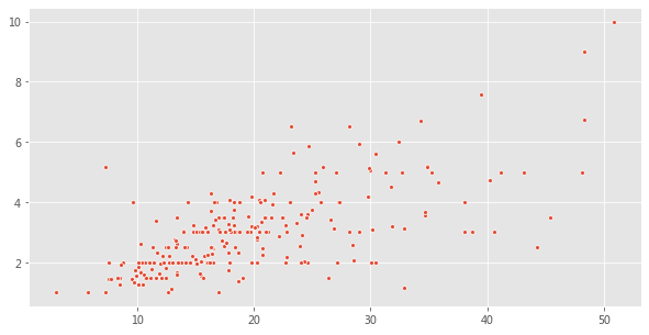
total_bill = tips['total_bill' ].values'tip' ].values10 , 5 ))15 );
tip = tips['tip' ].values'day' ].values10 , 5 ))"Set2" );
2、使用 Pandas 的 Dataframe 类型以及列名。
Seaborn 受欢迎的主要原因之一是它可以直接可以与 Pandas 的 Dataframes 配合使用。
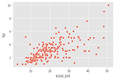
fig = plt.figure(figsize=(10 , 5 ))'total_bill' , y='tip' , data=tips, s=50 );
fig = plt.figure(figsize=(10 , 5 ))'day' , y='tip' , data=tips);
3、仅传递 Dataframe
在这种数据传递方式中,仅将 Dataframe 传递给 data 参数。数据集中的每个数字列都将使用此方法绘制。此方法只能与以下轴级函数一起使用,
stripplot( )、swarmplot( )
boxplot( )、boxenplot( )、violinplot( )、pointplot( )
使用上述图轴级函数来展示某个数据集中的多个数值型变量的分布,是这种数据传递方式的常见用例。
fig = plt.figure(figsize=(10 , 5 ))
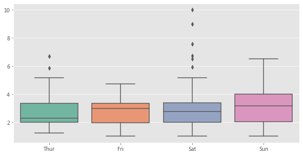
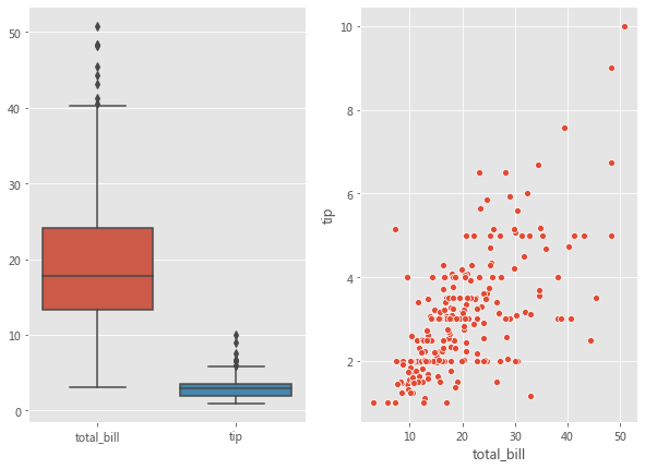
2.1.2 指定用于绘图的图轴 Seaborn 中的每个图轴级函数都带有一个 ax 参数。传递给 ax 参数的 Axes 将负责具体绘图。这为控制使用具体图轴进行绘图提供了极大的灵活性。例如,假设要查看总账单 bill 和小费 tip 之间的关系(使用散点图) 以及它们的分布(使用箱形图) ,我们希望在同一个图形但在不同图轴上展示它们。
fig, axes = plt.subplots(1 , 2 , figsize=(10 , 7 ))'total_bill' , y='tip' , data=tips, ax=axes[1 ]);'total_bill' ,'tip' ]], ax=axes[0 ]);
每个图轴级函数还会返回实际在其上进行绘图的图轴。如果将图轴传递给了 ax 参数,则将返回该图轴对象。然后可以使用不同的方法(如Axes.set_xlabel( ),Axes.set_ylabel( ) 等) 对返回的图轴对象进行进一步自定义设置。
如果没有图轴传递给 ax 参数,则 Seaborn 将使用当前(活动) 图轴来进行绘制。
fig, curr_axes = plt.subplots()'total_bill' , y='tip' , data=tips)True
在上面的示例中,即使我们没有将 curr_axes(当前活动图轴) 显式传递给 ax 参数,但 Seaborn 仍然使用它进行了绘制,因为它是当前的活动图轴。id(curr_axes) == id(scatter_plot_axes) 返回 True,表示它们是相同的轴。
如果没有将图轴传递给 ax 参数并且没有当前活动图轴对象,那么 Seaborn 将创建一个新的图轴对象以进行绘制,然后返回该图轴对象。
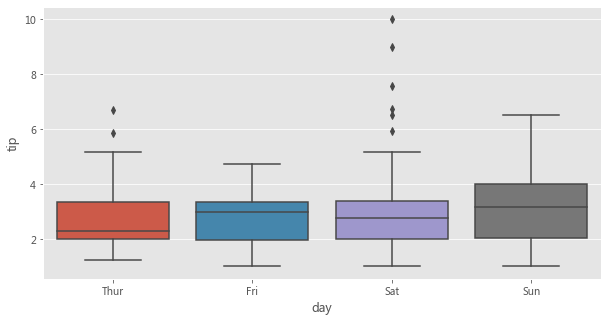
Seaborn 中的图轴级函数并没有参数用来控制图形的尺寸。但是,由于我们可以指定要使用哪个图轴进行绘图,因此可以通过为 ax 参数传递图轴来控制图形尺寸,如下所示。
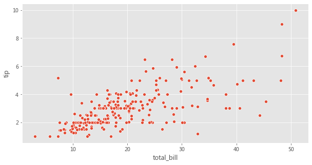
fig, axes = plt.subplots(1 , 1 , figsize=(10 , 5 ))'total_bill' , y='tip' , data=tips, ax=axes);
2.2 图形级函数 在浏览多维数据集时,数据可视化的最常见用例之一就是针对各个数据子集绘制同一类图的多个实例 。
Seaborn 中的图形级函数就是为这种情形量身定制的。
图形级函数可以完全控制整个图形,并且每次调用图形级函数时,它都会创建一个包含多个图轴的新图形。
Seaborn 中三个最通用的图形级函数是 FacetGrid、PairGrid 以及 JointGrid。
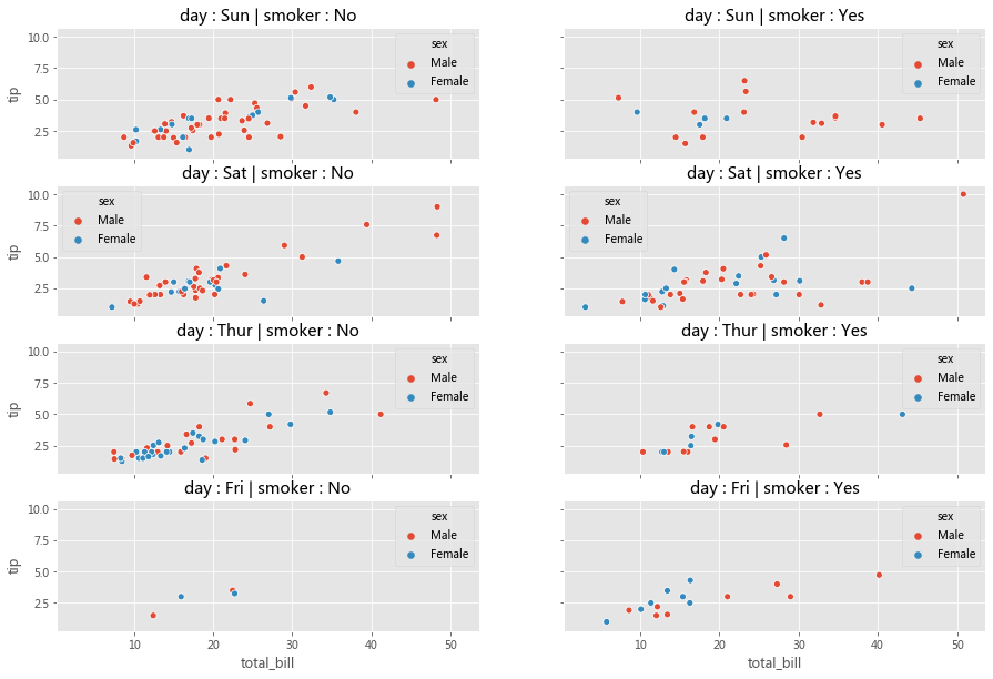
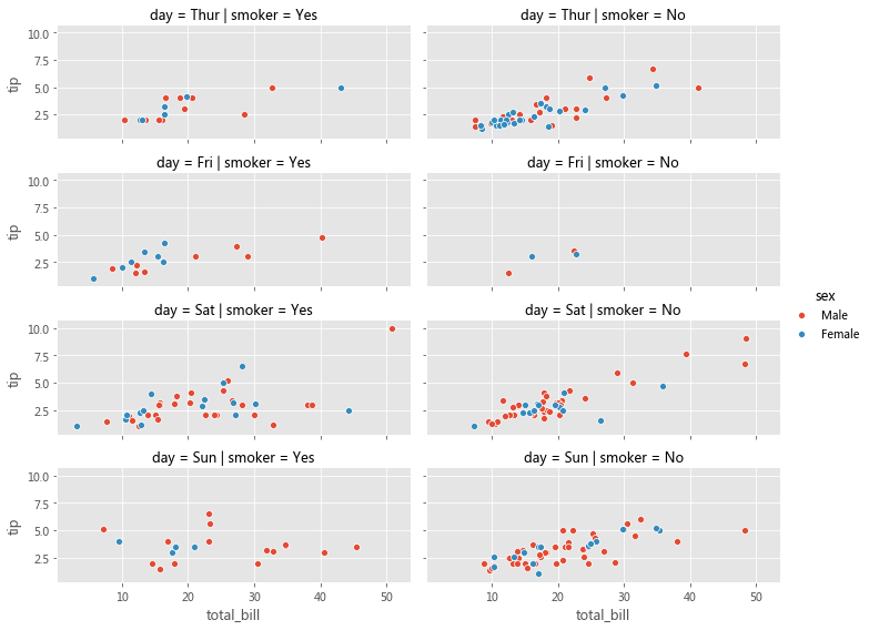
2.2.1 FacetGrid 考虑下面的用例,我们想可视化不同数据子集上的总账单和小费之间的关系(通过散点图) 。数据的每个子集均按以下变量的值的唯一组合进行分类,
如下所示,我们可以用 Matplotlib 和 Seaborn 轻松完成这个操作,
row_variable = 'day' 'smoker' 'sex' 0 ]0 ]True , sharey=True , figsize=(15 ,10 ))for row in range(num_rows):for col in range(num_cols):'total_bill' , y='tip' , data=ax_data, hue=hue_variable,ax=ax);' : ' + row_id + ' | ' + col_variable + ' : ' + col_id
分析一下,上面的代码可以分为三个步骤,
3、在每个图轴上,使用对应于该图轴的数据子集来绘制散点图
在 Seaborn 中,可以将上面三部曲进一步简化为两部曲。
步骤 1 可以在 Seaborn 中可以使用 FacetGrid( ) 完成
步骤 2 和步骤 3 可以使用 FacetGrid.map( ) 完成
使用 FacetGrid,我们可以创建图轴并结合 row,col 和 hue 参数将数据集划分为三个维度。一旦创建好 FacetGrid 后,可以将具体的绘图函数作为参数传递给 FacetGrid.map( ) 以在所有图轴上绘制相同类型的图。在绘图时,我们还需要传递用于绘图的 Dataframe 中的具体列名。
facet_grid = sns.FacetGrid(row='day' , col='smoker' , hue='sex' , data=tips, height=2 , aspect=2.5 )'total_bill' , 'tip' )
Matplotlib 为使用多个图轴绘图提供了良好的支持,而 Seaborn 在它基础上将图的结构与数据集的结构直接连接起来了。
使用 FacetGrid,我们既不必为每个数据子集显式地创建图轴,也不必显式地将数据划分为子集 。这些任务由 FacetGrid( ) 和 FacetGrid.map( ) 分别在内部完成了。
我们可以将不同的图轴级函数传递给 FacetGrid.map( )。
另外,Seaborn 提供了三个图形级函数(高级接口) ,这些函数在底层使用 FacetGrid( ) 和 FacetGrid.map( )。
上面的图形级函数都使用 FacetGrid( ) 创建多个图轴 Axes,并用参数 kind 记录一个图轴级函数,然后在内部将该参数传递给 FacetGrid.map( )。上述三个函数分别使用不同的图轴级函数来实现不同的绘制。
relplot() - FacetGrid() + lineplot() / scatterplot() 与直接使用诸如 relplot( )、catplot( ) 或 lmplot( ) 之类的高级接口相比,显式地使用 FacetGrid 提供了更大的灵活性。例如,使用 FacetGrid( ),我们还可以将自定义函数 传递给 FacetGrid.map( ),但是对于高级接口,我们只能使用内置的图轴级函数指定给参数 kind。如果你不需要这种灵活性,则可以直接使用这些高级接口函数。
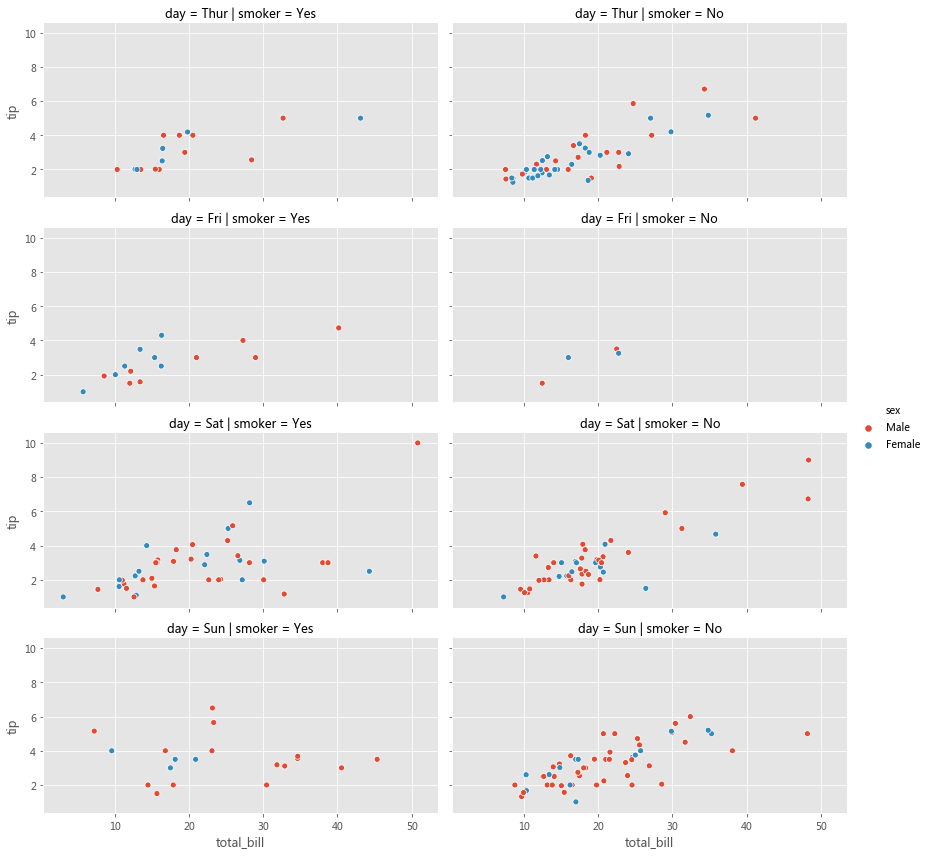
grid = sns.relplot(x='total_bill' , y='tip' , row='day' , col='smoker' , hue='sex' , data=tips, kind='scatter' , height=3 , aspect=2.0 )
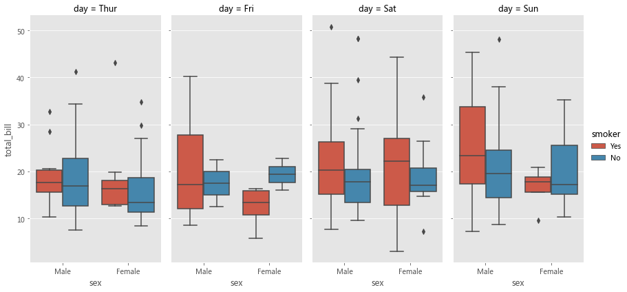
sns.catplot(col='day' , kind='box' , data=tips, x='sex' , y='total_bill' , hue='smoker' , height=6 , aspect=0.5 )
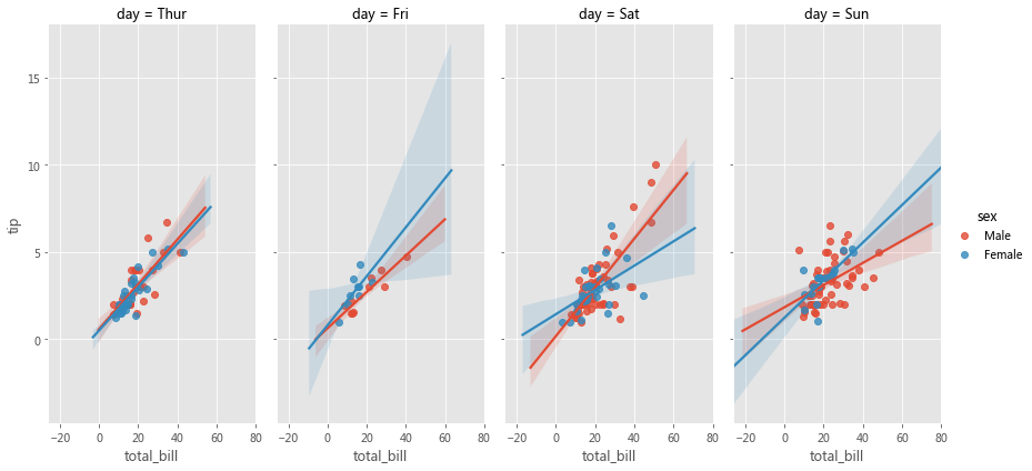
sns.lmplot(col='day' , data=tips, x='total_bill' , y='tip' , hue='sex' , height=6 , aspect=0.5 )
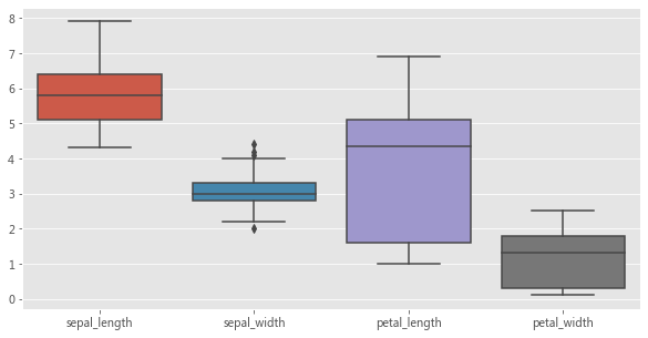
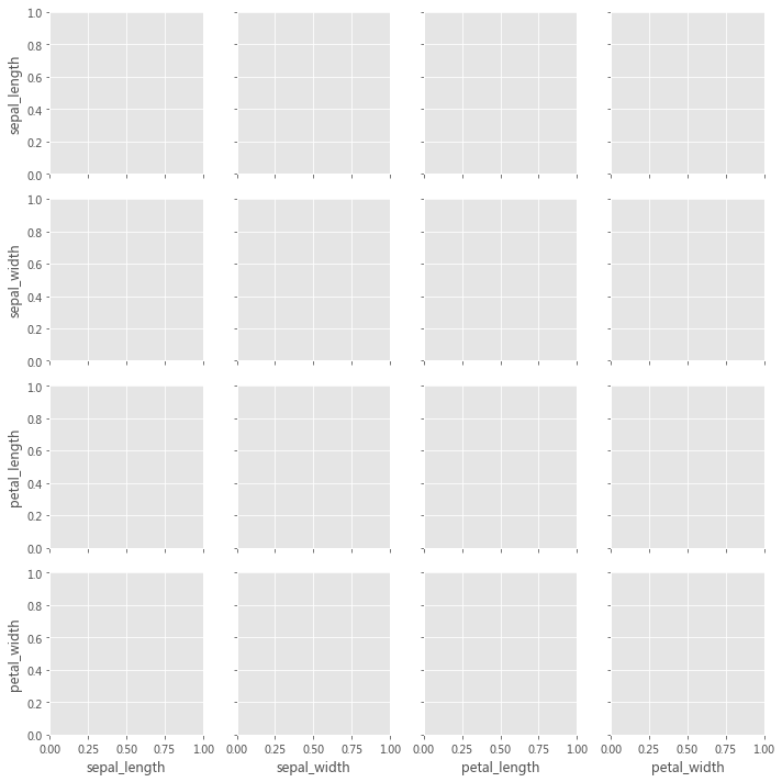
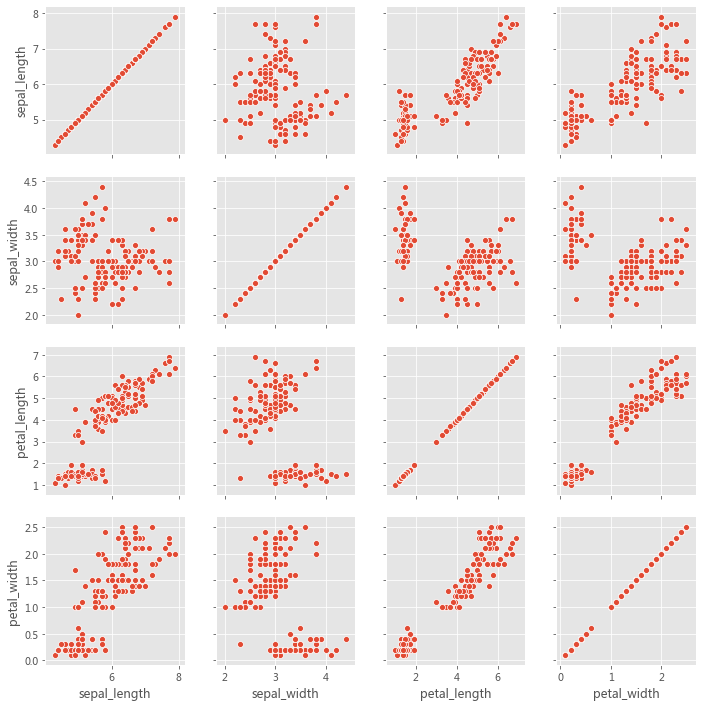
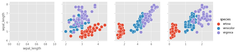
2.2.2 PairGrid PairGrid 用于绘制数据集中变量之间的成对关系。每个子图显示一对变量之间的关系。考虑以下用例,我们希望可视化每对变量之间的关系(通过散点图) 。虽然可以在 Matplotlib 中也能完成此操作,但如果用 Seaborn 就会变得更加便捷。
iris = sns.load_dataset('iris' )
此处的实现主要分为两步,
2、在每个图轴上,使用与该对变量对应的数据绘制散点图
第 1 步可以使用 PairGrid( ) 来完成。第 2 步可以使用 PairGrid.map( ) 来完成。
因此,PairGrid( ) 为每对变量创建图轴,而 PairGrid.map( ) 使用与该对变量相对应的数据在每个图轴上绘制曲线。我们可以将不同的图轴级函数传递给 PairGrid.map( )。
grid = sns.PairGrid(iris)
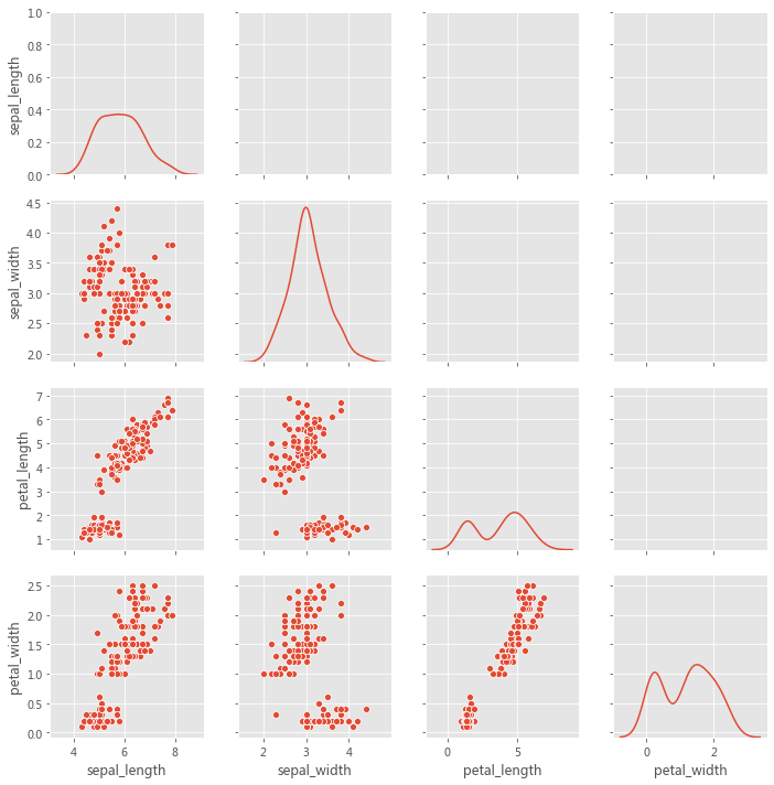
grid = sns.PairGrid(iris, diag_sharey=True , despine=False )
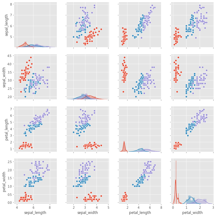
grid = sns.PairGrid(iris, hue='species' )
该图不必是正方形的:可以使用单独的变量来定义行和列,
x_vars = ['sepal_length' , 'sepal_width' , 'petal_length' , 'petal_width' ]'sepal_length' ]'species' , x_vars=x_vars, y_vars=y_vars, height=3 )150 )# grid.map_diag(sns.kdeplot)
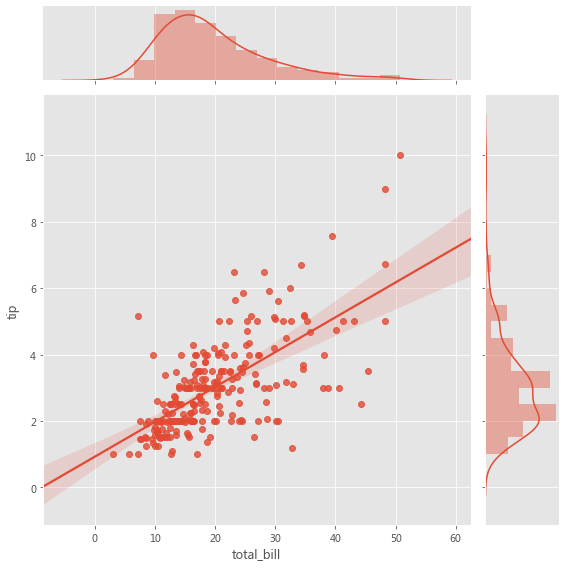
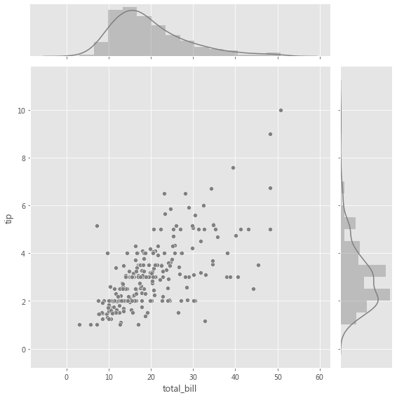
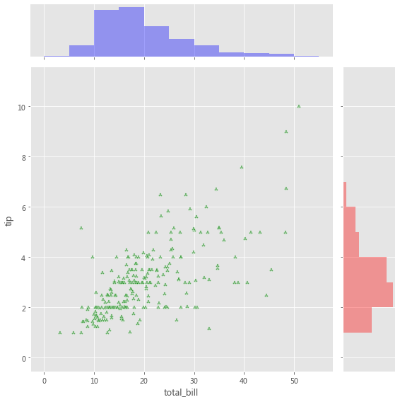
2.2.3 JointGrid 当我们要在同一图中绘制双变量联合分布和边际分布时,使用 JointGrid。可以使用 scatter plot、regplot 或 kdeplot 可视化两个变量的联合分布。变量的边际分布可以通过直方图和/或 kde 图可视化。
用于联合分布的图轴级函数必须传递给 JointGrid.plot_joint( ) 。
用于边际分布的轴级函数必须传递给 JointGrid.plot_marginals( ) 。
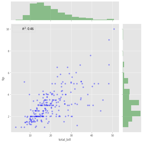
grid = sns.JointGrid(x="total_bill" , y="tip" , data=tips, height=8 )
grid = sns.JointGrid(x="total_bill" , y="tip" , data=tips, height=8 )".5" , edgecolor="white" )True , color=".5" )
g = sns.JointGrid(x="total_bill" , y="tip" , data=tips, height=8 )"g" , marker='$\clubsuit$' , edgecolor="white" , alpha=.6 )"total_bill" ], color="b" , alpha=.36 ,0 , 60 , 5 ))"tip" ], color="r" , alpha=.36 ,"horizontal" ,0 , 12 , 1 ))
添加带有统计信息的注释(Annotation) ,该注释汇总了双变量关系,
from scipy import stats"total_bill" , y="tip" , data=tips, height=8 )"b" , alpha=0.36 , s=40 , edgecolor="white" )False , color="g" )lambda a, b: stats.pearsonr(a, b)[0 ] ** 2 "{stat}: {val:.2f}" , stat="$R^2$" , loc="upper left" , fontsize=12 )
3 小结 探索性数据分析(EDA) 涉及两个基本步骤,
数据可视化 (使用不同类型的图来展示数据中的关系) 。
Seaborn 与 Pandas 的集成有助于以最少的代码制作复杂的多维图,
Seaborn 中的每个绘图函数都是图轴级函数或图形级函数。
图轴级函数绘制到单个 Matplotlib 图轴上,并且不影响图形的其余部分。
⟳参考资料⟲ [1] Meet Desai : https://towardsdatascience.com/matplotlib-seaborn-pandas-an-ideal-amalgamation-for-statistical-data-visualisation-f619c8e8baa3