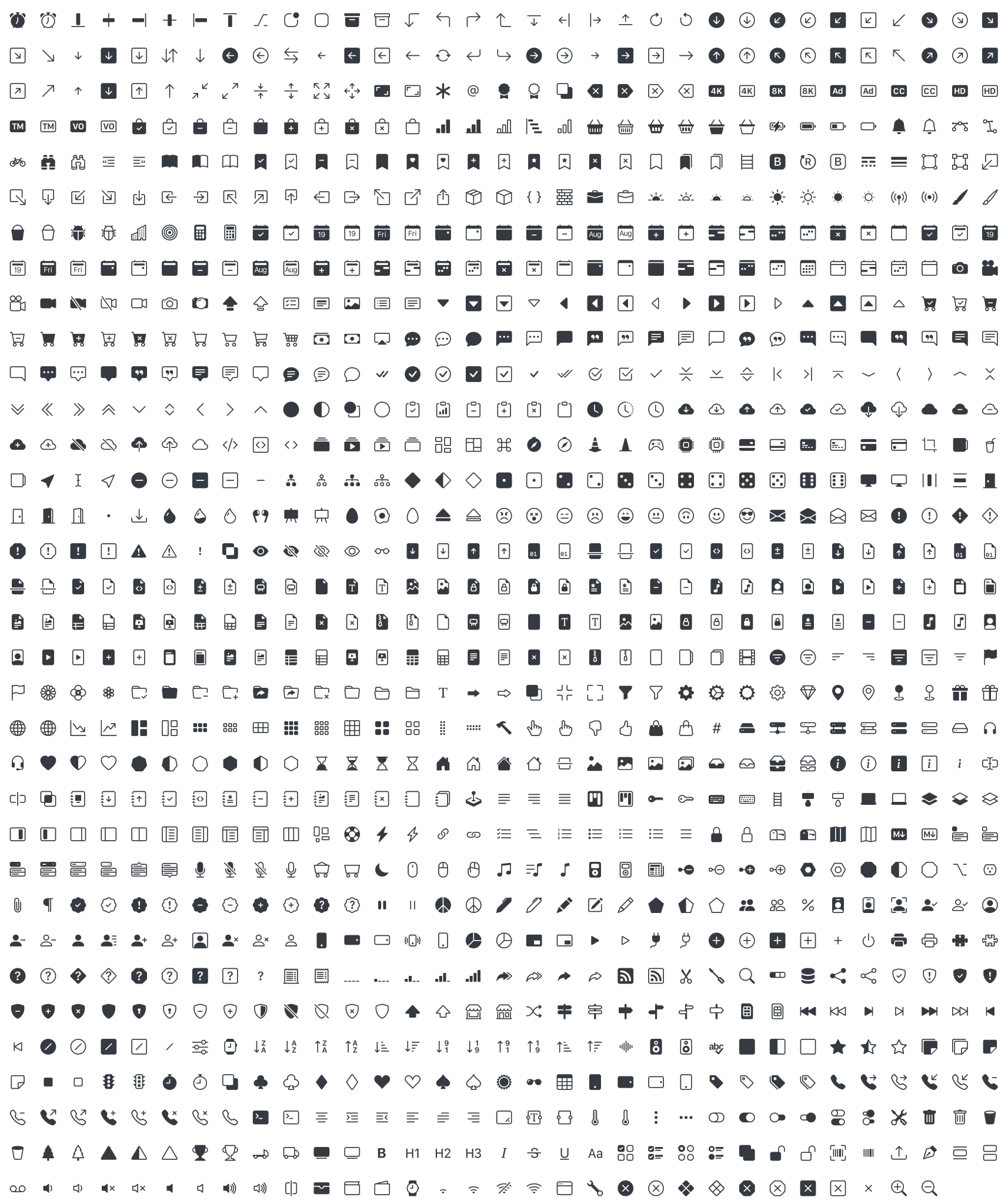
经历了 5 个 alpha 版本后,Bootstrap Icons 已于近日正式发布 v1.0.0 稳定版。目前该图标库已拥有超过 1100 个图标,团队计划在即将发布的小版本中再为其增加数百个图标。
![]()
自第五个 alpha 版本发布以来,团队已经重新绘制了超过三分之一的图标,主要是因为对路径和形状进行了微调。这里的大部分重绘和改进都是为图标字体(icon font)做准备,但遗憾的是,由于从 SVG 生成字体的工具未够完善,所以图标字体被推迟到了 v1.1.0 版本。
安装
通过 npm 安装:
npm i bootstrap-icons
或者从 GitHub 下载新版本,或仅下载 SVG 文件(不包含仓库的其他文件)。
用法
根据自己的设置,可以通过多种方式将 Bootstrap Icons 添加到项目:
<svg class="bi bi-chevron-right" width="32" height="32" viewBox="0 0 20 20" fill="currentColor" xmlns="http://www.w3.org/2000/svg"><path fill-rule="evenodd" d="M6.646 3.646a.5.5 0 01.708 0l6 6a.5.5 0 010 .708l-6 6a.5.5 0 01-.708-.708L12.293 10 6.646 4.354a.5.5 0 010-.708z"/></svg>
<img src="/assets/img/bootstrap.svg" alt="" width="32" height="32" title="Bootstrap">
<svg class="bi" width="32" height="32" fill="currentColor">
  <use xlink:href="bootstrap-icons.svg#heart-fill"/>
</svg>
<svg class="bi" width="32" height="32" fill="currentColor">
  <use xlink:href="bootstrap-icons.svg#toggles"/>
</svg>
<svg class="bi" width="32" height="32" fill="currentColor">
  <use xlink:href="bootstrap-icons.svg#shop"/>
</svg>
.bi::before {
  display: inline-block;
  content: "";
  background-image: url("data:image/svg+xml,<svg viewBox='0 0 16 16' fill='%23333' xmlns='http://www.w3.org/2000/svg'><path fill-rule='evenodd' d='M8 9.5a1.5 1.5 0 1 0 0-3 1.5 1.5 0 0 0 0 3z' clip-rule='evenodd'/></svg>");
  background-repeat: no-repeat;
  background-size: 1rem 1rem;
}
详情查看发布公告。
