01前言
在之前的一篇文章《Python 数据可视化利器》中,我写了 Bokeh、pyecharts 的用法,但是有一个挺强大的库 Plotly 没写,主要是我看到它的教程都是在 Jupyter Notebooks 中使用,说来也奇怪,硬是找不到如何本地使用(就是本地输出 HTML 文件),所以不敢写出来。现在已经找到方法了,这里我就在原文的基础上增加了 Plotly 的部分教程。
数据可视化的第三方库挺多的,这里我主要推荐两个,分别是 Bokeh、pyecharts。
02推荐
数据可视化的库有挺多的,这里推荐几个比较常用的:
● Matplotlib
● Plotly
● Seaborn
● Ggplot
● Bokeh
● Pyechart
● Pygal
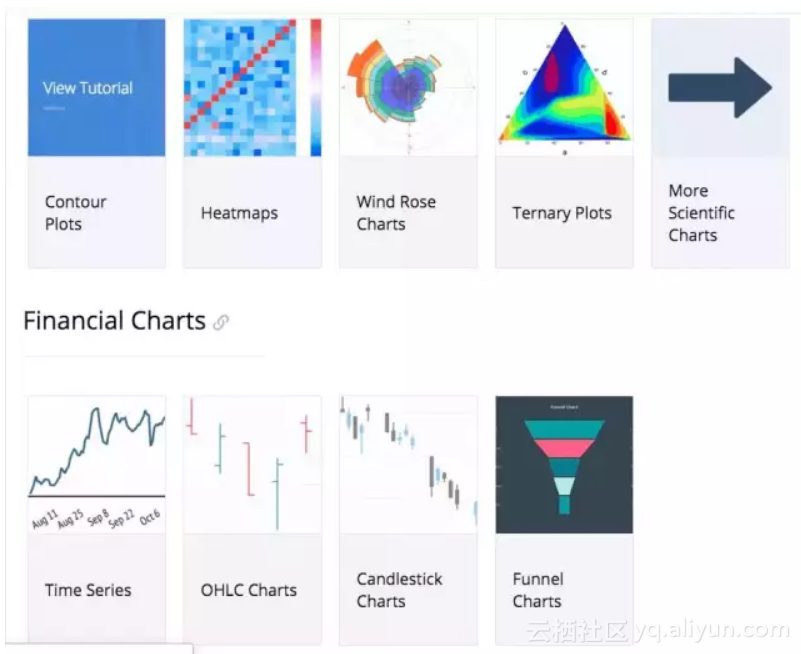
03Plotly
Plotly 文档地址:
● https://plot.ly/python/#financial-charts
![f22f9790f118bd0bc9c1d6712a5b6b8f993326e1]()
使用方式:
Plotly 有 online 和 offline 两种方式,这里只介绍 offline 的。
![4294db1349301898168a88ab884de1b1a047ef06]()
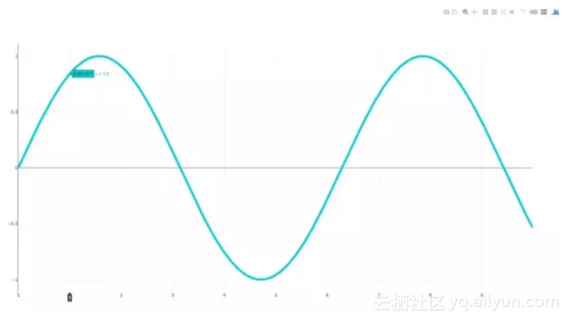
这是 Plotly 官方教程的一部分
import plotly.plotly as py
import numpy as np

data = [dict(

visible=False,

line=dict(color='#00CED1', width=6), # 配置线宽和颜色

name='𝜈 = ' + str(step),

x=np.arange(0, 10, 0.01), # x 轴参数

y=np.sin(step * np.arange(0, 10, 0.01))) for step in np.arange(0, 5, 0.1)] # y 轴参数

data[10]['visible'] = True

py.iplot(data, filename='Single Sine Wave')
只要将最后一行中的
py.iplot
替换为下面代码
py.offline.plot
便可以运行。
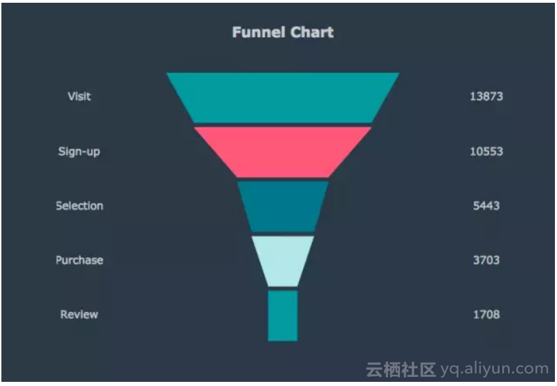
漏斗图
这个图代码太长了,就不 po 出来了。
![0bb2f58ecfef8c92b86a6a48c1b60e8a34061876]()
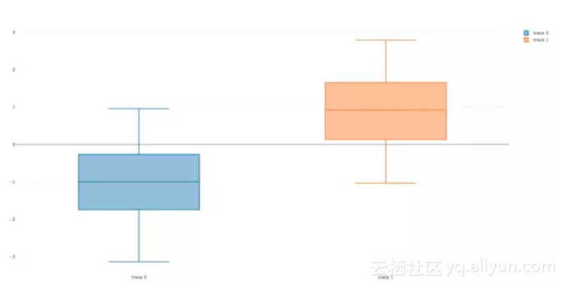
Basic Box Plot
![30b4a94f95d80959ea5d39e3d9aaabfa86ed30f2]()
import plotly.plotly
import plotly.graph_objs as go
import numpy as np
y0 = np.random.randn(50)-1
y1 = np.random.randn(50)+1
trace0 = go.Box(
y=y0
)
trace1 = go.Box(
y=y1
)
data = [trace0, trace1]
plotly.offline.plot(data)
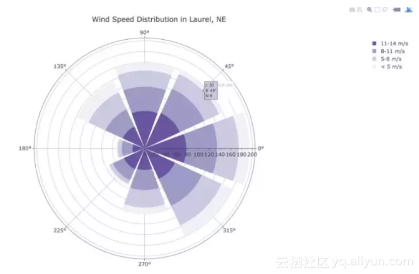
Wind Rose Chart
![2309bcaa9598d6a750ccc358eae106b1a5fb63e5]()
import plotly.graph_objs as go
trace1 = go.Barpolar(
r=[77.5, 72.5, 70.0, 45.0, 22.5, 42.5, 40.0, 62.5],
text=['North', 'N-E', 'East', 'S-E', 'South', 'S-W', 'West', 'N-W'],
name='11-14 m/s',
marker=dict(
color='rgb(106,81,163)'
)
)
trace2 = go.Barpolar(
r=[57.49999999999999, 50.0, 45.0, 35.0, 20.0, 22.5, 37.5, 55.00000000000001],
text=['North', 'N-E', 'East', 'S-E', 'South', 'S-W', 'West', 'N-W'], # 鼠标浮动标签文字描述
name='8-11 m/s',
marker=dict(
color='rgb(158,154,200)'
)
)
trace3 = go.Barpolar(
r=[40.0, 30.0, 30.0, 35.0, 7.5, 7.5, 32.5, 40.0],
text=['North', 'N-E', 'East', 'S-E', 'South', 'S-W', 'West', 'N-W'],
name='5-8 m/s',
marker=dict(
color='rgb(203,201,226)'
)
)
trace4 = go.Barpolar(
r=[20.0, 7.5, 15.0, 22.5, 2.5, 2.5, 12.5, 22.5],
text=['North', 'N-E', 'East', 'S-E', 'South', 'S-W', 'West', 'N-W'],
name='< 5 m/s',
marker=dict(
color='rgb(242,240,247)'
)
)
data = [trace1, trace2, trace3, trace4]
layout = go.Layout(
title='Wind Speed Distribution in Laurel, NE',
font=dict(
size=16
),
legend=dict(
font=dict(
size=16
)
),
radialaxis=dict(
ticksuffix='%'
),
orientation=270
)
fig = go.Figure(data=data, layout=layout)
plotly.offline.plot(fig, filename='polar-area-chart')
Basic Ternary Plot with Markers
篇幅有点长,这里就不 po 代码了。
![34c4cd44fad86e9a009ba5c722b161e70d721f76]()
04Bokeh
这里展示一下常用的图表和比较抢眼的图表,详细的文档可查看。
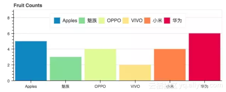
条形图
这配色看着还挺舒服的,比 pyecharts 条形图的配色好看一点。
![2c49abfc1ef768d44d8b610ed37da574bc51cb98]()
from bokeh.io import show, output_file
from bokeh.models import ColumnDataSource
from bokeh.palettes import Spectral6
from bokeh.plotting import figure
output_file("colormapped_bars.html")# 配置输出文件名
fruits = ['Apples', '魅族', 'OPPO', 'VIVO', '小米', '华为'] # 数据
counts = [5, 3, 4, 2, 4, 6] # 数据
source = ColumnDataSource(data=dict(fruits=fruits, counts=counts, color=Spectral6))
p = figure(x_range=fruits, y_range=(0,9), plot_height=250, title="Fruit Counts",
toolbar_location=None, tools="")# 条形图配置项
p.vbar(x='fruits', top='counts', width=0.9, color='color', legend="fruits", source=source)
p.xgrid.grid_line_color = None # 配置网格线颜色
p.legend.orientation = "horizontal" # 图表方向为水平方向
p.legend.location = "top_center"
show(p) # 展示图表
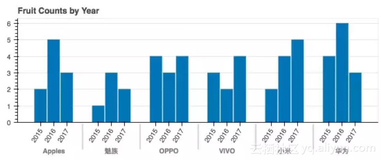
年度条形图
可以对比不同时间点的量。
![ce5caddf815b74eeccc1981f4fc73bf5d09de13d]()
from bokeh.io import show, output_file
from bokeh.models import ColumnDataSource, FactorRange
from bokeh.plotting import figure
output_file("bars.html") # 输出文件名
fruits = ['Apple', '魅族', 'OPPO', 'VIVO', '小米', '华为'] # 参数
years = ['2015', '2016', '2017'] # 参数
data = {'fruits': fruits,
'2015': [2, 1, 4, 3, 2, 4],
'2016': [5, 3, 3, 2, 4, 6],
'2017': [3, 2, 4, 4, 5, 3]}
x = [(fruit, year) for fruit in fruits for year in years]
counts = sum(zip(data['2015'], data['2016'], data['2017']), ())
source = ColumnDataSource(data=dict(x=x, counts=counts))
p = figure(x_range=FactorRange(*x), plot_height=250, title="Fruit Counts by Year",
toolbar_location=None, tools="")
p.vbar(x='x', top='counts', width=0.9, source=source)
p.y_range.start = 0
p.x_range.range_padding = 0.1
p.xaxis.major_label_orientation = 1
p.xgrid.grid_line_color = None
show(p)
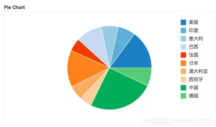
饼图
![2a9d04dd5f8c256f4c85f85c88d68c10c17fc89a]()
from collections import Counter
from math import pi
import pandas as pd
from bokeh.io import output_file, show
from bokeh.palettes import Category20c
from bokeh.plotting import figure
from bokeh.transform import cumsum
output_file("pie.html")
x = Counter({
'中国': 157,
'美国': 93,
'日本': 89,
'巴西': 63,
'德国': 44,
'印度': 42,
'意大利': 40,
'澳大利亚': 35,
'法国': 31,
'西班牙': 29
})
data = pd.DataFrame.from_dict(dict(x), orient='index').reset_index().rename(index=str, columns={0:'value', 'index':'country'})
data['angle'] = data['value']/sum(x.values()) * 2*pi
data['color'] = Category20c[len(x)]
p = figure(plot_height=350, title="Pie Chart", toolbar_location=None,
tools="hover", tooltips="@country: @value")
p.wedge(x=0, y=1, radius=0.4,
start_angle=cumsum('angle', include_zero=True), end_angle=cumsum('angle'),
line_color="white", fill_color='color', legend='country', source=data)
p.axis.axis_label=None
p.axis.visible=False
p.grid.grid_line_color = None
show(p)
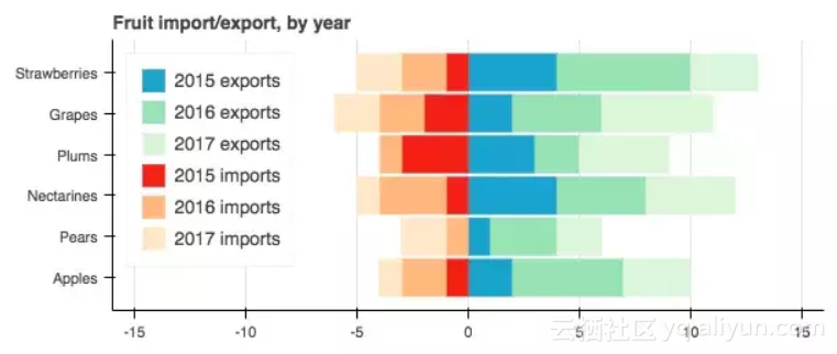
条形图
![99498b354ffc8a41f4810205d041ebe32ae8a331]()
年度水果进出口
from bokeh.io import output_file, show
from bokeh.models import ColumnDataSource
from bokeh.palettes import GnBu3, OrRd3
from bokeh.plotting import figure

output_file("stacked_split.html")

fruits = ['Apples', 'Pears', 'Nectarines', 'Plums', 'Grapes', 'Strawberries']
years = ["2015", "2016", "2017"]

exports = {'fruits': fruits,
'2015': [2, 1, 4, 3, 2, 4],
'2016': [5, 3, 4, 2, 4, 6],
'2017': [3, 2, 4, 4, 5, 3]}

imports = {'fruits': fruits,
'2015': [-1, 0, -1, -3, -2, -1],
'2016': [-2, -1, -3, -1, -2, -2],
'2017': [-1, -2, -1, 0, -2, -2]}

p = figure(y_range=fruits, plot_height=250, x_range=(-16, 16), title="Fruit import/export, by year",

toolbar_location=None)

p.hbar_stack(years, y='fruits', height=0.9, color=GnBu3, source=ColumnDataSource(exports),

legend=["%s exports" % x for x in years])

p.hbar_stack(years, y='fruits', height=0.9, color=OrRd3, source=ColumnDataSource(imports),

legend=["%s imports" % x for x in years])

p.y_range.range_padding = 0.1

p.ygrid.grid_line_color = None

p.legend.location = "top_left"

p.axis.minor_tick_line_color = None

p.outline_line_color = None
show(p)
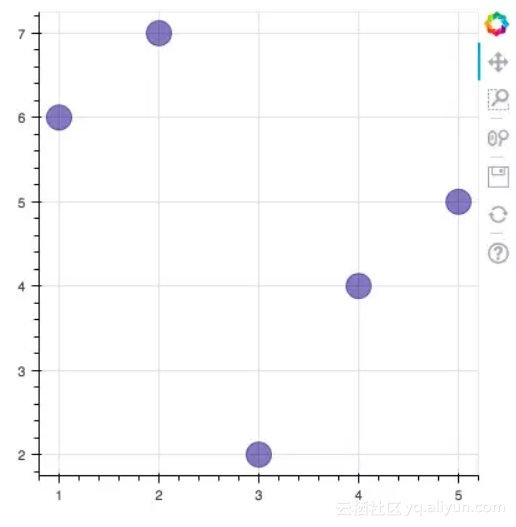
散点图
![6644c9a067e9f2fb5264c65a9ec60e076a549413]()
from bokeh.plotting import figure, output_file, show
output_file("line.html")
p = figure(plot_width=400, plot_height=400)
p.circle([1, 2, 3, 4, 5], [6, 7, 2, 4, 5], size=20, color="navy", alpha=0.5)
show(p)
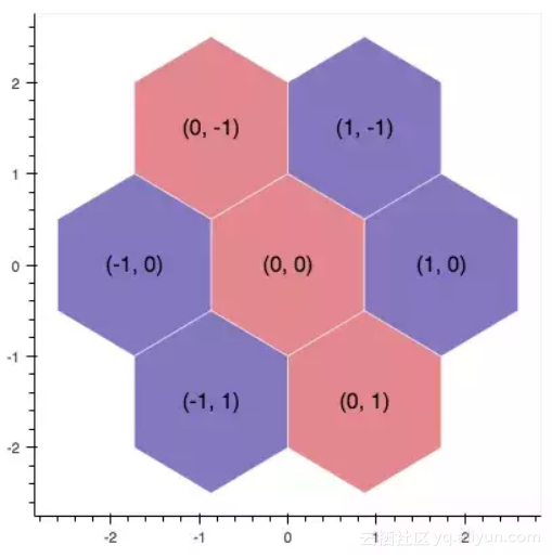
六边形图
这两天,马蜂窝刚被发现数据造假,这不,与马蜂窝应应景。
![b803f6d7f149989141f523bfae9f7bd562037764]()
import numpy as np
from bokeh.io import output_file, show
from bokeh.plotting import figure
from bokeh.util.hex import axial_to_cartesian
output_file("hex_coords.html")
q = np.array([0, 0, 0, -1, -1, 1, 1])
r = np.array([0, -1, 1, 0, 1, -1, 0])
p = figure(plot_width=400, plot_height=400, toolbar_location=None) #
p.grid.visible = False # 配置网格是否可见
p.hex_tile(q, r, size=1, fill_color=["firebrick"] * 3 + ["navy"] * 4,
line_color="white", alpha=0.5)
x, y = axial_to_cartesian(q, r, 1, "pointytop")
p.text(x, y, text=["(%d, %d)" % (q, r) for (q, r) in zip(q, r)],
text_baseline="middle", text_align="center")
show(p)
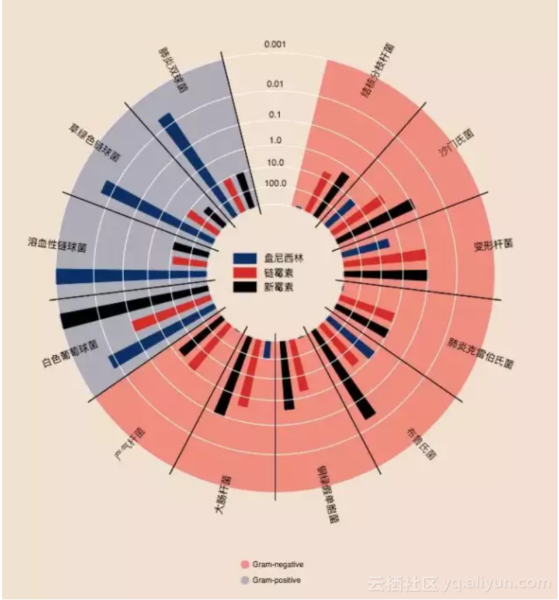
环比条形图
这个实现挺厉害的,看了一眼就吸引了我。我在代码中都做了一些注释,希望对你理解有帮助。注:圆心为正中央,即直角坐标系中标签为(0,0)的地方。
![8398d0007e33fd143426e279ef87467dbbdf7619]()
from collections import OrderedDict
from math import log, sqrt
import numpy as np
import pandas as pd
from six.moves import cStringIO as StringIO
from bokeh.plotting import figure, show, output_file
antibiotics = """
bacteria, penicillin, streptomycin, neomycin, gram
结核分枝杆菌, 800, 5, 2, negative
沙门氏菌, 10, 0.8, 0.09, negative
变形杆菌, 3, 0.1, 0.1, negative
肺炎克雷伯氏菌, 850, 1.2, 1, negative
布鲁氏菌, 1, 2, 0.02, negative
铜绿假单胞菌, 850, 2, 0.4, negative
大肠杆菌, 100, 0.4, 0.1, negative
产气杆菌, 870, 1, 1.6, negative
白色葡萄球菌, 0.007, 0.1, 0.001, positive
溶血性链球菌, 0.001, 14, 10, positive
草绿色链球菌, 0.005, 10, 40, positive
肺炎双球菌, 0.005, 11, 10, positive
"""
drug_color = OrderedDict([# 配置中间标签名称与颜色
("盘尼西林", "#0d3362"),
("链霉素", "#c64737"),
("新霉素", "black"),
])
gram_color = {
"positive": "#aeaeb8",
"negative": "#e69584",
}
# 读取数据
df = pd.read_csv(StringIO(antibiotics),
skiprows=1,
skipinitialspace=True,
engine='python')
width = 800
height = 800
inner_radius = 90
outer_radius = 300 - 10
minr = sqrt(log(.001 * 1E4))
maxr = sqrt(log(1000 * 1E4))
a = (outer_radius - inner_radius) / (minr - maxr)
b = inner_radius - a * maxr
def rad(mic):
return a * np.sqrt(np.log(mic * 1E4)) + b
big_angle = 2.0 * np.pi / (len(df) + 1)
small_angle = big_angle / 7
# 整体配置
p = figure(plot_width=width, plot_height=height, title="",
x_axis_type=None, y_axis_type=None,
x_range=(-420, 420), y_range=(-420, 420),
min_border=0, outline_line_color="black",
background_fill_color="#f0e1d2")
p.xgrid.grid_line_color = None
p.ygrid.grid_line_color = None
# annular wedges
angles = np.pi / 2 - big_angle / 2 - df.index.to_series() * big_angle #计算角度
colors = [gram_color[gram] for gram in df.gram] # 配置颜色
p.annular_wedge(
0, 0, inner_radius, outer_radius, -big_angle + angles, angles, color=colors,
)
# small wedges
p.annular_wedge(0, 0, inner_radius, rad(df.penicillin),
-big_angle + angles + 5 * small_angle, -big_angle + angles + 6 * small_angle,
color=drug_color['盘尼西林'])
p.annular_wedge(0, 0, inner_radius, rad(df.streptomycin),
-big_angle + angles + 3 * small_angle, -big_angle + angles + 4 * small_angle,
color=drug_color['链霉素'])
p.annular_wedge(0, 0, inner_radius, rad(df.neomycin),
-big_angle + angles + 1 * small_angle, -big_angle + angles + 2 * small_angle,
color=drug_color['新霉素'])
# 绘制大圆和标签
labels = np.power(10.0, np.arange(-3, 4))
radii = a * np.sqrt(np.log(labels * 1E4)) + b
p.circle(0, 0, radius=radii, fill_color=None, line_color="white")
p.text(0, radii[:-1], [str(r) for r in labels[:-1]],
text_font_size="8pt", text_align="center", text_baseline="middle")
# 半径
p.annular_wedge(0, 0, inner_radius - 10, outer_radius + 10,
-big_angle + angles, -big_angle + angles, color="black")
# 细菌标签
xr = radii[0] * np.cos(np.array(-big_angle / 2 + angles))
yr = radii[0] * np.sin(np.array(-big_angle / 2 + angles))
label_angle = np.array(-big_angle / 2 + angles)
label_angle[label_angle < -np.pi / 2] += np.pi # easier to read labels on the left side
# 绘制各个细菌的名字
p.text(xr, yr, df.bacteria, angle=label_angle,
text_font_size="9pt", text_align="center", text_baseline="middle")
# 绘制圆形,其中数字分别为 x 轴与 y 轴标签
p.circle([-40, -40], [-370, -390], color=list(gram_color.values()), radius=5)
# 绘制文字
p.text([-30, -30], [-370, -390], text=["Gram-" + gr for gr in gram_color.keys()],
text_font_size="7pt", text_align="left", text_baseline="middle")
# 绘制矩形,中间标签部分。其中 -40,-40,-40 为三个矩形的 x 轴坐标。18,0,-18 为三个矩形的 y 轴坐标
p.rect([-40, -40, -40], [18, 0, -18], width=30, height=13,
color=list(drug_color.values()))
# 配置中间标签文字、文字大小、文字对齐方式
p.text([-15, -15, -15], [18, 0, -18], text=list(drug_color),
text_font_size="9pt", text_align="left", text_baseline="middle")
output_file("burtin.html", title="burtin.py example")
show(p)
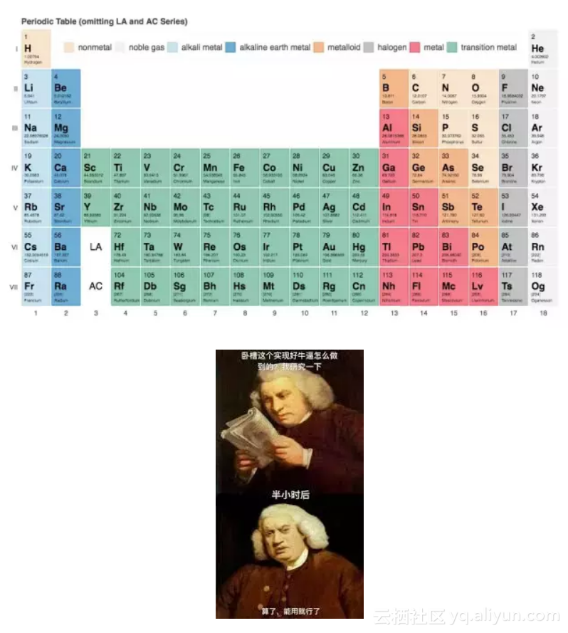
元素周期表
元素周期表,这个实现好牛逼啊,距离初三刚开始学化学已经很遥远了,想当年我还是化学课代表呢!由于基本用不到化学了,这里就不实现了。
![356ca8c3caf445bdcc92bc0aac0f2facfab78d1f]()
真实状态
05Pyecharts
pyecharts 也是一个比较常用的数据可视化库,用得也是比较多的了,是百度 Echarts 库的 Python 支持。这里也展示一下常用的图表。
文档地址为:
● http://pyecharts.org/#/zh-cn/prepare?id=%E5%AE%89%E8%A3%85-pyecharts
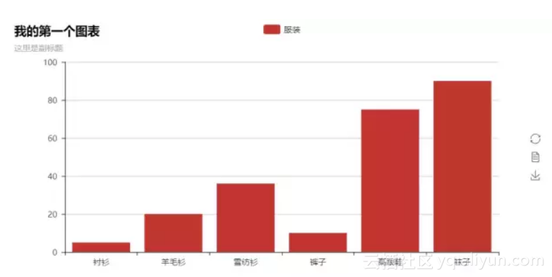
条形图
![c2a948e4311af61af171a7c41f3edd473d342187]()
from pyecharts import Bar
bar = Bar("我的第一个图表", "这里是副标题")
bar.add("服装", ["衬衫", "羊毛衫", "雪纺衫", "裤子", "高跟鞋", "袜子"], [5, 20, 36, 10, 75, 90])
# bar.print_echarts_options() # 该行只为了打印配置项,方便调试时使用
bar.render() # 生成本地 HTML 文件
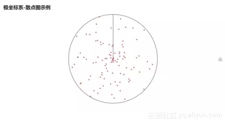
散点图
![8eaa8307230343db329fc55b3c1cf971b65ecc55]()
from pyecharts import Polar
import random
data_1 = [(10, random.randint(1, 100)) for i in range(300)]
data_2 = [(11, random.randint(1, 100)) for i in range(300)]
polar = Polar("极坐标系-散点图示例", width=1200, height=600)
polar.add("", data_1, type='scatter')
polar.add("", data_2, type='scatter')
polar.render()
饼图
![782300554139ab2db9f133df52a2579dce66bb62]()
import random
from pyecharts import Pie
attr = ['A', 'B', 'C', 'D', 'E', 'F']
pie = Pie("饼图示例", width=1000, height=600)
pie.add(
"",
attr,
[random.randint(0, 100) for _ in range(6)],
radius=[50, 55],
center=[25, 50],
is_random=True,
)
pie.add(
"",
attr,
[random.randint(20, 100) for _ in range(6)],
radius=[0, 45],
center=[25, 50],
rosetype="area",
)
pie.add(
"",
attr,
[random.randint(0, 100) for _ in range(6)],
radius=[50, 55],
center=[65, 50],
is_random=True,
)
pie.add(
"",
attr,
[random.randint(20, 100) for _ in range(6)],
radius=[0, 45],
center=[65, 50],
rosetype="radius",
)
pie.render()
词云
这个是我在前面的文章中用到的图片实例,这里就不 po 具体数据了。
![842c467a9dc2e33203730dc5e2330d63c8c213cc]()
from pyecharts import WordCloud
name = ['Sam S Club'] # 词条
value = [10000] # 权重
wordcloud = WordCloud(width=1300, height=620)
wordcloud.add("", name, value, word_size_range=[20, 100])
wordcloud.render()
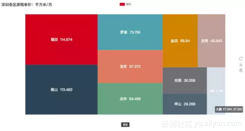
树图
这个是我在前面的文章中用到的图片实例,这里就不 po 具体数据了。
![64f180818a00ab253b359fde216b39511044508e]()
from pyecharts import TreeMap
data = [ # 键值对数据结构
{
value: 1212, # 数值
# 子节点
children: [
{
# 子节点数值
value: 2323,
# 子节点名
name: 'description of this node',
children: [...],
},
{
value: 4545,
name: 'description of this node',
children: [
{
value: 5656,
name: 'description of this node',
children: [...]
},
...
]
}
]
},
...
]
treemap = TreeMap(title, width=1200, height=600) # 设置标题与宽高
treemap.add("深圳", data, is_label_show=True, label_pos='inside', label_text_size=19)
treemap.render()
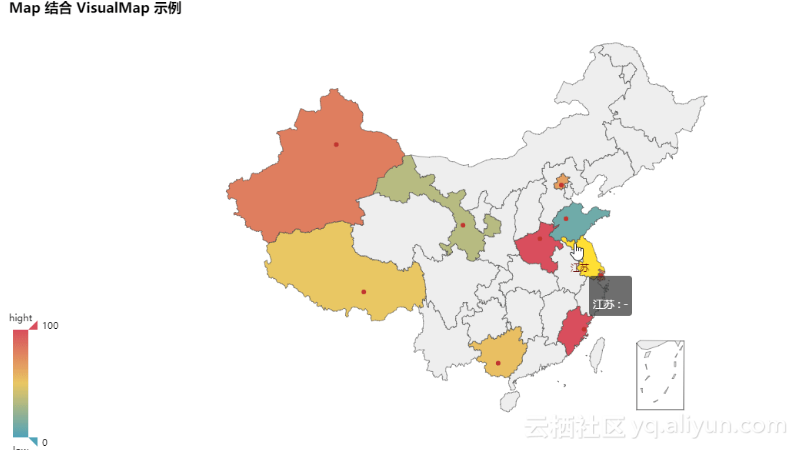
地图
![a8b699655ff0e6bc09c669848784b6d7e29fad8b]()
from pyecharts import Map
value = [155, 10, 66, 78, 33, 80, 190, 53, 49.6]
attr = [
"福建", "山东", "北京", "上海", "甘肃", "新疆", "河南", "广西", "西藏"
]
map = Map("Map 结合 VisualMap 示例", width=1200, height=600)
map.add(
"",
attr,
value,
maptype="china",
is_visualmap=True,
visual_text_color="#000",
)
map.render()
3D 散点图
from pyecharts import Scatter3D

import random

data = [

[random.randint(0, 100),

random.randint(0, 100),

random.randint(0, 100)] for _ in range(80)

]

range_color = [
'#313695', '#4575b4', '#74add1', '#abd9e9', '#e0f3f8', '#ffffbf',
'#fee090', '#fdae61', '#f46d43', '#d73027', '#a50026']

scatter3D = Scatter3D("3D 散点图示例", width=1200, height=600) # 配置宽高

scatter3D.add("", data, is_visualmap=True, visual_range_color=range_color) # 设置颜色等

scatter3D.render() # 渲染
06后记
大概介绍就是这样了,三个库的功能都挺强大的,Bokeh 的中文资料会少一点,如果阅读英文有点难度,还是建议使用 pyecharts 就好。总体也不是很难,按照文档来修改数据都能够直接上手使用。主要是多练习。
原文发布时间为:2018-10-29
本文作者:zone
本文来自云栖社区合作伙伴“CDA数据分析师”,了解相关信息可以关注“CDA数据分析师”。