本文由体验技术团队Kagol同学创作~
前端组件库作为 Web 应用开发重要的基石,发挥了用户体验统一和开发效率提升的双层价值,但业务场景变化和需求变化万千,没有任何组件库可以满足所有业务场景,但我们依然可以通过精心的 API 设计,让组件在易用性和灵活性这两个看似矛盾的能力中取得平衡,覆盖尽可能丰富的业务场景,在业务开发中发挥更大的价值。
本文主要以 Carousel 走马灯组件为例,给大家分享我的组件设计经验,如何通过子组件+插槽的设计思想,让组件在易用性和灵活性之间取得平衡。
先来看下我们要实现的 VueCarousel 组件的效果图:
![]()
可以看到它的功能是很强大的,可以应用于丰富的业务场景,接下来就带大家一起来设计和实现 VueCarousel。
实现步骤
1、创建初始项目工程
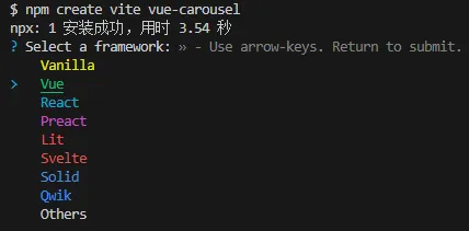
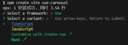
先使用 vite 命令行工具创建一个初始项目工程。
npm create vite vue-carousel
![]()
![]()
cd vue-carousel
npm i
npm run dev
然后安装必要的依赖。
npm i -D @vitejs/plugin-vue-jsx sass
配置下 vite.config.ts
import { defineConfig } from 'vite'
import vue from '@vitejs/plugin-vue'
++ import vueJsx from '@vitejs/plugin-vue-jsx'
++ import path from 'path'

// https://vitejs.dev/config/
export default defineConfig({
--  plugins: [vue()],
++  plugins: [vue(), vueJsx()],
++  resolve: {
++    alias: [
++      { find: '@kagol/vue-carousel', replacement: path.resolve(__dirname, 'carousel') }
++    ]
  }
})
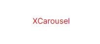
2、创建空的 Carousel 组件
在实现具体的组件功能之前,我们先创建一个空的组件结构,走通组件本地效果预览的流程。
先看下这个组件怎么使用。
在 src/main.ts 中导入和注册组件插件:
import { createApp } from 'vue'
++ import Carousel from '@kagol/vue-carousel'
import './style.css'
import App from './App.vue'

-- createApp(App).mount('#app')
++ createApp(App).use(Carousel).mount('#app')
然后在 src/App.vue 中使用:
<template>
  <HelloWorld msg="Vite + Vue" />
++  <XCarousel />
</template>
接下来设计这个组件的目录结构:
vue-carousel
├── carousel
|  ├── index.ts
|  └── src
|     ├── carousel.scss
|     └── carousel.tsx
先编写入口文件 carousel/index.ts
import type { App } from 'vue'
import XCarousel from './src/carousel'

export { XCarousel }

export default {
  install(app: App) {
    app.component(XCarousel.name, XCarousel)
  }
}
然后是定义组件 carousel/src/carousel.tsx
import { defineComponent } from 'vue'
import './carousel.scss'

export default defineComponent({
  name: 'XCarousel',
  setup(props, context) {
    return () => {
      return <div class="x-carousel">XCarousel</div>
    }
  }
})
编写样式 carousel/src/carousel.scss
.x-carousel {
  color: red;
}
效果如下:
![]()
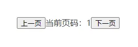
3、增加 usePage 实现基础分页能力
接下来实现组件逻辑,Carousel 组件本质上是一个简化的分页组件。
先实现分页逻辑 composables/use-page.ts
import { ref } from 'vue'

export default function usePage(defaultPageIndex = 1) {
  // 当前页码
  const pageIndex = ref(defaultPageIndex)

  // 跳到第几页
  const setPageIndex = (current: number) => {
    pageIndex.value = current
  }

  // 一次性往前(或往后)跳几页
  const jumpPage = (page: number) => {
    pageIndex.value += page
  }

  // 上一页
  const prevPage = () => jumpPage(-1)

  // 下一页
  const nextPage = () => jumpPage(1)

  return { pageIndex, setPageIndex, jumpPage, prevPage, nextPage }
}
然后配合 UI 展示 carousel.tsx
import { defineComponent } from 'vue'
++ import usePage from './composables/use-page'
import './carousel.scss'

export default defineComponent({
  name: 'XCarousel',
  setup(props, context) {
++    const { pageIndex, prevPage, nextPage } = usePage(1)

    return () => {
--      return <div class="x-carousel">XCarousel</div>
++      return <div class="x-carousel">
++        <button onClick={ prevPage }>上一页</button>
++        <span>当前页码:{ pageIndex.value }</span>
++        <button onClick={ nextPage }>下一页</button>
++      </div>
    }
  }
})
carousel/src/carousel.scss
.x-carousel {
--  color: red;
++  color: #3c3c43;
}
效果如下:
![]()
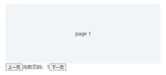
点击上一个、下一页按钮可以切换页码。
4、实现 Carousel 基础功能
我们再配合轮播内容,实现 Carousel 基础功能。
carousel.tsx
import { defineComponent, renderSlot, useSlots } from 'vue'
import usePage from './composables/use-page'
import './carousel.scss'

export default defineComponent({
  name: 'XCarousel',
  setup(props, context) {
    const { pageIndex, prevPage, nextPage } = usePage(1)

++    // 获取插槽内容中的元素数量
++    const count = useSlots().default().length

    return () => {
      return <div class="x-carousel">
++        <div class="x-carousel-item-container" style={{
++          width: count * 100 + '%', // 根据内容元素的数量计算容器宽度
++          left: - (pageIndex.value - 1) * 100 + '%', // 根据当前页码计算容器偏移的位置,从而显示特定的元素内容
++        }}>{renderSlot(useSlots(), 'default')}</div>
        <button onClick={ prevPage }>上一页</button>
        <span>当前页码:{ pageIndex.value }</span>
        <button onClick={ nextPage }>下一页</button>
      </div>
    }
  }
})
carousel/src/carousel.scss
.x-carousel {
++  overflow: hidden;
  color: #3c3c43;
}

++ .x-carousel-item-container {
++  display: flex;
++  position: relative;
++
++  & > * {
++    flex: 1;
++  }
++}
在 App.vue 中使用:
<template>
--  <XCarousel />
++  <XCarousel>
++    <div class="carousel-item">page 1</div>
++    <div class="carousel-item">page 2</div>
++    <div class="carousel-item">page 3</div>
++  </XCarousel>
</template>

<style scoped>
++.carousel-item {
++  text-align: center;
++  line-height: 200px;
++  background: #f3f6f8;
++}
</style>
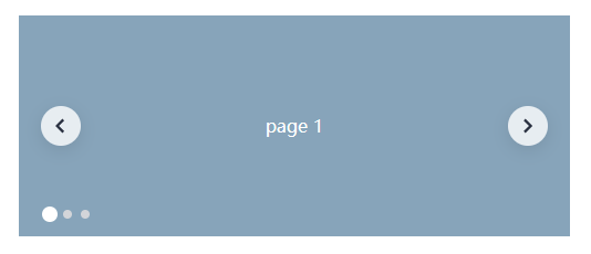
效果如下:
![]()
点击上一页、下一页,不仅页码会变化,上面的轮播内容也会跟随变化,基础功能已实现,接下来就是完善分页器样式,并增加页码指示器,让 Carousel 组件的功能更加完整。
5、增加分页器
用一个向左和向右的箭头图标代替之前的上一页、下一页按钮。
carousel.tsx
import { defineComponent, renderSlot, useSlots } from 'vue'
import usePage from './composables/use-page'
import './carousel.scss'

export default defineComponent({
  name: 'XCarousel',
  setup(props, context) {
    const { pageIndex, prevPage, nextPage } = usePage(1)

    // 获取插槽内容中的元素数量
    const count = useSlots().default().length

    return () => {
      return <div class="x-carousel">
        <div class="x-carousel-item-container" style={{
          width: count * 100 + '%', // 根据内容元素的数量计算容器宽度
          left: - (pageIndex.value - 1) * 100 + '%', // 根据当前页码计算容器偏移的位置,从而显示特定的元素内容
        }}>{renderSlot(useSlots(), 'default')}</div>
--        <button onClick={ prevPage }>上一页</button>
--        <span>当前页码:{ pageIndex.value }</span>
--        <button onClick={ nextPage }>下一页</button>
++        <div class="x-carousel-pagination">
++          <button class="arrow arrow-left" onClick={ prevPage }>
++            <svg width="18px" height="18px" viewBox="0 0 16 16">XXX</svg>
++          </button>
++          <button class="arrow arrow-right" onClick={ nextPage }>
++            <svg width="18px" height="18px" viewBox="0 0 16 16" version="1.1">XXX</svg>
++          </button>
++        </div>
      </div>
    }
  }
})
并调整对应的样式,增加切换时的动效。
carousel.scss
.x-carousel {
++  position: relative;
  overflow: hidden;
  color: #3c3c43;
}

.x-carousel-item-container {
  display: flex;
  position: relative;
++  transition: left 500ms ease 0s; // 内容切换时的动效

  & > * {
    flex: 1;
  }
}

++.x-carousel-pagination {
++  position: absolute;
++  width: 100%;
++  top: 50%;
++  display: flex;
++  justify-content: space-between;
++  margin-top: -18px;
++
++  .arrow {
++    cursor: pointer;
++    width: 36px;
++    height: 36px;
++    border-radius: 18px;
++    background: rgba(255, 255, 255, .8);
++    box-shadow: 0 4px 16px 0 rgba(0, 0, 0, .1);
++    display: inline-flex;
++    align-items: center;
++    justify-content: center;
++    border: 0;
++    outline: 0;
++    transition: background-color .3s cubic-bezier(.645, .045, .355, 1); // 按钮hover时的动效
++
++    &:hover {
++      background: #f8f8f8;
++    }
++
++    &.arrow-left {
++      margin-left: 20px;
++    }
++
++    &.arrow-right {
++      margin-right: 20px;
++    }
++  }
++}
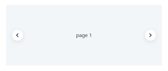
效果如下:
![]()
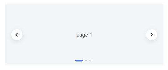
6、增加页码指示器
为了了解当前轮播到了哪一页,还需要增加增加页码指示器,页码指示器其实就类似分页组件里面的页码,只是一般显示成小圆点,而不是数字。
carousel.tsx
import { defineComponent, renderSlot, useSlots } from 'vue'
import usePage from './composables/use-page'
import './carousel.scss'

export default defineComponent({
  name: 'XCarousel',
  setup(props, context) {
    // 跳转特定页码时,需要使用到 setPageIndex 方法
    const { pageIndex, prevPage, nextPage, setPageIndex } = usePage(1)

    // 获取插槽内容中的元素数量
    const count = useSlots().default().length

++    // 生成指示器数组
++    const indicatorArr = Array.from(new Array(count).keys())

    return () => {
      return <div class="x-carousel">
        <div class="x-carousel-item-container" style={{
          width: count * 100 + '%', // 根据内容元素的数量计算容器宽度
          left: - (pageIndex.value - 1) * 100 + '%', // 根据当前页码计算容器偏移的位置,从而显示特定的元素内容
        }}>{renderSlot(useSlots(), 'default')}</div>
        <div class="x-carousel-pagination">
          <button class="arrow arrow-left" onClick={ prevPage }>
            <svg width="18px" height="18px" viewBox="0 0 16 16">XXX</svg>
          </button>
          <button class="arrow arrow-right" onClick={ nextPage }>
            <svg width="18px" height="18px" viewBox="0 0 16 16" version="1.1">XXX</svg>
          </button>
        </div>
++        <div class="x-carousel-indicator">
++          {
++            indicatorArr.map((item, index) => {
++              return <div class={`x-carousel-indicator-item${pageIndex.value === index+1 ? ' active' : ''}`} onClick={() => setPageIndex(index + 1)}></div>
++            })
++          }
++        </div>
      </div>
    }
  }
})
调整下样式 carousel.scss
...

++.x-carousel-indicator {
++  display: flex;
++  position: absolute;
++  bottom: 12px;
++  justify-content: center;
++  width: 100%;
++
++  .x-carousel-indicator-item {
++    cursor: pointer;
++    width: 6px;
++    height: 6px;
++    border-radius: 3px;
++    margin-right: 8px;
++    background: #d3d5d9;
++
++    &.active {
++      width: 24px;
++      background: #5e7ce0;
++      transition: all .3s cubic-bezier(.645, .045, .355, 1); // 切换内容时指示器小圆点上的动效
++    }
++  }
++}
效果如下:
![]()
至此,一个功能完整的 Carousel 组件就完成了,但这个组件是一个封装好的组件,开发者不能灵活进行扩展和定制。
7、增加灵活性:子组件+插槽
为了增加组件的灵活性,让用户可以自定义一些内容,我们需要做两件事:
- 将子组件抽取出来,并暴露给开发者
- 设置对应的插槽,让开发者可以放置自己的内容,当然也可以放置我们暴露出去的子组件
我们以页码指示器这个子组件为例,其他子组件同理。
先定义一个 CarouselIndicator 子组件。
carousel/src/components/carousel-indicator.tsx
import { defineComponent, toRefs, watch } from 'vue'
import usePage from '../composables/use-page'
import './carousel-indicator.scss'

export default defineComponent({
  name: 'XCarouselIndicator',
  props: {
    modelValue: {
      type: Number,
    },
    count: {
      type: Number,
    }
  },
  emits: ['update:modelValue'],
  setup(props, { emit, slots }) {
    const { modelValue } = toRefs(props)
    const { pageIndex, setPageIndex } = usePage(modelValue.value)
    const indicatorArr = Array.from(new Array(props.count).keys())

    watch(modelValue, (newVal: number) => {
      pageIndex.value = newVal
    })

    watch(pageIndex, (newVal: number) => {
      emit('update:modelValue', newVal)
    })

    return () => {
      return <div class="x-carousel-indicator">
        {
          slots.default
          ? slots.default({
            pageIndex: pageIndex.value,
            setPageIndex
          })
          : indicatorArr.map((item, index) => {
            return <div class={`x-carousel-indicator-item${pageIndex.value === index+1 ? ' active' : ''}`} onClick={() => setPageIndex(index + 1)}></div>
          })
        }
      </div>
    }
  }
})
carousel-indicator.scss
.x-carousel-indicator {
  display: flex;
  position: absolute;
  bottom: 12px;
  justify-content: center;
  width: 100%;

  .x-carousel-indicator-item {
    cursor: pointer;
    width: 6px;
    height: 6px;
    border-radius: 3px;
    margin-right: 8px;
    background: #d3d5d9;

    &.active {
      width: 24px;
      background: #5e7ce0;
      transition: all .3s cubic-bezier(.645, .045, .355, 1); // 切换内容时指示器小圆点上的动效
    }
  }
}
然后把写死的页码指示器用 CarouselIndicator 子组件替换,并增加 indicator 插槽。
carousel.tsx
import { defineComponent, renderSlot, useSlots } from 'vue'
++import XCarouselIndicator from './components/carousel-indicator'
import usePage from './composables/use-page'
import './carousel.scss'

export default defineComponent({
  name: 'XCarousel',
++  components: {
++    XCarouselIndicator,
++  },
--  setup(props, context) {
++  setup(props, { slots }) {
    // 跳转特定页码时,需要使用到 setPageIndex 方法
    const { pageIndex, prevPage, nextPage, setPageIndex } = usePage(1)

    // 获取插槽内容中的元素数量
    const count = useSlots().default().length

--    // 生成指示器数组
--    const indicatorArr = Array.from(new Array(count).keys())

    return () => {
      return <div class="x-carousel">
        <div class="x-carousel-item-container" style={{
          width: count * 100 + '%', // 根据内容元素的数量计算容器宽度
          left: - (pageIndex.value - 1) * 100 + '%', // 根据当前页码计算容器偏移的位置,从而显示特定的元素内容
        }}>{renderSlot(useSlots(), 'default')}</div>
        ...
--        <div class="x-carousel-indicator">
--          {
--            indicatorArr.map((item, index) => {
--              return <div class={`x-carousel-indicator-item${pageIndex.value === index+1 ? ' active' : ''}`} onClick={() => setPageIndex(index + 1)}></div>
--            })
--          }
--        </div>
++        {slots.indicator ? (
++          slots.indicator({
++            count,
++            pageIndex: pageIndex.value,
++            setPageIndex
++          })
++        ) : (
++          <XCarouselIndicator
++            count={count}
++            v-model={pageIndex.value}
++          ></XCarouselIndicator>
++        )}
      </div>
    }
  }
})
移除页码指示器对应的样式代码 carousel.scss
...

--.x-carousel-indicator {
--  display: flex;
--  position: absolute;
--  bottom: 12px;
--  justify-content: center;
--  width: 100%;
--
--  .x-carousel-indicator-item {
--    cursor: pointer;
--    width: 6px;
--    height: 6px;
--    border-radius: 3px;
--    margin-right: 8px;
--    background: #d3d5d9;
--
--    &.active {
--      width: 24px;
--      background: #5e7ce0;
--      transition: all .3s cubic-bezier(.645, .045, .355, 1); // 切换内容时指示器小圆点上的动效
--    }
--  }
--}
在入口文件 index.ts 中暴露 CarouselIndicator 子组件出去。
import type { App } from 'vue'
import XCarousel from './src/carousel'
++import XCarouselIndicator from './src/components/carousel-indicator'

--export { XCarousel }
++export { XCarousel, XCarouselIndicator }

export default {
  install(app: App) {
    app.component(XCarousel.name, XCarousel)
++    app.component(XCarouselIndicator.name, XCarouselIndicator)
  }
}
重构之后,默认使用方式依然不变,展示的效果也没有任何差别。
App.vue
<XCarousel>
  <div class="carousel-item">page 1</div>
  <div class="carousel-item">page 2</div>
  <div class="carousel-item">page 3</div>
</XCarousel>
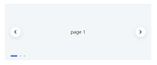
但这个组件灵活性却增加了,我们可以通过 indicator 插槽和 CarouselIndicator 子组件,实现更多的走马灯效果,满足更多的业务场景。
比如:我们可以调整页码指示器的位置
<XCarousel>
  <div class="carousel-item">page 1</div>
  <div class="carousel-item">page 2</div>
  <div class="carousel-item">page 3</div>
  <template #indicator="page">
    <XCarouselIndicator :count="page.count" v-model="page.pageIndex" @update:modelValue="page.setPageIndex"
      style="justify-content: flex-start; padding-left: 20px;">
    </XCarouselIndicator>
  </template>
</XCarousel>
效果如下:
![]()
比如:我们可以自定义自己的指示器
<script setup lang="ts">
const indicatorArr = Array.from(new Array(3).keys())
</script>

<template>
  <XCarousel>
    <div class="carousel-item-dark">page 1</div>
    <div class="carousel-item-dark">page 2</div>
    <div class="carousel-item-dark">page 3</div>
    <template #indicator="page">
      <XCarouselIndicator :count="page.count" v-model="page.pageIndex" style="justify-content: flex-start; padding-left: 20px;">
        <div
          :class="['carousel-indicator-item', page.pageIndex === item+1 ? 'active' : '']"
          v-for="item of indicatorArr"
          :key="item"
          @click="page.setPageIndex(item+1)"
        ></div>
      </XCarouselIndicator>
    </template>
  </XCarousel>
</template>

<style scoped>
.carousel-item-dark {
  text-align: center;
  line-height: 200px;
  background: rgb(135, 164, 186);
  color: #fff;
}

.carousel-indicator-item {
  position: relative;
  display: inline-block;
  width: 8px;
  height: 8px;
  margin: 4px;
  border-radius: 50%;
  background-color: var(--xui-icon-fill, #d3d5d9);
  overflow: hidden;
  cursor: pointer;
}

.carousel-indicator-item.active {
  width: 14px;
  height: 14px;
  margin: 1px;
  border-radius: 50%;
  background-color: #fff;
}
</style>
效果如下:
![]()
我们甚至可以单独使用 CarouselIndicator 组件,实现一个很漂亮的手风琴式折叠卡片效果。
<template>
  <XCarouselIndicator>
    <template #default="page">
    <div class="box">
      <div :class="['panel', page.pageIndex === 1 ? 'active' : '']" @click="page.setPageIndex(1)">
        <h3>Explore The World</h3>
      </div>
      <div :class="['panel', page.pageIndex === 2 ? 'active' : '']" @click="page.setPageIndex(2)">
        <h3>Wild Forest</h3>
      </div>
      <div :class="['panel', page.pageIndex === 3 ? 'active' : '']" @click="page.setPageIndex(3)">
        <h3>Sunny Beach</h3>
      </div>
      <div :class="['panel', page.pageIndex === 4 ? 'active' : '']" @click="page.setPageIndex(4)">
        <h3>City on Winter</h3>
      </div>
      <div :class="['panel', page.pageIndex === 5 ? 'active' : '']" @click="page.setPageIndex(5)">
        <h3>Mountains - Clouds</h3>
      </div>
    </div>
    </template>
  </XCarouselIndicator>
</template>

<style scoped>
.box {
  display: flex;
  width: 90vw;
}

.panel {
  background-size: cover;
  background-position: center;
  background-repeat: no-repeat;
  height: 40vh;
  border-radius: 50px;
  color: #fff;
  cursor: pointer;
  flex: 0.5;
  margin: 10px;
  position: relative;
  -webkit-transition: all 700ms ease-in;
  transition: all 700ms ease-in;
}
.panel:nth-child(1){
  background-image: url("https://picsum.photos/1350/900?random=1");
}
.panel:nth-child(2){
  background-image: url("https://picsum.photos/1350/900?random=2");
}
.panel:nth-child(3){
  background-image: url("https://picsum.photos/1350/900?random=3");
}
.panel:nth-child(4){
  background-image: url("https://picsum.photos/1350/900?random=4");
}
.panel:nth-child(5){
  background-image: url("https://picsum.photos/1350/900?random=5");
}

.panel h3 {
  font-size: 24px;
  position: absolute;
  bottom: 20px;
  left: 20px;
  margin: 0;
  opacity: 0;
}

.panel.active {
  flex: 5;
}

.panel.active h3 {
  opacity: 1;
  transition: opacity 0.3s ease-in 0.4s;
}
</style>
效果如下:
![]()
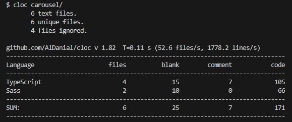
VueCarousel 通过子组件+插槽的设计方式,仅使用 171 行代码就实现了 Carousel 基础功能、调整指示器位置、自定义指示器、手风琴式折叠卡片等效果。
![]()
其实组件的很多其他部分也可以外溢出去,包括子组件、内部方法、TypeScript类型等,将这些能力外溢,把自主权交给开发者,可以有效地增加组件的灵活性,让我们设计的组件既是“易用的”,又是“灵活的”,在易用性和灵活性之间取得一定的平衡。
关于OpenTiny
![]()
OpenTiny 是一套企业级 Web 前端开发解决方案,提供跨端、跨框架、跨版本的 TinyVue 组件库,包含基于 Angular+TypeScript 的 TinyNG 组件库,拥有灵活扩展的低代码引擎 TinyEngine,具备主题配置系统TinyTheme / 中后台模板 TinyPro/ TinyCLI 命令行等丰富的效率提升工具,可帮助开发者高效开发 Web 应用。
欢迎加入 OpenTiny 开源社区。添加微信小助手:opentiny-official 一起参与交流前端技术~
OpenTiny 官网:https://opentiny.design/
OpenTiny 代码仓库:https://github.com/opentiny/
TinyVue 源码:https://github.com/opentiny/tiny-vue
TinyEngine 源码: https://github.com/opentiny/tiny-engine
欢迎进入代码仓库 Star🌟TinyEngine、TinyVue、TinyNG、TinyCLI~
如果你也想要共建,可以进入代码仓库,找到 good first issue标签,一起参与开源贡献~


