前言
Q:你一生中闻过最臭的东西,是什么?
A:我那早已腐烂的梦。
兄弟萌!!!我又来了!
这次,我能自信的对大家说:我终于给大家带了一个,能真正帮助大家解决诸多坑比场景的pub包!
将之前的flutter_smart_dialog,在保持api稳定的基础上,进行了各种抓头重构,解决了一系列问题
现在,我终于可以说:它现在是一个简洁,强大,侵入性极低的pub包!
关于侵入性问题
- 之前为了解决返回关闭弹窗,使用了一个很不优雅的解决方法,导致侵入性有点高
- 这真是让我如坐针毡,如芒刺背,如鲠在喉,这个问题终于搞定了!
同时,我在pub包内部设计了一个弹窗栈,能自动移除栈顶弹窗,也可以定点移除栈内标记的弹窗。
存在的问题
使用系统弹窗存在一系列坑,来和各位探讨探讨
相关思考
上面列举了一些比较常见的问题,最严重的问题,应该就是loading的问题
-
loading是个超高频使用的弹窗,关闭loading弹窗的方法,同时也能关闭正常使用的页面,本身就是一个隐患
-
穿透dialog遮罩是个非常重要的功能,基于该功能,能够在实际业务中,实现很多骚操作
-
既然在系统dialog难以解决各种痛点,加上系统dialog也是基于overlay去实现的,这样的话,我们也可以去高度定制overlay!
这次,我要一次性帮各位解决:toast消息,loading弹窗,以及更强大的自定义dialog!
快速上手
初始化
dependencies:
  flutter_smart_dialog: ^3.2.0
void main() => runApp(MyApp());

class MyApp extends StatelessWidget {
  @override
  Widget build(BuildContext context) {
    return MaterialApp(
      home: HomePage,
      // here
      navigatorObservers: [FlutterSmartDialog.observer],
      // here
      builder: FlutterSmartDialog.init(),
    );
  }
}
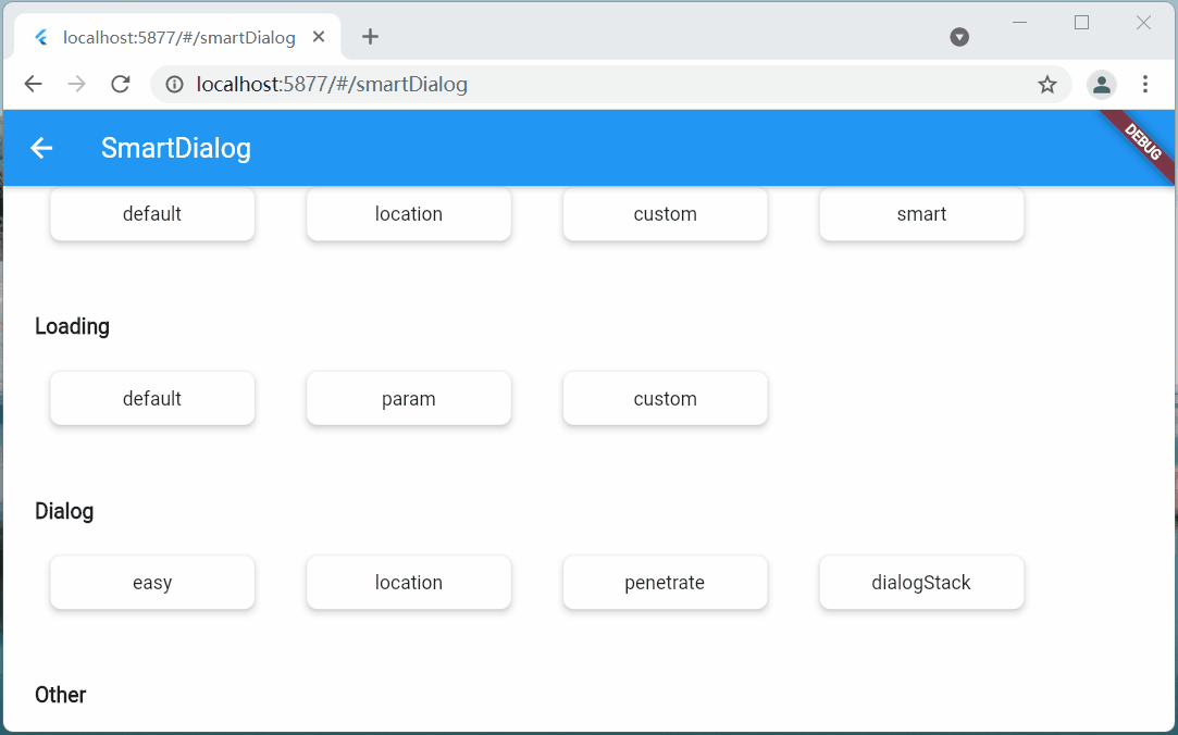
极简使用
SmartDialog.showToast('test toast');
![toastDefault]()
SmartDialog.showLoading();
await Future.delayed(Duration(seconds: 2));
SmartDialog.dismiss();
![loadingDefault]()
var custom = Container(
    height: 80,
    width: 180,
    decoration: BoxDecoration(
        color: Colors.black,
        borderRadius: BorderRadius.circular(20),
    ),
    alignment: Alignment.center,
    child: Text('easy custom dialog', style: TextStyle(color: Colors.white)),
);
// here
SmartDialog.show(widget: custom, isLoadingTemp: false);
![dialogEasy]()
OK,上面展示了,只需要极少的代码,就可以调用相应的功能
当然,内部还有不少地方做了特殊优化,接下来,我会详细的向大家描述下
你可能会有的疑问
初始化框架的时候,相比以前,居然让大家多写了一个参数,内心十分愧疚😩
关闭页面本质上是一个比较复杂的情况,涉及到
- 物理返回按键
- AppBar的back按钮
- 手动pop
为了监控这些情况,不得已增加了一个路由监控参数
实体返回键
对返回按钮的监控,是非常重要的,基本能覆盖大多数情况
![initBack]()
pop路由
虽然对返回按钮的监控能覆盖大多数场景,但是一些手动pop的场景就需要新增参数监控
- 不加
FlutterSmartDialog.observer
- 如果打开了穿透参数(就可以和弹窗后的页面交互),然后手动关闭页面
- 就会出现这种很尴尬的情况
![initPopOne]()
- 加了
FlutterSmartDialog.observer,就能比较合理的处理了
- 当然,这里的过渡动画,也提供了参数控制是否开启 😉
![initPopTwo]()
关于 FlutterSmartDialog.init()
本方法不会占用你的builder参数,init内部回调出来了builder,你可以大胆放心的继续套
class MyApp extends StatelessWidget {
  @override
  Widget build(BuildContext context) {
    return MaterialApp(
      home: HomePage,
      navigatorObservers: [FlutterSmartDialog.observer],
      builder: FlutterSmartDialog.init(builder: _builder),
    );
  }
}

Widget _builder(BuildContext context, Widget? child) {
  return MultiBlocProvider(
    providers: [
      BlocProvider.value(value: BlocSpanOneCubit()),
    ],
    child: child!,
  );
}
超实用的参数:backDismiss
- 这个参数是默认设置为true,返回的时候会默认关闭弹窗;如果设置为false,将不会关闭页面
- 这样就可以十分轻松的做一个紧急弹窗,禁止用户的下一步操作
- 我们来看一个场景:假定某开源作者决定弃坑软件,不允许用户再使用该软件的弹窗
SmartDialog.show(
  // here
  backDismiss: false,
  clickBgDismissTemp: false,
  isLoadingTemp: false,
  widget: Container(
    height: 480,
    width: 500,
    padding: EdgeInsets.all(20),
    decoration: BoxDecoration(
      borderRadius: BorderRadius.circular(20),
      color: Colors.white,
    ),
    alignment: Alignment.topCenter,
    child: SingleChildScrollView(
      child: Wrap(
        direction: Axis.vertical,
        crossAxisAlignment: WrapCrossAlignment.center,
        spacing: 10,
        children: [
          // title
          Text(
            '特大公告',
            style: TextStyle(fontSize: 30, fontWeight: FontWeight.bold),
          ),
          // content
          Text('鄙人日夜钻研下面秘籍,终于成功钓到富婆'),
          Image.network(
            'https://cdn.jsdelivr.net/gh/xdd666t/MyData@master/pic/flutter/blog/20211102213746.jpeg',
            height: 200,
            width: 400,
          ),
          Text('鄙人思考了三秒钟,怀着\'沉重\'的心情,决定弃坑本开源软件'),
          Text('本人今后的生活是富婆和远方,已无\'精力\' 再维护本开源软件了'),
          Text('各位叼毛,有缘江湖再见!'),
          // button (only method of close the dialog)
          ElevatedButton(
            onPressed: () => SmartDialog.dismiss(),
            child: Text('再会!'),
          )
        ],
      ),
    ),
  ),
);
![hardClose]()
从上面的效果图可以看出来
- 点击遮罩,无法关闭弹窗
- 点击返回按钮无法关闭弹窗
- 只能点我们自己的按钮,才能关闭弹窗,点击按钮的逻辑可以直接写成关闭app之类
只需要俩个简单的参数设置,就能实现这样一个很棒的应急弹窗
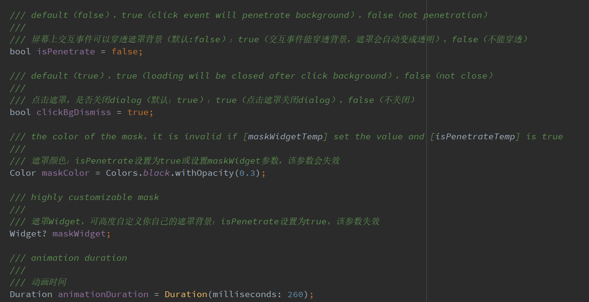
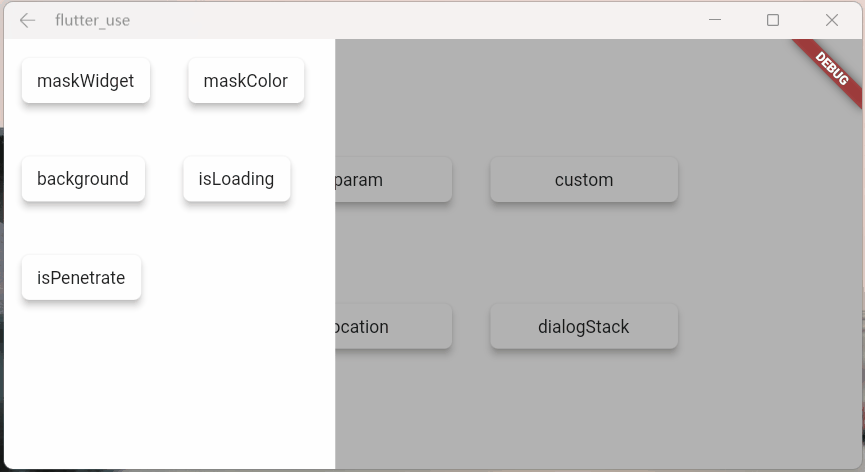
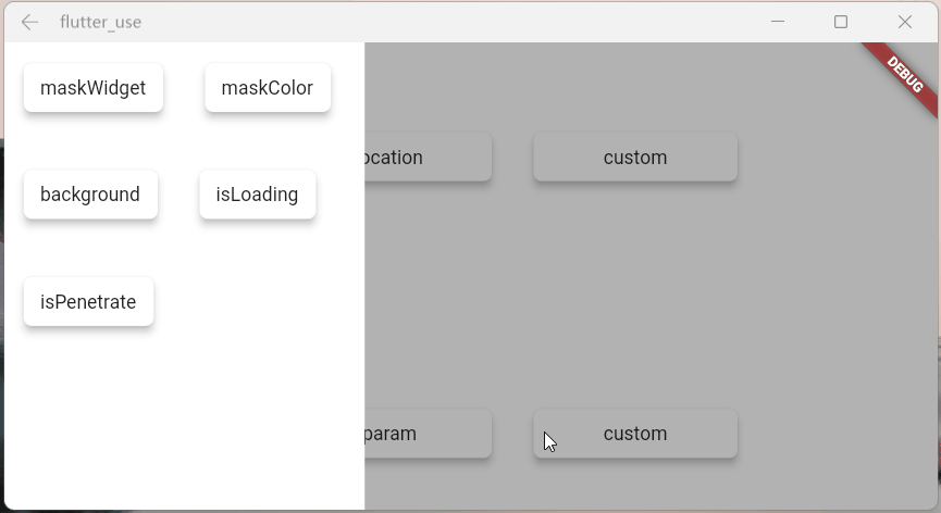
设置全局参数
SmartDialog的全局参数都有着一个比较合理的默认值
为了应付多变的场景,你可以修改符合你自己要求的全局参数
- 设置符合你的要求的数据,放在app入口就行初始化就行
- 注:如果没有特殊要求,可以不用初始化全局参数(内部皆有默认值)
SmartDialog.config
  ..alignment = Alignment.center
  ..isPenetrate = false
  ..clickBgDismiss = true
  ..maskColor = Colors.black.withOpacity(0.35)
  ..maskWidget = null
  ..animationDuration = Duration(milliseconds: 260)
  ..isUseAnimation = true
  ..isLoading = true
  ..antiShake = false
  ..antiShakeTime = Duration(milliseconds: 300);
- 代码的注释写的很完善,某个参数不明白的,点进去看看就行了
![image-20211102223129866]()
Attach篇
这是一个很重要的功能,本来早就想加进去了,但是比较忙,一直搁置了;元旦(2022.1.1)开了头,就花了一些时间,完成了这个功能和相关demo
定位
定位目标widget的坐标,这个做起来并不难;但是必须要拿到我们传入的自定义widget大小,这样才能将自定义widget叠放到一个比较合适的位置(通过一些计算,获取中心点)
- 实际上Flutter提供一个非常合适的组件
CustomSingleChildLayout,这个组件还提供偏移坐标功能,按理来说非常合适
- 但是,
CustomSingleChildLayout 和 SizeTransition 动画控件,存在占位面积冲突,只能使用AnimatedOpacity渐隐动画
- 位移动画不能用,这我没法忍,抛弃
CustomSingleChildLayout;使用了各种骚操作,终于拿到自定义widget的大小,比较完美实现了效果
定位dialog,使用showAttach方法,参数注释写的相当详细,不明白用法的看看注释就行了
强大的定位功能
- 必须传目标widget的BuildContext,需要通过它计算出目标widget的坐标和大小
var attach = (BuildContext context, AlignmentGeometry alignment) async {
  SmartDialog.showAttach(
    targetContext: context,
    isPenetrateTemp: true,
    alignmentTemp: alignment,
    clickBgDismissTemp: false,
    widget: Container(width: 100, height: 100, color: randomColor()),
  );
  await Future.delayed(Duration(milliseconds: 350));
};

//target widget
List<BuildContext> contextList = [];
List<Future Function()> funList = [
  () async => await attach(contextList[0], Alignment.topLeft),
  () async => await attach(contextList[1], Alignment.topCenter),
  () async => await attach(contextList[2], Alignment.topRight),
  () async => await attach(contextList[3], Alignment.centerLeft),
  () async => await attach(contextList[4], Alignment.center),
  () async => await attach(contextList[5], Alignment.centerRight),
  () async => await attach(contextList[6], Alignment.bottomLeft),
  () async => await attach(contextList[7], Alignment.bottomCenter),
  () async => await attach(contextList[8], Alignment.bottomRight),
];
var btn = ({
  required String title,
  required Function(BuildContext context) onTap,
}) {
  return Builder(builder: (context) {
    Color? color = title.contains('all') ? randomColor() : null;
    contextList.add(context);
    return Container(
      width: 130,
      child: ElevatedButton(
        style: ButtonStyle(
          backgroundColor: ButtonStyleButton.allOrNull<Color>(color),
        ),
        onPressed: () => onTap(context),
        child: Text('$title'),
      ),
    );
  });
};

SmartDialog.show(
  isLoadingTemp: false,
  widget: Container(
    width: 700,
    padding: EdgeInsets.all(70),
    decoration: BoxDecoration(
      borderRadius: BorderRadius.circular(20),
      color: Colors.white,
    ),
    child: Wrap(
      spacing: 50,
      runSpacing: 50,
      alignment: WrapAlignment.spaceEvenly,
      children: [
        btn(title: 'topLeft', onTap: (context) => funList[0]()),
        btn(title: 'topCenter', onTap: (context) => funList[1]()),
        btn(title: 'topRight', onTap: (context) => funList[2]()),
        btn(title: 'centerLeft', onTap: (context) => funList[3]()),
        btn(title: 'center', onTap: (context) => funList[4]()),
        btn(title: 'centerRight', onTap: (context) => funList[5]()),
        btn(title: 'bottomLeft', onTap: (context) => funList[6]()),
        btn(title: 'bottomCenter', onTap: (context) => funList[7]()),
        btn(title: 'bottomRight', onTap: (context) => funList[8]()),
        btn(
          title: 'allOpen',
          onTap: (_) async {
            for (var item in funList) {
              await item();
            }
          },
        ),
        btn(
          title: 'allClose',
          onTap: (_) => SmartDialog.dismiss(status: SmartStatus.allAttach),
        ),
      ],
    ),
  ),
);
![attachLocation]()
动画效果和show方法几乎是一致的,为了这个一致的体验,内部做了相当多的针对性优化
自定义坐标点
SmartDialog.showAttach(
  targetContext: context,
  widget: Container(width: 100, height: 100, color: Colors.red),
);
- 当然还有少数情况,需要使用自定义坐标,此处也提供target参数:设置了target参数,targetContext将自动失效
- targetContext 是十分常见到场景,所以,这边设置为必传参数,但是你可以给它设置为null
SmartDialog.showAttach(
  targetContext: null,
  target: Offset(100, 100);,
  widget: Container(width: 100, height: 100, color: Colors.red),
);
var attach = (Offset offset) {
  var random = Random().nextInt(100) % 5;
  var alignment = Alignment.topCenter;
  if (random == 0) alignment = Alignment.topCenter;
  if (random == 1) alignment = Alignment.centerLeft;
  if (random == 2) alignment = Alignment.center;
  if (random == 3) alignment = Alignment.centerRight;
  if (random == 4) alignment = Alignment.bottomCenter;
  SmartDialog.showAttach(
    targetContext: null,
    target: offset,
    isPenetrateTemp: true,
    clickBgDismissTemp: false,
    alignmentTemp: alignment,
    keepSingle: true,
    widget: ClipRRect(
      borderRadius: BorderRadius.circular(10),
      child: Container(width: 100, height: 100, color: randomColor()),
    ),
  );
};

SmartDialog.show(
  isLoadingTemp: false,
  widget: Container(
    width: 600,
    height: 400,
    alignment: Alignment.center,
    decoration: BoxDecoration(
      borderRadius: BorderRadius.circular(20),
      color: Colors.white,
    ),
    child: GestureDetector(
      onTapDown: (detail) => attach(detail.globalPosition),
      child: Container(
        width: 500,
        height: 300,
        color: Colors.grey,
        alignment: Alignment.center,
        child: Text('click me', style: TextStyle(color: Colors.white)),
      ),
    ),
  ),
);
![attachPoint]()
模仿DropdownButton
- 实际上模仿DropdownButton挺不容易的
- 首先要计算DropdownButton控件的位置,在其位置上显示点击后的折叠控件
- 需要处理DropdownButton之外区域的点击事件(点击区域外关闭DropdownButton)
- 还需要监听返回事件,手动pop路由事件;是这类事件的,需要关闭DropdownButton
- 这玩意要自定义,挺让人头大的;但是,现在你可以使用
SmartDialog.showAttach 轻松模仿一个,上述需要注意的事项都帮你处理好了
//模仿DropdownButton
var imitate = (BuildContext context) {
  var list = ['小呆呆', '小菲菲', '小猪猪'];
  SmartDialog.showAttach(
    targetContext: context,
    isPenetrateTemp: true,
    widget: Container(
      margin: EdgeInsets.all(10),
      decoration: BoxDecoration(
        boxShadow: [
          BoxShadow(color: Colors.black12, blurRadius: 8, spreadRadius: 0.2)
        ],
      ),
      child: Column(
        children: List.generate(list.length, (index) {
          return Material(
            color: Colors.white,
            child: InkWell(
              onTap: () => SmartDialog.dismiss(),
              child: Container(
                height: 50,
                width: 100,
                alignment: Alignment.center,
                child: Text('${list[index]}'),
              ),
            ),
          );
        }),
      ),
    ),
  );
};

//imitate widget
var dropdownButton = ({String title = 'Dropdown'}) {
  return DropdownButton<String>(
    value: '1',
    items: [
      DropdownMenuItem(value: '1', child: Text('$title:小呆呆')),
      DropdownMenuItem(value: '2', child: Text('小菲菲')),
      DropdownMenuItem(value: '3', child: Text('小猪猪'))
    ],
    onChanged: (value) {},
  );
};
var imitateDropdownButton = () {
  return Builder(builder: (context) {
    return Stack(children: [
      dropdownButton(title: 'Attach'),
      GestureDetector(
        onTap: () => imitate(context),
        child: Container(height: 50, width: 140, color: Colors.transparent),
      )
    ]);
  });
};
SmartDialog.show(
  isLoadingTemp: false,
  widget: Container(
    width: 600,
    height: 400,
    alignment: Alignment.center,
    padding: EdgeInsets.symmetric(horizontal: 100),
    decoration: BoxDecoration(
      borderRadius: BorderRadius.circular(20),
      color: Colors.white,
    ),
    child: MaterialApp(
      debugShowCheckedModeBanner: false,
      home: Row(
        mainAxisAlignment: MainAxisAlignment.spaceBetween,
        children: [dropdownButton(), imitateDropdownButton()],
      ),
    ),
  ),
);
![attachImitate]()
高亮
这次把遮罩特定区域高亮的功能加上了,这是一个非常实用的功能!
- 你只需要设置
highlight参数即可
- 定义高亮的区域,他必须是个不通透的Widget,例如是Contaienr,必须设置一个颜色(色值无要求)
- 使用各种奇形怪状的图片也行,这样就能显示各种复杂图形的高亮区域
- highlight类型是Positioned,你可以在屏幕上定位任何需要高亮的区域
SmartDialog.showAttach(
  targetContext: context,
  alignmentTemp: Alignment.bottomCenter,
  highlight: Positioned(
    right: 190,
    bottom: 190,
    child: Container(
      height: 120,
      width: 120,
      decoration: BoxDecoration(
        borderRadius: BorderRadius.circular(10),
        color: Colors.white,
      ),
    ),
  ),
  widget: Container(width: 100, height: 100, color: Colors.red),
);
实际的业务场景
![attachBusiness]()
上面俩个业务场景非常常见,有时候,我们需要目标widget上面或下面或特定的区域,不被遮罩覆盖
自己去做的话,可以做出来,但是会很麻烦;现在你可以使用showAttach中的highlight参数轻松实现这个需求
引导操作
引导操作在app上还是非常常见的,需要指定区域高亮,然后介绍其功能
- 使用
showAttach中的highlight参数,也可以轻松实现这个需求,来看下效果
![attachGuide]()
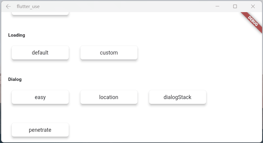
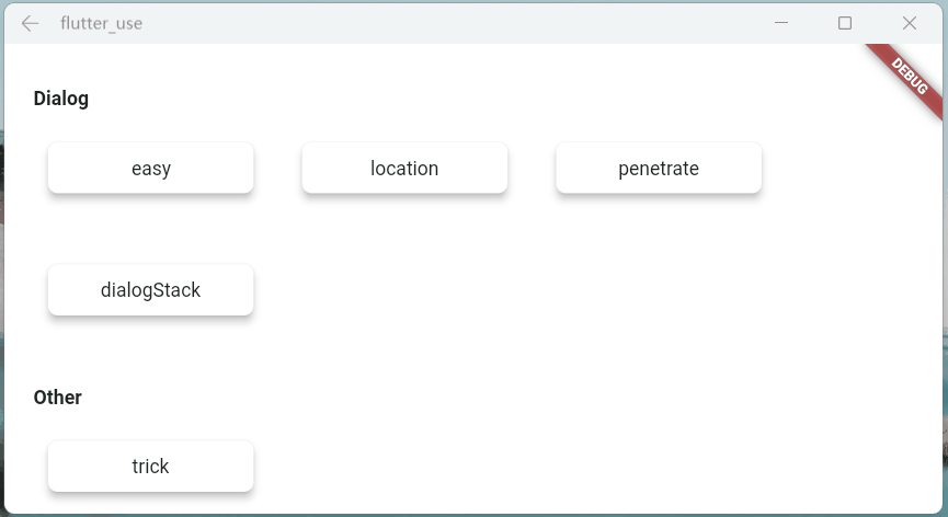
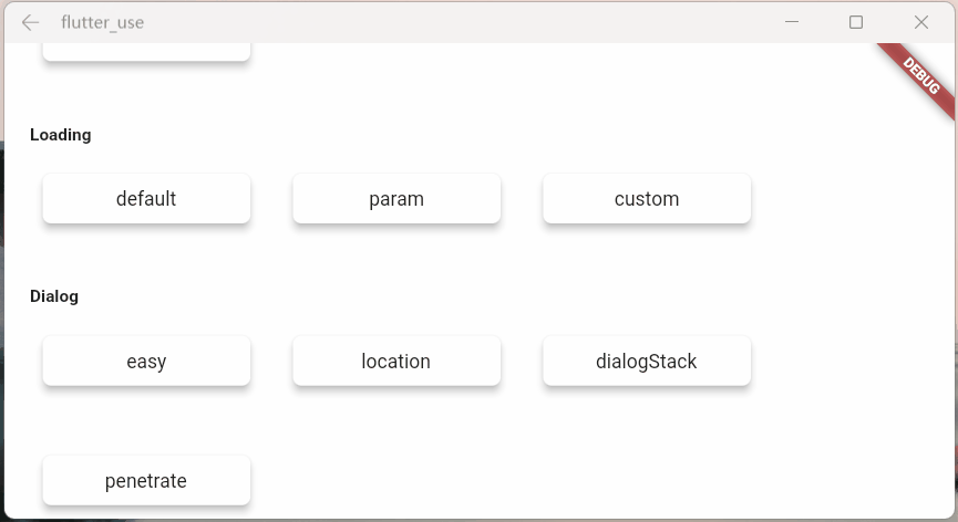
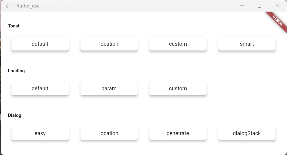
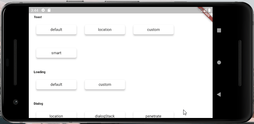
Dialog篇
花里胡哨
弹窗从不同位置弹出,动画是有区别的
![image-20211031221419600]()
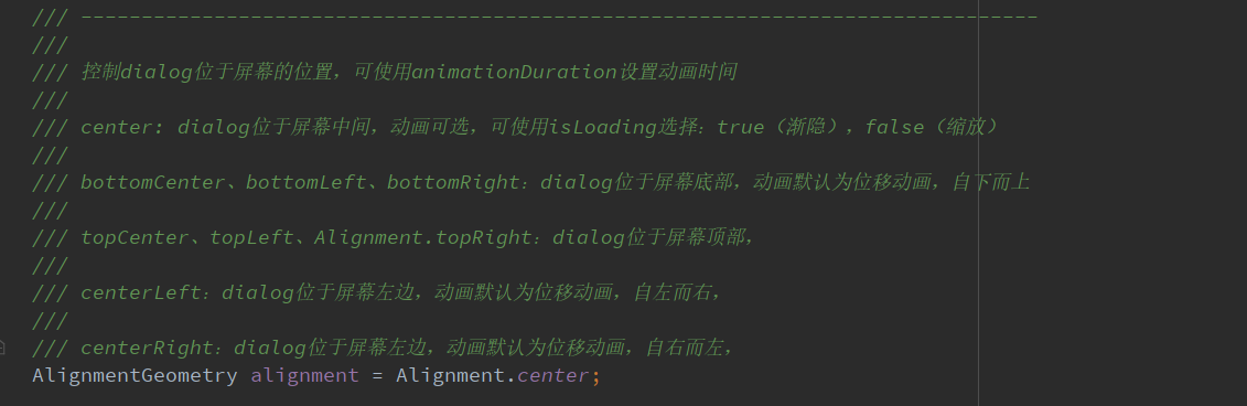
- alignmentTemp:该参数设置不同,动画效果会有所区别
var location = ({
  double width = double.infinity,
  double height = double.infinity,
}) {
  return Container(width: width, height: height, color: randomColor());
};

//left
SmartDialog.show(
  widget: location(width: 70),
  alignmentTemp: Alignment.centerLeft,
);
await Future.delayed(Duration(milliseconds: 500));
//top
SmartDialog.show(
  widget: location(height: 70),
  alignmentTemp: Alignment.topCenter,
);
await Future.delayed(Duration(milliseconds: 500));
//right
SmartDialog.show(
  widget: location(width: 70),
  alignmentTemp: Alignment.centerRight,
);
await Future.delayed(Duration(milliseconds: 500));
//bottom
SmartDialog.show(
  widget: location(height: 70),
  alignmentTemp: Alignment.bottomCenter,
);
await Future.delayed(Duration(milliseconds: 500));
//center
SmartDialog.show(
  widget: location(height: 100, width: 100),
  alignmentTemp: Alignment.center,
  isLoadingTemp: false,
);
![dialogLocation]()
SmartDialog.show(
    alignmentTemp: Alignment.centerRight,
    isPenetrateTemp: true,
    clickBgDismissTemp: false,
    widget: Container(
        width: 80,
        height: double.infinity,
        color: randomColor(),
    ),
);
![dialogPenetrate]()
dialog栈
var stack = ({
  double width = double.infinity,
  double height = double.infinity,
  String? msg,
}) {
  return Container(
    width: width,
    height: height,
    color: randomColor(),
    alignment: Alignment.center,
    child: Text('dialog $msg', style: TextStyle(color: Colors.white)),
  );
};

//left
SmartDialog.show(
  tag: 'A',
  widget: stack(msg: 'A', width: 70),
  alignmentTemp: Alignment.centerLeft,
);
await Future.delayed(Duration(milliseconds: 500));
//top
SmartDialog.show(
  tag: 'B',
  widget: stack(msg: 'B', height: 70),
  alignmentTemp: Alignment.topCenter,
);
await Future.delayed(Duration(milliseconds: 500));
//right
SmartDialog.show(
  tag: 'C',
  widget: stack(msg: 'C', width: 70),
  alignmentTemp: Alignment.centerRight,
);
await Future.delayed(Duration(milliseconds: 500));
//bottom
SmartDialog.show(
  tag: 'D',
  widget: stack(msg: 'D', height: 70),
  alignmentTemp: Alignment.bottomCenter,
);
await Future.delayed(Duration(milliseconds: 500));

//center:the stack handler
SmartDialog.show(
  alignmentTemp: Alignment.center,
  isLoadingTemp: false,
  widget: Container(
    decoration: BoxDecoration(
        color: Colors.white, borderRadius: BorderRadius.circular(15)),
    padding: EdgeInsets.symmetric(horizontal: 30, vertical: 20),
    child: Wrap(spacing: 20, children: [
      ElevatedButton(
        child: Text('close dialog A'),
        onPressed: () => SmartDialog.dismiss(tag: 'A'),
      ),
      ElevatedButton(
        child: Text('close dialog B'),
        onPressed: () => SmartDialog.dismiss(tag: 'B'),
      ),
      ElevatedButton(
        child: Text('close dialog C'),
        onPressed: () => SmartDialog.dismiss(tag: 'C'),
      ),
      ElevatedButton(
        child: Text('close dialog D'),
        onPressed: () => SmartDialog.dismiss(tag: 'D'),
      ),
    ]),
  ),
);
![dialogStack]()
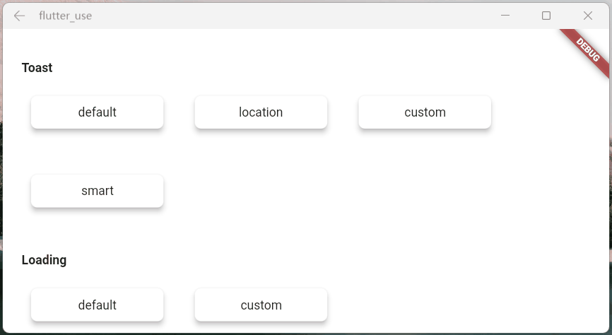
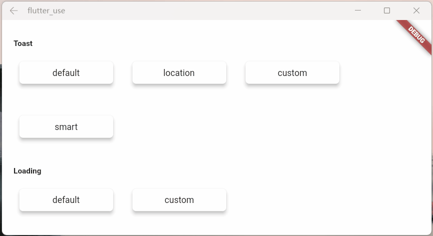
Loading篇
避坑指南
- 开启loading后,可以使用以下方式关闭
- SmartDialog.dismiss():可以关闭loading和dialog
- status设置为SmartStatus.loading:仅仅关闭loading
// easy close
SmartDialog.dismiss();
// exact close
SmartDialog.dismiss(status: SmartStatus.loading);
- 一般来说,loading弹窗是封装在网络库里面的,随着请求状态的自动开启和关闭
- 基于这种场景,我建议:使用dismiss时,加上status参数,将其设置为:SmartStatus.loading
- 坑比场景
- 网络请求加载的时候,loading也随之打开,这时很容易误触返回按钮,关闭loading
- 当网络请求结束时,会自动调用dismiss方法
- 因为loading已被关闭,假设此时页面又有SmartDialog的弹窗,未设置status的dismiss就会关闭SmartDialog的弹窗
- 当然,这种情况很容易解决,封装进网络库的loading,使用:
SmartDialog.dismiss(status: SmartStatus.loading); 关闭就行了
status参数,是为了精确关闭对应类型弹窗而设计的参数,在一些特殊场景能起到巨大的作用
- 如果大家理解这个参数的含义,那对于何时添加
status参数,必能胸有成竹
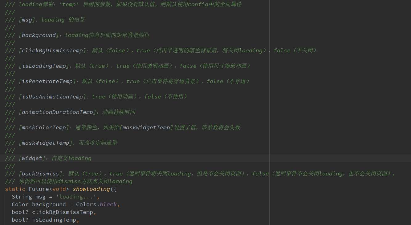
参数说明
参数在注释里面写的十分详细,就不赘述了,来看看效果
![image-20211031215728656]()
- maskWidgetTemp:强大的遮罩自定义功能😆,发挥你的脑洞吧。。。
var maskWidget = Container(
  width: double.infinity,
  height: double.infinity,
  child: Opacity(
    opacity: 0.6,
    child: Image.network(
      'https://cdn.jsdelivr.net/gh/xdd666t/MyData@master/pic/flutter/blog/20211101103911.jpeg',
      fit: BoxFit.fill,
    ),
  ),
);
SmartDialog.showLoading(maskWidgetTemp: maskWidget);
![loadingOne]()
- maskColorTemp:支持快捷自定义遮罩颜色
SmartDialog.showLoading(maskColorTemp: randomColor().withOpacity(0.3));

/// random color
Color randomColor() => Color.fromRGBO(
    Random().nextInt(256), Random().nextInt(256), Random().nextInt(256), 1);
![loadingTwo]()
SmartDialog.showLoading(background: randomColor());

/// random color
Color randomColor() => Color.fromRGBO(
    Random().nextInt(256), Random().nextInt(256), Random().nextInt(256), 1);
![loadingThree]()
SmartDialog.showLoading(isLoadingTemp: false);
![loadingFour]()
- isPenetrateTemp:交互事件可以穿透遮罩,这是个十分有用的功能,对于一些特殊的需求场景十分关键
SmartDialog.showLoading(isPenetrateTemp: true);
![loadingFive]()
自定义Loading
使用showLoading可以轻松的自定义出强大的loading弹窗;鄙人脑洞有限,就简单演示下
自定义一个loading布局
class CustomLoading extends StatefulWidget {
  const CustomLoading({Key? key, this.type = 0}) : super(key: key);

  final int type;

  @override
  _CustomLoadingState createState() => _CustomLoadingState();
}

class _CustomLoadingState extends State<CustomLoading>
    with TickerProviderStateMixin {
  late AnimationController _controller;

  @override
  void initState() {
    _controller = AnimationController(
      duration: const Duration(milliseconds: 800),
      vsync: this,
    );
    _controller.forward();
    _controller.addStatusListener((status) {
      if (status == AnimationStatus.completed) {
        _controller.reset();
        _controller.forward();
      }
    });
    super.initState();
  }

  @override
  Widget build(BuildContext context) {
    return Stack(children: [
      // smile
      Visibility(visible: widget.type == 0, child: _buildLoadingOne()),

      // icon
      Visibility(visible: widget.type == 1, child: _buildLoadingTwo()),

      // normal
      Visibility(visible: widget.type == 2, child: _buildLoadingThree()),
    ]);
  }

  Widget _buildLoadingOne() {
    return Stack(alignment: Alignment.center, children: [
      RotationTransition(
        alignment: Alignment.center,
        turns: _controller,
        child: Image.network(
          'https://cdn.jsdelivr.net/gh/xdd666t/MyData@master/pic/flutter/blog/20211101174606.png',
          height: 110,
          width: 110,
        ),
      ),
      Image.network(
        'https://cdn.jsdelivr.net/gh/xdd666t/MyData@master/pic/flutter/blog/20211101181404.png',
        height: 60,
        width: 60,
      ),
    ]);
  }

  Widget _buildLoadingTwo() {
    return Stack(alignment: Alignment.center, children: [
      Image.network(
        'https://cdn.jsdelivr.net/gh/xdd666t/MyData@master/pic/flutter/blog/20211101162946.png',
        height: 50,
        width: 50,
      ),
      RotationTransition(
        alignment: Alignment.center,
        turns: _controller,
        child: Image.network(
          'https://cdn.jsdelivr.net/gh/xdd666t/MyData@master/pic/flutter/blog/20211101173708.png',
          height: 80,
          width: 80,
        ),
      ),
    ]);
  }

  Widget _buildLoadingThree() {
    return Center(
      child: Container(
        height: 120,
        width: 180,
        decoration: BoxDecoration(
          color: Colors.white,
          borderRadius: BorderRadius.circular(15),
        ),
        alignment: Alignment.center,
        child: Column(mainAxisSize: MainAxisSize.min, children: [
          RotationTransition(
            alignment: Alignment.center,
            turns: _controller,
            child: Image.network(
              'https://cdn.jsdelivr.net/gh/xdd666t/MyData@master/pic/flutter/blog/20211101163010.png',
              height: 50,
              width: 50,
            ),
          ),
          Container(
            margin: EdgeInsets.only(top: 20),
            child: Text('loading...'),
          ),
        ]),
      ),
    );
  }

  @override
  void dispose() {
    _controller.dispose();
    super.dispose();
  }
}
来看看效果
SmartDialog.showLoading(isLoadingTemp: false, widget: CustomLoading());
await Future.delayed(Duration(seconds: 2));
SmartDialog.dismiss();
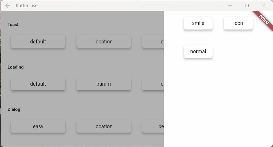
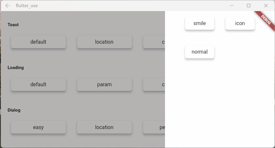
![loadingSmile]()
SmartDialog.showLoading(
    isLoadingTemp: false,
    widget: CustomLoading(type: 1),
);
await Future.delayed(Duration(seconds: 2));
SmartDialog.dismiss();
![loadingIcon]()
SmartDialog.showLoading(widget: CustomLoading(type: 2));
await Future.delayed(Duration(seconds: 2));
SmartDialog.dismiss();
![loadingNormal]()
Toast篇
toast的特殊性
严格来说,toast是一个非常特殊的弹窗,我觉得理应具备下述的特征
toast消息理应一个个展示,后续消息不应该顶掉前面的toast
- 这是一个坑点,如果框架内部不做处理,很容易出现后面toast会直接顶掉前面toast的情况
- 当然,内部提供了type参数,你可以选择你想要的显示逻辑
![toastOne]()
展示在页面最上层,不应该被一些弹窗之类遮挡
- 可以发现loading和dialog的遮罩等布局,均未遮挡toast信息
![toastTwo]()
对键盘遮挡情况做处理
- 键盘这玩意有点坑,会直接遮挡所有布局,只能曲线救国
- 在这里做了一个特殊处理,当唤起键盘的时候,toast自己会动态的调整自己和屏幕底部的距离
- 这样就能起到一个,键盘不会遮挡toast的效果
![toastSmart]()
自定义Toast
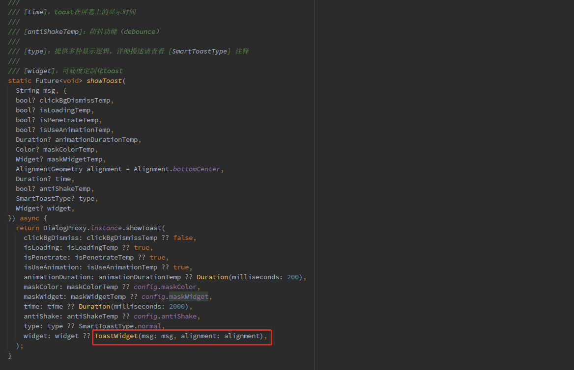
参数说明
toast的一些参数并未向外暴露,仅仅暴露了msg和alignment
- 例如:toast字体大小,字体颜色,toast的背景色等等之类,都没提供参数
- 一是觉得提供了这些参数,会让整体参数输入变的非常多,乱花渐入迷人眼
- 二是觉得就算我提供了很多参数,也不一定会满足那些奇奇怪怪的审美和需求
- 基于上述的考虑,我直接提供了大量的底层参数
- 你可以随心所欲的定制toast
- 注意喔,不仅仅可以定制toast,例如:成功提示,失败提示,警告提示等等
- Toast做了很多的优化,type参数,让你能拥有多种显示逻辑,发挥你的想象力吧
- 注意:使用了
widget参数,msg和alignment参数会失效
![image-20211217142656380]()
调整toast显示的位置
SmartDialog.showToast('the toast at the bottom');
SmartDialog.showToast('the toast at the center', alignment: Alignment.center);
SmartDialog.showToast('the toast at the top', alignment: Alignment.topCenter);
![toastLocation]()
更强大的自定义toast
class CustomToast extends StatelessWidget {
  const CustomToast(this.msg, {Key? key}) : super(key: key);

  final String msg;

  @override
  Widget build(BuildContext context) {
    return Align(
      alignment: Alignment.bottomCenter,
      child: Container(
        margin: EdgeInsets.only(bottom: 30),
        padding: EdgeInsets.symmetric(horizontal: 20, vertical: 7),
        decoration: BoxDecoration(
          color: _randomColor(),
          borderRadius: BorderRadius.circular(100),
        ),
        child: Row(mainAxisSize: MainAxisSize.min, children: [
          //icon
          Container(
            margin: EdgeInsets.only(right: 15),
            child: Icon(Icons.add_moderator, color: _randomColor()),
          ),

          //msg
          Text('$msg', style: TextStyle(color: Colors.white)),
        ]),
      ),
    );
  }

  Color _randomColor() {
    return Color.fromRGBO(
      Random().nextInt(256),
      Random().nextInt(256),
      Random().nextInt(256),
      1,
    );
  }
}
SmartDialog.showToast('', widget: CustomToast('custom toast'));
![toastCustom]()
骚气的小技巧
有一种场景比较蛋筒
- 我们使用StatefulWidget封装了一个小组件
- 在某个特殊的情况,我们需要在这个组件外部,去触发这个组件内部的一个方法
- 对于这种场景,有不少实现方法,但是弄起来可能有点麻烦
这里提供一个简单的小思路,可以非常轻松的触发,组件内部的某个方法
class OtherTrick extends StatefulWidget {
  const OtherTrick({Key? key, this.onUpdate}) : super(key: key);

  final Function(VoidCallback onInvoke)? onUpdate;

  @override
  _OtherTrickState createState() => _OtherTrickState();
}

class _OtherTrickState extends State<OtherTrick> {
  int _count = 0;

  @override
  void initState() {
    // here
    widget.onUpdate?.call(() {
      _count++;
      setState(() {});
    });

    super.initState();
  }

  @override
  Widget build(BuildContext context) {
    return Center(
      child: Container(
        padding: EdgeInsets.symmetric(horizontal: 50, vertical: 20),
        decoration: BoxDecoration(
          color: Colors.white,
          borderRadius: BorderRadius.circular(10),
        ),
        child: Text('Counter: $_count ', style: TextStyle(fontSize: 30.0)),
      ),
    );
  }
}
VoidCallback? callback;

// display
SmartDialog.show(
  alignmentTemp: Alignment.center,
  widget: OtherTrick(
    onUpdate: (VoidCallback onInvoke) => callback = onInvoke,
  ),
);

await Future.delayed(Duration(milliseconds: 500));

// handler
SmartDialog.show(
  alignmentTemp: Alignment.centerRight,
  maskColorTemp: Colors.transparent,
  widget: Container(
    height: double.infinity,
    width: 150,
    color: Colors.white,
    alignment: Alignment.center,
    child: ElevatedButton(
      child: Text('add'),
      onPressed: () => callback?.call(),
    ),
  ),
);
![trick]()
最后
相关地址
哎,人总是在不断的迷茫中前行。。。
![梦]()


