本文由体验技术团队 TinyVue 项目成员岑灌铭创作,欢迎大家实操体验,本实操内容通过实现 TinyVue 中 Button 组件和 Alert 的类 element 主题适配,让开发者感受到 TinyVue 跨设计规范的亮点特性,同时对 TinyVue 组件库多主题的实现原理有个初步的了解。
知识背景
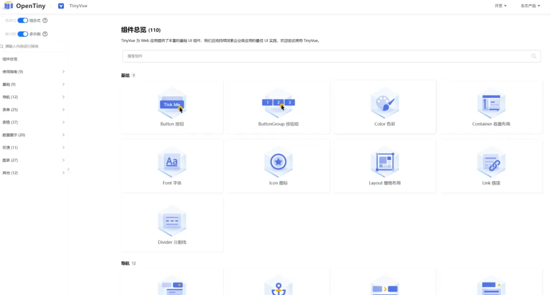
1. TinyVue 组件库简介
![]()
2.环境基本要求
- node.js v16+ npm v8+
- 代码编辑器 VsCode 以及 Chrome/Edge 浏览器
代码实战
1.使用Vite创建一个Vue3项目
1.1 打开 VSCode 软件,使用 Ctrl+~快捷键打开终端。执行以下命令安装Vite
npm install -g vite
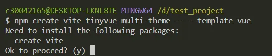
1.2 使用 Vite 创建一个 Vue3 工程
npm create vite[@latest](https://my.oschina.net/u/4418429) tinyvue-multi-theme -- --template vue
![]()
命令行提示是否安装 create-vite@latest,输入y后回车,安装并创建
cd tinyvue-multi-theme
npm install
npm run dev
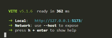
创建工程完毕后,依次输入以上命名
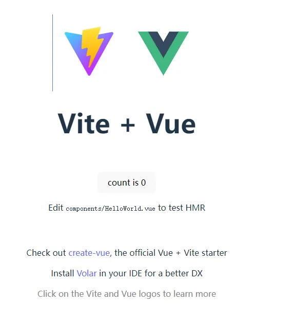
出现以下界面,则说明项目启动成功,Ctrl+鼠标左边单击 http://127.0.0.1:5173/ 从浏览器启动项目
![]()
![]()
浏览器打开会出现以上界面,说明一切正常,到此为止,Vue3项目已经完成创建。
2.安装 TinyVue,使用 button 以及 alert 组件
安装@opentiny/vue,在 vscode 终端下执行以下命名,安装 TinyVue 组件库
npm install @opentiny/vue@3.16.0
打开 OpenTiny 官网 https://opentiny.design/tiny-vue/zh-CN/overview 找到 Button 组件和 Alert 组件,可以参考官网 demo 的写法新增本次实验所需代码。
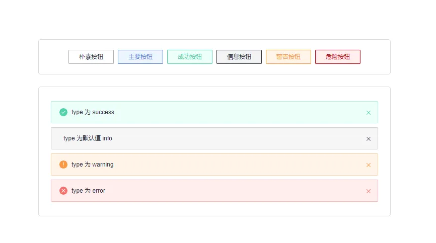
在 components 文件夹下,新建ButtonDemo.vue文件, 使用 Button 组件,新增6个类型的朴素按钮。
<template>
  <tiny-button plain> 朴素按钮 </tiny-button>
  <tiny-button type="primary" plain> 主要按钮 </tiny-button>
  <tiny-button type="success" plain> 成功按钮 </tiny-button>
  <tiny-button type="info" plain> 信息按钮 </tiny-button>
  <tiny-button type="warning" plain> 警告按钮 </tiny-button>
  <tiny-button type="danger" plain> 危险按钮 </tiny-button>
</template>

<script>
import { Button } from "@opentiny/vue";
export default {
  components: {
    TinyButton: Button,
  },
};
</script>
在 components 文件夹下,新建AlertDemo.vue文件, 使用 Alert 组件,新增4个类型 alert。
<template>
  <div>
    <tiny-alert type="success" description="type 为 success"></tiny-alert>
    <tiny-alert type="simple" description="type 为默认值 info"></tiny-alert>
    <tiny-alert type="warning" description="type 为 warning"></tiny-alert>
    <tiny-alert type="error" description="type 为 error"></tiny-alert>
  </div>
</template>

<script>
import { Alert } from "@opentiny/vue";

export default {
  components: {
    TinyAlert: Alert,
  },
};
</script>
删除无关文件HelloWorld.vue ,修改App.vue文件,引入ButtonDemo.vue和AlertDemo.vue组件。
import ButtonDemo from "./components/ButtonDemo.vue";
import AlertDemo from "./components/AlertDemo.vue";
修改模板代码,删除 vite 初始 demo 代码,使用引入的 Button 和 Alert。
<template>
    <div class="theme-app">
      <div class="container">
        <button-demo></button-demo>
      </div>
      <div class="container">
        <alert-demo></alert-demo>
      </div>
    </div>
</template>
删除原本 vite 初始 demo 代码样式代码,新增本次实验所需的样式代码,使其看起来更美观一些。
<style scoped>
.container {
  width: 650px;
  padding: 20px 24px;
  border-radius: 5px;
  border: 1px solid #ddd;
  margin-top: 24px;
}
</style>
完成以上步骤,就已经掌握了 TinyVue 组件的基本用法了,打开页面查看,如果显示以下页面,那么准备工作就完毕了~
![]()
3.实现样式切换
下面来准备第三步,实现样式上的切换,开始实现之前,首先简单介绍一下 TinyVue 主题适配的原理。
原理:
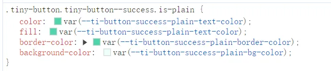
在页面打开控制台,查看 button 的样式,可以看到样式属性值都是使用的 css var 变量。这些变量都以 ti-button 开头,这些可以称之为组件级变量。
![]()
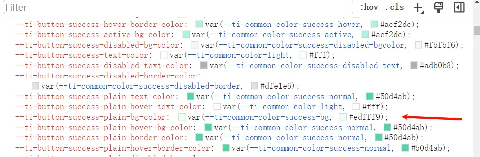
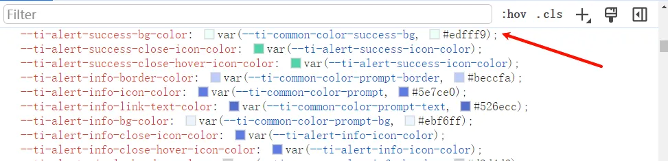
通常情况下,相同类型(成功类型)的背景色、文本色等在不同组件中属性值相同,因此组件库定义了这部分常用到公共变量。而绝大多数组件级变量也都是使用的公共变量。
![]()
![]()
本次实验中 Button 和 Alert 的组件级变量的背景色正是使用的同一个公共变量ti-common-color-success-bg
主题适配的原理就是覆盖这些 css var 变量的值,去达到改变样式的效果。了解了原理后,就可以开始实现样式切换了。
实战:
在 components 文件夹下,新建ChangeTheme.vue文件, 编写切换样式逻辑。
这里使用 TinyVue 内置的 theme-tool 切换主题工具,只需要定义好相应主题变量的值即可,工具就会自动完成覆盖变量值的操作。
然后引入 Radio 组件,选中不同值时切换不同的主题,引入 theme-tool 工具,尝试修改上文提到的公共变量ti-common-color-success-bg,这里先设置为测试值 green 查看效果。
<script setup>
import {
  Radio as TinyRadio,
  RadioGroup as TinyRadioGroup,
} from "@opentiny/vue";
import TinyThemeTool from "@opentiny/vue-theme/theme-tool";
import { ref } from "vue";

const theme = ref("tiny-vue");
const themeTool = new TinyThemeTool();
const elementTheme = {
  id: "element-theme",
  name: "elementTheme",
  cnName: "饿了么主题",
  data: {
    "ti-common-color-success-bg": "green",
  },
};

const emit = defineEmits(["change-theme"]);
const changeTheme = (theme) => {
  themeTool.changeTheme(theme === "element" ? elementTheme : null);
  emit("change-theme", theme);
};
</script>

<template>
  <tiny-radio-group v-model="theme" @change="changeTheme">
    <tiny-radio label="tiny-vue"></tiny-radio>
    <tiny-radio label="element"></tiny-radio>
  </tiny-radio-group>
</template>
在App.vue中引入并使用ChangeTheme组件
// script下新增
import ChangeTheme from "./components/ChangeTheme.vue";

// template下新增
<change-theme></change-theme>
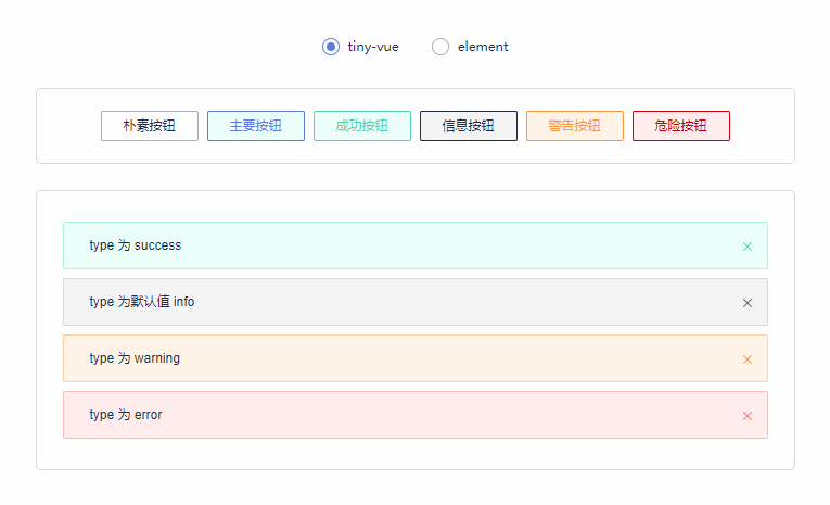
接着打开页面查看效果,切换主题时,成功按钮和成功类型的 alert 背景颜色都变为 green 了~
![]()
然后可以对比 element 组件样式差异:https://element-plus.org/zh-CN/component/button.html
将背景色、文字色等 css 属性修改为与 element 一致,当然也可以自己发挥,DIY 自己的主题。以下是一份参考配置:
const elementTheme = {
  id: "element-theme",
  name: "elementTheme",
  cnName: "饿了么主题",
  data: {
    // 设置公共变量
    "ti-common-color-primary-bg": "#409eff",
    "ti-common-color-primary-normal": "#409eff",
    "ti-common-color-success-bg": "#f0f9eb",
    "ti-common-color-success-normal": "#67c23a",
    "ti-common-color-info-bg": "#f4f4f5",
    "ti-common-color-info-normal": "#909399",
    "ti-common-color-warn-bg": "#fdf6ec",
    "ti-common-color-warn-normal": "#e6a23c",
    "ti-common-color-danger-bg": "#fef0f0",
    "ti-common-color-danger-normal": "#f56c6c",
    // 设置button相关样式属性
    "ti-button-size-normal-height": "32px",
    "ti-button-border-radius": "4px",
    "ti-button-font-size": "14px",
    // 设置alert相关样式属性
    "ti-alert-border-radius": "6px",
    "ti-alert-close-font-size": "14px",
    "ti-alert-description-font-size": "14px",
    "ti-alert-success-close-icon-color": "#a8abb2",
    "ti-alert-simple-close-icon-color": "#a8abb2",
    "ti-alert-error-close-icon-color": "#a8abb2",
    "ti-alert-warning-close-icon-color": "#a8abb2",
    "ti-alert-success-title-text-color": "#67c23a",
    "ti-alert-simple-title-text-color": "#909399",
    "ti-alert-warning-title-text-color": "#e6a23c",
    "ti-alert-error-title-text-color": "#f56c6c",
    "ti-alert-border-weight": "0px",
  },
};
4.图标的适配
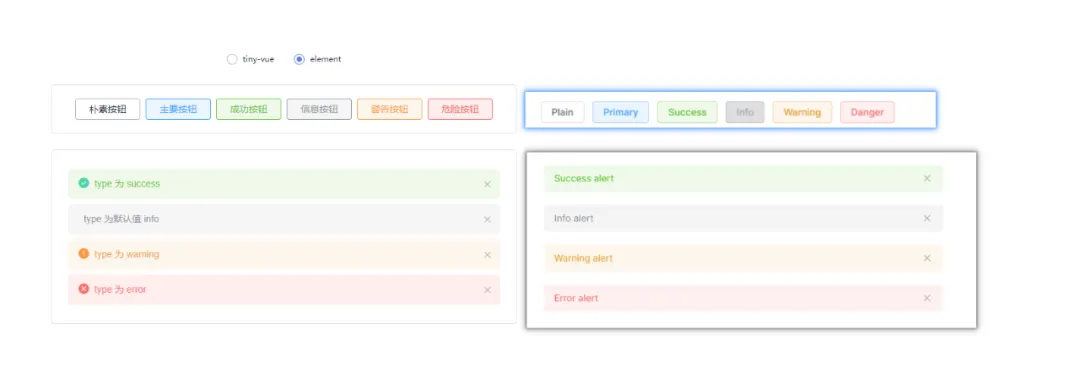
完成以上三步,此时 css 样式部分已经适配完毕。但是和 element 主题还是会有差别,仔细对比发现,element 主题是没有图标的。
![]()
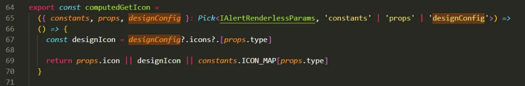
而对于图标的隐藏,其实也可以通过 css var 变量的方式去实现,但是只能控制图标的显示和隐藏,无法实现不同主题下展示不同的图标,因此对于图标的适配,组件库采用配置的方式去实现。
以下是组件库代码截图,组件库对于图标,预留了配置项,组件库提供 ConfigProvider 组件来实现适配不同设计规范之间的图标和逻辑。
![]()
在App.vue文件下,引入 ConfigProvider,定义 designConfig,因为 element 是没有图标,因此配置为返回 null。定义切换方法 changeDesign,在切换样式的同时切换主题配置。
import { ConfigProvider } from "@opentiny/vue";
import { ref } from "vue";
const elementConfig = {
  name: "elementConfig", // 自定义规范名称
  components: {
    Alert: {
      icons: {
        warning: () => null,
        success: () => null,
        error: () => null,
      },
    },
  },
};
const designConfig = ref({});
const changeDesign = (val) => {
  console.log(val === "element");
  designConfig.value = val === "element" ? elementConfig : {};
};
在模板中使用 ConfigProvider,传入主题配置。因为主题配置为非响应式更新,因此需要配置一下 key,切换配置后重新加载一下。
<template>
  <change-theme @change-theme="changeDesign"></change-theme>
  <config-provider :design="designConfig" :key="designConfig.name">
    <div class="theme-app">
      <div class="container">
        <button-demo></button-demo>
      </div>
      <div class="container">
        <alert-demo></alert-demo>
      </div>
    </div>
  </config-provider>
</template>
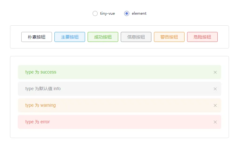
配置完 designConfig 后,图标问题也解决了~
![]()
5.交互的适配
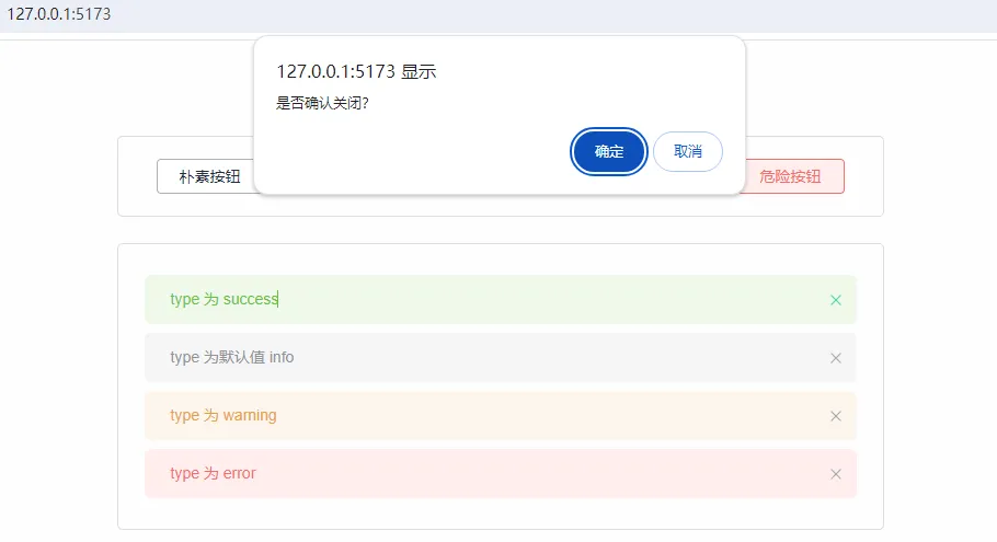
完成以上4点,已经完成了 Button 组件和 Alert 组件的类 element 主题适配了,第5点属于拓展内容,试想一下,如果 element 主题在关闭 alert 前,需要弹出确认框确认,应该如何适配?
得益于 TinyVue 的 renderless 架构,可以很轻易地实现逻辑的替换,从而适配不同交互规范。对原理感兴趣的话,可以查看往期文章《手把手教你实现 miniTinyVue 版组件库》
这里直接贴实现方式,在 elementConfig 中新增替换 handleClose 的配置。
const elementConfig = {
  name: "elementConfig", // 自定义规范名称
  components: {
    Alert: {
      icons: {
        warning: () => null,
        success: () => null,
        error: () => null,
      },
      // 可以通过renderless重写某个方法,自定义交互逻辑
      renderless: (props, hooks, { emit }, api) => {
        const state = api.state;
        return {
          handleClose() {
            const isClose = confirm("是否确认关闭?");
            if (isClose) {
              state.show = false;
            }
          },
        };
      },
    },
  },
};
打开页面,尝试关闭其中一个 alert,发现关闭前会弹出确认框。至此,样式、图标以及交互的适配都完成了~
![]()
总结
至此,本次实操体验已全部完成。相信通过本次实操体验,你已经对 TinyVue 跨设计规范的原理以及相关工具有一个初步了解了~
如果你感兴趣,完全通过theme-tool和config-provider打造一套属于自己的主题 ~
关于OpenTiny
![]()
OpenTiny 是一套企业级 Web 前端开发解决方案,提供跨端、跨框架、跨版本的 TinyVue 组件库,包含基于 Angular+TypeScript 的 TinyNG 组件库,拥有灵活扩展的低代码引擎 TinyEngine,具备主题配置系统TinyTheme / 中后台模板 TinyPro/ TinyCLI 命令行等丰富的效率提升工具,可帮助开发者高效开发 Web 应用。
欢迎加入 OpenTiny 开源社区。添加微信小助手:opentiny-official 一起参与交流前端技术~
OpenTiny 官网:https://opentiny.design/
OpenTiny 代码仓库:https://github.com/opentiny/
TinyVue 源码:https://github.com/opentiny/tiny-vue
TinyEngine 源码: https://github.com/opentiny/tiny-engine
欢迎进入代码仓库 Star?*TinyEngine、TinyVue、TinyNG、TinyCLI~ 如果你也想要共建,可以进入代码仓库,找到 good first issue标签,一起参与开源贡献~
