引言
在平常的开发中,我们总会有各种各样的按钮,圆角的、直角的、正常状态的、按下状态的、禁用状态的。一直的做法就是在drawable中写一个selector,然后用item加shap来实现。这种做法实现起来也是非常简单,但是存在一个问题:当我们shap文件有上千个的时候,我们应该如何维护?
分析
先上一张图吧:
仔细分析下来,图中的几个按钮都是差不多的,他们之间有着许多的相通点,像这种情况,我们真的需要为每一个TextView写一个单独的selector吗?按照我个人的理解,其实可以将这些不同的属性抽取出来做成自定义View。
确定属性
既然分析出了异同,那么我们就可以先确定好需要哪些属性,所谓磨刀不误砍柴工,编码之前有个完整的思路,能少走许多弯路。
| 属性名 |
说明 |
| TextRadius |
圆角 |
| 背景颜色相关 |
| NormalBackgroundColor |
正常情况下的背景颜色 |
| PressBackgroundColor |
按下情况下的背景颜色 |
| DisableBackgroundColor |
禁用状态下的背景颜色 |
| SelectedBackgroundColor |
选中状态下背景颜色 |
| 文字颜色相关 |
| NormalTextColor |
正常情况下的文字颜色 |
| PressTextdColor |
按下情况下的文字颜色 |
| DisableTextColor |
禁用状态下的文字颜色 |
| SelectedTextColor |
选中状态下文字颜色 |
开始编码
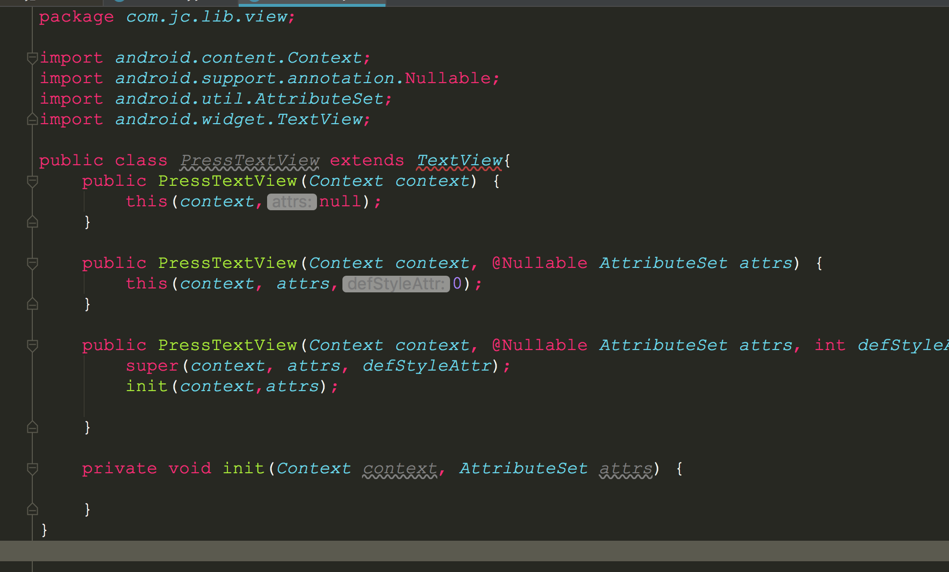
创建PressTextView
开始编码了,创建PressTextView继承至TextView,我的做法是将TextView当做Button来使用,好像是TextView有更好的拓展性。
创建attr
class创建完成,在value目录下创建press_text_view_attr文件,将前面确定好的属性转换为attr,内容如下:
<?xml version="1.0" encoding="utf-8"?>
<resources>
    <declare-styleable name="PressTextView">
        <!--圆角-->
        <attr name="TextRadius" format="dimension" />
        <!--正常情况下的背景颜色-->
        <attr name="NormalBackgroundColor" format="color" />
        <!--按下情况下的背景颜色-->
        <attr name="PressBackgroundColor" format="color" />
        <!--禁用状态下的背景颜色-->
        <attr name="DisableBackgroundColor" format="color" />
        <!--选中状态下背景颜色-->
        <attr name="SelectedBackgroundColor" format="color" />
        <!--正常情况下的文字颜色-->
        <attr name="NormalTextColor" format="color" />
        <!--按下情况下的文字颜色-->
        <attr name="PressTextColor" format="color" />
        <!--禁用状态下的文字颜色-->
        <attr name="DisableTextColor" format="color" />
        <!--选中状态下文字颜色-->
        <attr name="SelectedTextColor" format="color" />
    </declare-styleable>
</resources>
初始化相关属性
这里定义的属性稍微有点多,而且将来相关属性可能会越来越多,所以选择创建一个config类来存储相关属性,减少PressTextView的代码量。
PressTextViewConfig内容:
/**不使用public修饰是不想其它模块进行访问*/
/*public*/ class PressTextViewConfig {
    /**
     * 圆角
     */
    public float TextRadius;
    /**
     * 正常情况下的背景颜色
     */
    public int NormalBackgroundColor;
    /**
     * 按下情况下的背景颜色
     */
    public int PressBackgroundColor;
    /**
     * 禁用状态下的背景颜色
     */
    public int DisableBackgroundColor;
    /**
     * 选中状态下背景颜色
     */
    public int SelectedBackgroundColor;
    /**
     * 正常情况下的文字颜色
     */
    public int NormalTextColor;
    /**
     * 按下情况下的文字颜色
     */
    public int PressTextColor;
    /**
     * 禁用状态下的文字颜色
     */
    public int DisableTextColor;
    /**
     * 选中状态下文字颜色
     */
    public int SelectedTextColor;
}
然后再PressTextView中定义一个PressTextViewConfig的属性,这样就可以方便的赋值和使用:
/**
 * 初始化相关属性
 *
 * @param context
 * @param attrs
 */
private void init(Context context, AttributeSet attrs) {
    mPressTextViewConfig = new PressTextViewConfig();

    // 打开样式资源
    TypedArray typedArray = context.obtainStyledAttributes(attrs, R.styleable.PressTextView);

    //圆角
    mPressTextViewConfig.TextRadius = typedArray.getDimension(R.styleable.PressTextView_TextRadius, 5);

    // 正常背景颜色
    mPressTextViewConfig.NormalBackgroundColor = typedArray
            .getColor(R.styleable.PressTextView_NormalBackgroundColor,
                    0xff3F51B5);
    // 按下背景颜色
    mPressTextViewConfig.PressBackgroundColor = typedArray
            .getColor(R.styleable.PressTextView_PressBackgroundColor,
                    0xff303F9F);
    // 禁言背景颜色
    mPressTextViewConfig.DisableBackgroundColor = typedArray
            .getColor(R.styleable.PressTextView_DisableBackgroundColor,
                    0xffeeeeee);

    // 选中背景颜色
    mPressTextViewConfig.SelectedBackgroundColor = typedArray
            .getColor(R.styleable.PressTextView_SelectedBackgroundColor,
                    0xffFF4081);

    // 正常字体颜色
    mPressTextViewConfig.NormalTextColor = typedArray.getColor(R.styleable.PressTextView_NormalTextColor,
            Color.WHITE);
    // 按下字体颜色
    mPressTextViewConfig.PressTextColor = typedArray.getColor(R.styleable.PressTextView_PressTextColor,
            0xffeeeeee);
    // 禁用字体颜色
    mPressTextViewConfig.DisableTextColor = typedArray.getColor(R.styleable.PressTextView_DisableTextColor,
            0xff999999);
    // 选中字体颜色
    mPressTextViewConfig.SelectedTextColor = typedArray.getColor(R.styleable.PressTextView_SelectedTextColor,
            0xffcdcdcd);

    //释放资源
    typedArray.recycle();

    mPaint = new Paint();
    mPaint.setAntiAlias(true);

    setClickable(true);
    setFocusable(true);
}
绘制
我们继承的是TextView,所以其他逻辑可以直接忽略,包括宽高啊、测量之类的,只需要重写onDraw方法,在onDraw中进行绘制。而绘制有以下要点:
- 因为背景使用圆角,所以使用drawRoundRect来进行绘制,而绘制的时机是在super.onDraw(canvas)之前进行绘制。
- 需要判断不同的状态来使用不同的背景颜色和字体颜色
- 设置字体颜色需要在super.onDraw(canvas)之后
- 需要重写onTouchEvent方法,方法内不做其它事情,就为了调用postInvalidate方法触发绘制。
核心代码也比较简单,这里就直接全部贴上了:
@Override
protected void onDraw(Canvas canvas) {
    if (mBackgroundRectf == null) {
        mBackgroundRectf = new RectF(0, 0, getWidth(), getHeight());
    }
    // 画笔颜色
    mPaint.setColor(switchBackground());
    canvas.drawRoundRect(mBackgroundRectf, mPressTextViewConfig.TextRadius,
            mPressTextViewConfig.TextRadius,
            mPaint);

    super.onDraw(canvas);

    //设置字体颜色
    setTextColor(switchTextColor());
}

/**
 * 字体颜色
 */
private int switchTextColor() {
    if (!isEnabled()) {
        return mPressTextViewConfig.DisableTextColor;
    }
    // 按下状态
    if (isPressed()) {
        return mPressTextViewConfig.PressTextColor;
    }

    // 选中状态
    if (isSelected()) {
        return mPressTextViewConfig.SelectedTextColor;
    }
    return mPressTextViewConfig.NormalTextColor;
}

/**
 * 判断背景颜色
 *
 * @return
 */
private int switchBackground() {
    // 禁用状态
    if (!isEnabled()) {
        return mPressTextViewConfig.DisableBackgroundColor;
    }
    // 按下状态
    if (isPressed()) {
        return mPressTextViewConfig.PressBackgroundColor;
    }

    // 选中状态
    if (isSelected()) {
        return mPressTextViewConfig.SelectedBackgroundColor;
    }

    return mPressTextViewConfig.NormalBackgroundColor;
}

@Override
public boolean onTouchEvent(MotionEvent event) {
    // 触摸的时候重绘
    postInvalidate();
    return super.onTouchEvent(event);
}
使用
编写完成,现在在xml中进行引用。
<?xml version="1.0" encoding="utf-8"?>
<LinearLayout xmlns:android="http://schemas.android.com/apk/res/android"
xmlns:app="http://schemas.android.com/apk/res-auto"
xmlns:tools="http://schemas.android.com/tools"
android:layout_width="match_parent"
android:layout_height="match_parent"
android:gravity="center"
android:orientation="vertical"
tools:context=".MainActivity">
<com.jc.lib.view.PressTextView
android:layout_width="wrap_content"
android:layout_height="48dp"
android:layout_marginTop="10dp"
android:gravity="center"
android:paddingLeft="5dp"
android:paddingRight="5dp"
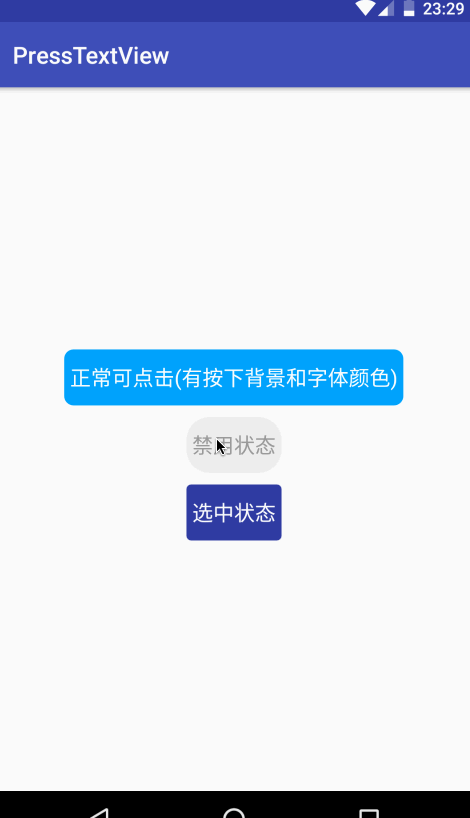
android:text="正常可点击(有按下背景和字体颜色)"
android:textSize="18sp"
app:NormalBackgroundColor="#03a4f9"
app:NormalTextColor="#fff"
app:PressBackgroundColor="#3F51B5"
app:PressTextColor="#eee"
app:TextRadius="8dp" />
<com.jc.lib.view.PressTextView
android:layout_width="wrap_content"
android:layout_height="48dp"
android:layout_marginTop="10dp"
android:gravity="center"
android:paddingLeft="5dp"
android:paddingRight="5dp"
android:text="禁用状态"
android:textSize="18sp"
android:enabled="false"
app:DisableBackgroundColor="#eeeeee"
app:DisableTextColor="#999999"
app:TextRadius="20dp" />
<com.jc.lib.view.PressTextView
android:id="@+id/mSelectTv"
android:layout_width="wrap_content"
android:layout_height="48dp"
android:layout_marginTop="10dp"
android:gravity="center"
android:paddingLeft="5dp"
android:paddingRight="5dp"
android:text="选中状态"
android:textSize="18sp"
app:SelectedBackgroundColor="@color/colorPrimaryDark"
app:SelectedTextColor="#fff"
app:TextRadius="4dp" />
</LinearLayout>
效果
现在就是验证编码成果的时候了。
总结
其实这只是一个简单的TextView封装,并不难,有时候只是一个思路问题,由此延伸,我们的其他布局也是不是可以这样做呢?或者再加上边框、实线边框、虚线边框、上边框。这些就不一一去实现了,在这里主要是为了提供这样一个思路,我们更需要做的是跳出当前思想的局限性,用散发性思维去思考事物。
最后
未完待续、敬请期待!
免为其难的关注一下公众号吧!!


